16

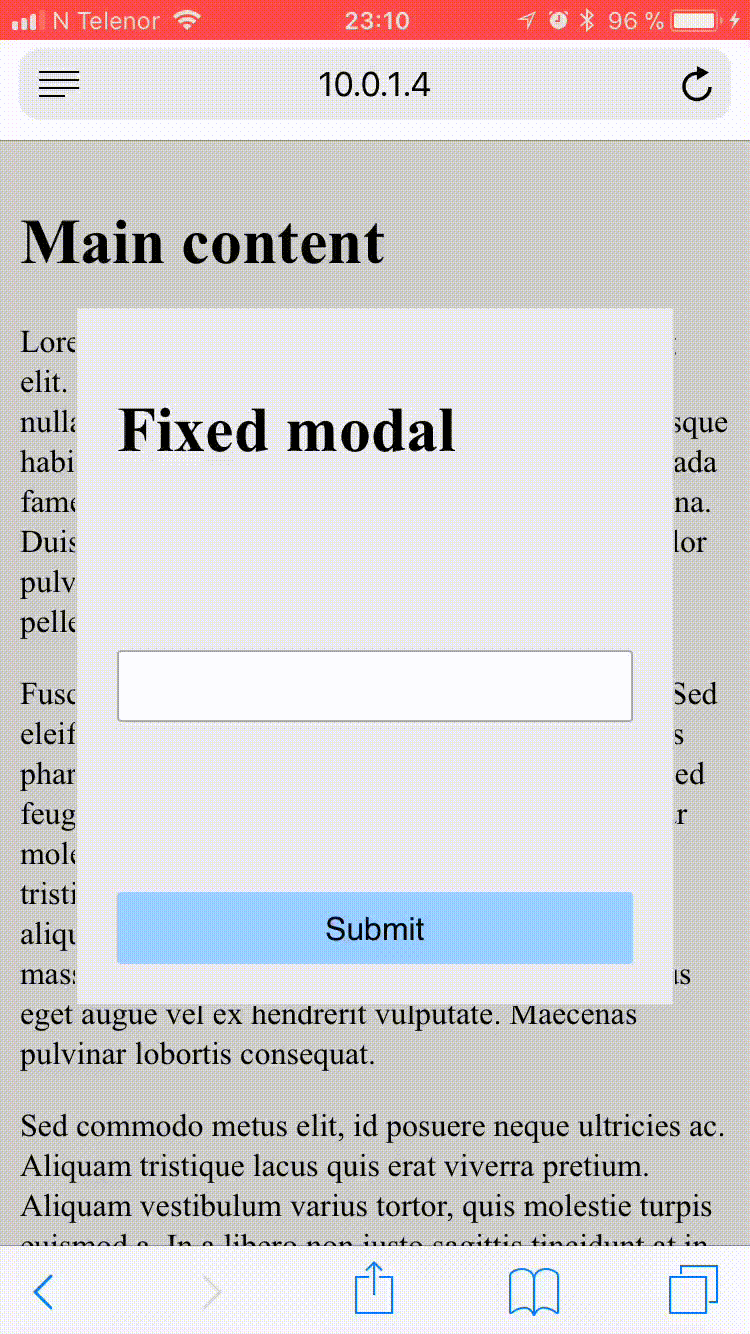
A bug in HTML inputs in the newly released iOS 11 is creating problems for websites that have input elements in fixed containers. Here is exactly what is happening and some possible workarounds.

If you have an in an fixed container and it is close enough to the bottom of the screen forcing the browser to scroll to make room for the keyboard, the cursor is put outside of the text input. This was a critical problem for us since one of our core functionalities relies on the user input through a fixed modal dialog.

This was a critical problem for us since one of our core functionalities relies on the user input through a fixed modal dialog.

enter image description here

Adeel
  • 2,901
  • 7
  • 24
  • 34
Amjad Jafar
  • 161
  • 1
  • 1
  • 5
  • The bug has been fixed by Apple in IOS 11.3 as mentioned in this [thread](https://bugs.webkit.org/show_bug.cgi?id=176896), I tested with the latest IOS 11 and all looks to be fixed now. – svnm Jun 20 '18 at 05:31

8 Answers8

6

For now there is no perfect fix for it. Two temporary options:

  1. Change dialog/modal to position: absolute (Not recommended)
  2. Try to remove background scrolling when modal/dialog opens and restore it when dialog close.

Detail for option 2: For example, you can set your root div (or whatever that has a scrollbar) as overflowY='hidden' when dialog opens, and change it back overflowY='' when dialog closes. (Drawback: browser will be scrolled to top when you open dialog/modal)

Note:

  1. Do remember to detect OS/browser when trigger fixes, otherwise you will probably encounter problem in IE.
  2. Follow this thread to get the newest update about this issue.
Ming
  • 4,110
  • 1
  • 29
  • 33
  • Thanks for showing interest but 'overflow' does not work on ipad safari browser and i am working on dynamic pages so there is no limit of page length and 'position:absolute' never work on them. – Amjad Jafar Dec 20 '17 at 18:31
  • Same issue before. Also fixed by setting `position: absolute` – iplus26 Dec 31 '17 at 07:18
4

This solution helped me to fix in any IOS model.

First thing target only IOS devices with this code.

//target ios
var isMobile = {
    iOS: function() {
        return navigator.userAgent.match(/iPhone|iPad|iPod/i);
    }
}
if(isMobile.iOS()) { 
      jQuery('body').addClass('apple-ios');
}

then put this code in your css:

body.apple-ios.modal-open {
  position: fixed;
  width:100%;
}

If you are using wordpress and cache plugin, you need to empty all the cache.

Hope this help you.

Sajjad Ahmad
  • 143
  • 3
  • 17
  • Position fixed on body - makes entire content jumps to the top of the page, but it's not the major issue it also prevents user to scroll up if modal content is larger than viewport. – Darko Apr 05 '18 at 15:51
2

I'm not sure if this is exactly the same issue you are facing, but this solution worked for me:

.modal-open {position:fixed;}

iOS 11 Safari bootstrap modal text area outside of cursor

John Nimis
  • 586
  • 3
  • 15
0

I had the same issue, take a look at my answer, maybe it will help you: https://stackoverflow.com/a/46954486/8775824

Dan
  • 1
  • 1
0

This solution helped me to fix IOS11 input problem: https://bitbucket.org/snippets/OlegChulakovStudio/RgBX8x

It also fixes annoying background scroll, when you try to scroll inside modal :)

Summary: You add position:fixed to body, cash window.pageYOffset and scroll to cashed position after popup close to prevent movement to the page top.

0

I had this iOS bugg with a login form inside a fixed header/banner element. There is a button inside the header to open the modal window with the login form. The actual modal window is absolute positioned, but the header/banner element is fixed.

I solved it quite easy with just a few rows of code. So what I am doing is that I am changing the fixed container to absolute, but only when the login form is open, it makes the magic with the input marker.

jQuery:

$('.ios #mob-login').on('click', function(){
  $('body').toggleClass('login-open');
});

CSS:

.ios body.login-open #banner-wrapper {
  position: absolute;
}

So now the fixed header becomes absolute. If it is iOS and only when the login box is open.

This might solve your problem if you have a similar problems.

Ps. You need a script to detect and write the class name ios/ios11 to <html> or similar, but I am not going into that in this post. You can find many solutions for that out there.

JoakimB
  • 157
  • 1
  • 11
0

Try this it may help you

//HTML
<head>
     <style>
          .ios-11-body-fixed {
             position: fixed;
             width: 100%;
          } 
     </style>
</head>

//jQuery
$("#leadgen-modal").on('show.bs.modal', function () {
    $('body').addClass('ios-11-body-fixed');
});
$('#leadgen-modal').on('hidden.bs.modal', function () {
           $('body').removeClass('ios-11-body-fixed');
});
Dharmesh Rakholia
  • 1,210
  • 9
  • 22
  • Thanks for help! but in my scenario it does not work 100% as i have very long dynamic pages and when you add 'position:fixed' to the body it scrolls to the top every time, any how i managed with a dynamic height adding in scroll top 'jquery' function, but it also failed in some scenarios. – Amjad Jafar Dec 20 '17 at 18:42
0

This bug also affects iframe inputs, so I believe the fix I found will also help with modals.

All that needs to be done is to apply a the following css to the input within the iframe.

input:hover {
   cursor: text
}

Here's an example: https://codepen.io/ryanoutloud/project/full/AEKGjj

Ryan L.
  • 103
  • 6