What fonts do you use for programming, and for what language/IDE? I use Consolas for all my Visual Studio work, any other recommendations?
Asked
Active
Viewed 2.5e+01k times
182
-
1Most answers to this question are "+1 for Consolas". If you had specified "only one answer per font" in your question, we could have used voting instead, the way the site was supposed to work. Just saying. – bzlm Sep 28 '08 at 14:51
-
Consolas is awesome. Unless you're connecting via RDP with Windows XP, in which case ClearType does not work so it looks way nasty... – devlord Oct 23 '08 at 06:16
-
alord1689, good news for you. Install XP SP3, then [HKEY_LOCAL_MACHINE\SYSTEM\CurrentControlSet\Control\Terminal Server\WinStations] "AllowFontAntiAlias"=dword:00000001 [HKEY_LOCAL_MACHINE\SYSTEM\CurrentControlSet\Control\Terminal Server\WinStations\RDP-Tcp] "AllowFontAntiAlias"=dword:00000001 :) – Alan Nov 21 '08 at 20:47
114 Answers
197
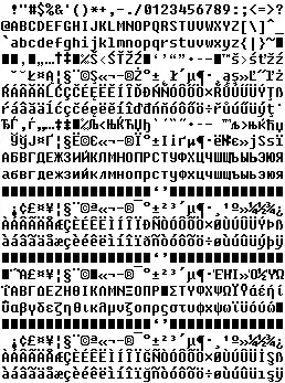
Either Consolas (download) or Andale Mono (download). I mostly use Andale Mono. I wrote an article about programming fonts a long time ago, I think Consolas wasn't even out yet.
http://www.deadprogrammer.com/photos/fonts.gif
I find that typing Illegal1 = O0 is a good test of suitability.
Joel Coehoorn
- 399,467
- 113
- 570
- 794
deadprogrammer
- 11,253
- 24
- 74
- 85
-
21Consolas is great if you're running ClearType on an LCD (though I haven't tried it on a CRT). Consolas is horrible if you don't have ClearType on because it was made with ClearType in mind. – Tom Kidd Sep 23 '08 at 17:08
-
6Is it only me that thinks cleartype makes everything look slight out of focus? (ye sI do have an LCD!) – Martin Beckett Sep 23 '08 at 17:14
-
1
-
3The Consolas link above only works if you have Visual Studio installed. Otherwise download the Powerpoint 2007 Viewer which contains the font. http://www.microsoft.com/downloads/details.aspx?familyid=048dc840-14e1-467d-8dca-19d2a8fd7485&displaylang=en – TravisO Nov 26 '08 at 19:13
-
1@mgb: YES! Sometime I activate ClearType to check again, and find everything to be fuzzy. I am probably too old school, but I prefer crisp characters, at least with small sizes. That's why I still prefer Andale Mono (or Bitstream Vera Sans Mono) over Consolas. – PhiLho Nov 29 '08 at 09:06
-
Yeah I don't like ClearType either, but is definitely required for certain fonts, at least at the smaller sizes (8 or 9 pt). – John B Feb 13 '09 at 16:33
-
1
-
10
84
I've really fallen in love with Droid Sans Mono.
-
12I must say this font looks nice, but the O and 0 are too similar for me to adopt this. – mbillard Sep 30 '08 at 17:30
-
8Looks very nice but it should be mentioned that it doesn't have bold or italic, which many people like to have for syntax highlighting. – TM. Jun 01 '09 at 04:32
-
I like italics for comments. In XCode you can specify that the comments have their own font and style, though, so not really a problem there. – Nosredna Jun 01 '09 at 04:37
-
I didn't even feel to find better font with "Menlo", however, this is first font made me feel to change my Xcode font setting. – eonil Aug 25 '10 at 09:27
66
I really really like DejaVu Sans Mono. It is very clean and easy on the eyes.
mbillard
- 38,386
- 18
- 74
- 98
-
1I like the DejaVu fonts a lot better than the Consolas; I'm not sure why so many people like Consolas so much, actually. – Trevoke Feb 25 '10 at 14:27
-
1I also like this one more than Consolas. Additionally, it has a wide range of rarer characters like arrows that are nice when using things like `font-lock-symbol-mode` for Haskell. Being able to use the same typeface for Cyrillic as well is also really nice. – Tikhon Jelvis Jul 13 '11 at 20:17
-
61
+1 for Monaco
alt text http://img.skitch.com/20080908-nmjji28uerreqpprs1h86gxna9.png
Just beautiful and I find I can read it for hours on end.
Dave Verwer
- 6,140
- 5
- 34
- 30
-
I heavily concur. I tried Inconsolata and others, but the letters are so squished together that it's hard to read. Shame. – Zarkonnen May 22 '09 at 07:23
-
Monaco looks really sweet on a Mac. I use them at size 13 and it is perfect. – wenbert Sep 26 '09 at 03:56
-
-
That's the best one on Mac because of its antialiasing adapted to mac screens... Too bad it doesn't exists in italic and bold for Xcode! sticking with consolas because of this. I wished consolas rendering was better. – Vincent Guerci May 17 '11 at 14:17
51
I use Consolas for everything, including Notepad++, SQL Studio, Eclipse, etc. I wish there was a Mac version. Also, if you notice, the text area field on Stack Overflow uses Consolas, so we have some other fans out there as well :p
Shawn
- 19,465
- 20
- 98
- 152
-
The same link Jeff provided will download Consolas on OS X, and it works fine for me at home. – JosephStyons Sep 08 '08 at 19:26
-
There's also Inconsolata which is a mac compatible copy. You'll need to google for it as the original creator's site is down, but it's out there! – defmeta Oct 08 '08 at 21:07
-
I tried Inconsolata on the Mac, but it didn't seem as good to me so I ended up moving Consolas to the Mac. – Nosredna Jun 01 '09 at 04:33
41
I like Envy Code R.
Community
- 1
- 1
Jon Galloway
- 52,327
- 25
- 125
- 193
-
-
It is also very readable on a dark background (even at 13pt) like Tomas Restrepo's DesertNights Visual Studio theme at http://winterdom.com/weblog/CategoryView,category,VSColorScheme.aspx – CAD bloke Nov 05 '08 at 02:00
-
7For me, the font is too high - not necessarily the height of the characters, but the space between the lines. (I want more lines of code on the screen!) – Ola Eldøy Dec 30 '08 at 11:37
-
-
thanks for the tip. this font is very good for coding, even more with GDI++ – Victor Rodrigues Aug 10 '09 at 23:29
-
Experiment with the font size. It seems to make a bigger difference to how it renders than with most fonts. Try 1 bigger or smaller. – CAD bloke Sep 06 '10 at 06:29
28
+1 for Monaco, although this blog post is making me think about switching to Inconsolata.
I'm curious as to what point size y'all use, I use the TextMate default size of 12pt.
Dan
- 4,855
- 3
- 25
- 21
-
Monaco 9pt has been my default since starting with BEEdit on OS9 (or 8?) – Lasar Nov 03 '08 at 09:51
-
1I'm getting older and screen resolutions are getting higher -- 9 pt is getting smaller and smaller. I've had to bump up to 10 pt or higher. – Barry Brown Nov 03 '08 at 18:18
-
I can't stand fonts that put a serif to the left of the bottom of the lowercase 'l'. such as inconsolata In what universe does an 'l' have that? It isn't similar to handwriting, printer's fonts, or a proportional font. It is too simliar to a '1'. At least Consolas and Monaco get it right. – Patrick Szalapski Dec 02 '08 at 03:23
28
I use Bitstream Vera Sans Mono, but you need to activate ClearType to get it readable .
I like the 'Illegal1 = O0' readablility test, mentioned earlier in this thread, thanks for that.
Pascal Immerzeel
- 46
- 2
- 3
-
-
I have just changed from being a loyal fan of this one as it doesn't contain macrons - http://en.wikipedia.org/wiki/Macron . I now use Consolas. – Wayne Koorts Apr 25 '09 at 00:43
-
3Apparently, DejaVu is an updated version of Bitstream Vera, with lots of characters that Bitstream Vera is missing. Perhaps you should look at DejaVu Sans Mono? – Paul Biggar Aug 20 '09 at 10:23
24
Anarch, 32 points, ofcourse. Code with style!
RazMaTaz
- 256
- 3
- 10
-
21
-
-
I prefer this: http://home.student.uu.se/j/jowi4905/fonts/annatar.html (the italic version) – Brendan Long Dec 04 '09 at 08:12
-
1I guess this is how a designer thinks programmers should work... – Camilo Martin Mar 16 '10 at 17:06
-
6
-
23
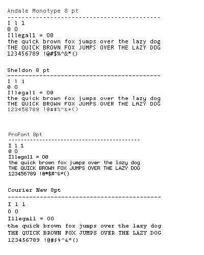
For UltraEdit and anything for that matter, I use the good old Courier New.
alt text http://www.identifont.com/samples/microsoft/CourierNew.gif
I've found Consolas to difficult to read with it's over anti-aliasing.
GateKiller
- 74,180
- 73
- 171
- 204
-
1Yeah, Courier New is great! ... for mixing up 1l, 0O and such... ;-) I don't Consolas either, but I definitively adopted Andale Mono since Microsoft started to distribute it on their Web site... – PhiLho Nov 29 '08 at 09:11
-
Makes sense to use a font like courier New that is specifically designed for easy readability – Alex Baranosky Aug 12 '09 at 22:31
-
I like Courier New because it's easy to read, has italic and bold and is monospaced. – Aug 05 '11 at 13:07
21
I use Lucida Console for years and never find anything better.
However I tried a few times Consolas fonts and simply -- I prefer Lucida Console.
Grzegorz Gierlik
- 11,112
- 4
- 47
- 55
-
The problem with Lucida Console is that bold is wider than normal. I like to use bold in my syntax highlighting, but not if it makes my line grow and shrink as I use it! – Patrick Szalapski Dec 02 '08 at 03:17
20
I like Terminus for some command line stuff, at least scrolling log files and irssi/irc (TTF versions available). Screenshot of the terminus.ttf in action below (PuTTY on Windows XP with ClearType enabled).
nybergh
- 231
- 1
- 3
- 9
18
I use Consolas on my mac, BTW; here's a link to download the consolas TTF files if you want to install this (Mac/Win/Linux).
/mp
mauriciopastrana
- 5,010
- 7
- 35
- 36
15
I don't use Consolas, though it does look good on LCD, but sometimes I'm not on LCD, like when I'm giving presentations and then it looks crap.
My current font of choice for programming is the Liberation Mono font.
Oh man, just discovered why the text on Stack Overflow looks like crap, it forces Consolas which is a cleartype font, and on my current setup which didn't have cleartype enabled, it looks very bad.
Going to make a bugreport on uservoice.
Lasse V. Karlsen
- 380,855
- 102
- 628
- 825
-
I never noticed... because I just haven't Consolas on this computer... :-) – PhiLho Nov 29 '08 at 09:10
-
-
I use the Liberation fonts for most of my screen and print output. Also removes any problem with font licensing between machines. – mas Jul 23 '09 at 13:21
15
I have been using the Dina - http://www.donationcoder.com/Software/Jibz/Dina/index.html - font for awhile now for text editing and it seems to be doing the job nicely.
rjzii
- 14,236
- 12
- 79
- 119
-
2I tried alot of programmer fonts before settling on this one too. If you are a cross platform developer, you can find a Linux (X Windows) version of the font in the forum on that page. http://www.donationcoder.com/Forums/bb/index.php?topic=7857.0 – Arnold Spence Apr 03 '09 at 19:11
-
1One more thing, take your favorite programming font and check the alignment on two lines with the same text but different sections in bold and italic. Alot of fonts don't get this right. – Arnold Spence Apr 03 '09 at 19:13
-
I like Dina as well, although there are others I don't mind. I'm not as picky as some of the other posters. – Charlie Salts Jun 20 '09 at 23:59
-
I use this font extensively in my editors, and even my command window and putty sessions. I find it the most comfortable font for coding. – RuntimeException Nov 24 '10 at 17:03
14
ProFont. Am I the only one still using it?
Carl Russmann
- 1,719
- 12
- 13
-
I use it for pretty much everything that a monospace font is useful for - I love it! – Dan Oct 14 '08 at 19:43
-
-
I use it and love it... Profont is usually one of the first things I install on my dev machines. – Jim OHalloran Jan 29 '09 at 04:39
-
I love ProFont as well. Got VS and Notepad++ using it. I usually grab it on the second day of using a new box when I start to get annoyed with Consolas. – Brandon Apr 28 '09 at 23:54
12
A excellent CodeProject article that list 33 fonts for programming (With examples of each)
rudigrobler
- 17,045
- 12
- 60
- 74
12
I like Fixedsys in Visual Studio. It's a classic. No anti-aliasing blur.
Community
- 1
- 1
Zack Peterson
- 56,055
- 78
- 209
- 280
-
-
I ported FixedSys to a TTF, and others continued my work http://fixedsys.moviecorner.de/?p=download&l=1 – TravisO Nov 26 '08 at 19:16
12
I'm amazed nobody has mentioned Pragmata. It's the BMW of programming fonts. Condensed, readable, and the pinnacle of simple elegance.
alt text http://www.fsd.it/fonts/imm/pr_abc.gif
There is now a fundraising project going on for PragmataPro (which covers a larger portion of Unicode than Pragmata) to make it available for free under a Creative Commons license!
Cetin Sert
- 4,497
- 5
- 38
- 76
Matias Nino
- 4,265
- 13
- 46
- 63
-
It's a pretty hard sell for someone to spend ~ $125-150 on a programming font. – Brad Wilson Oct 20 '08 at 07:35
-
That's a good point. It's definitely a luxury. The author gave me a discount though (upon request) and I'm sure he would do the same for any bulk purchases. – Matias Nino Oct 20 '08 at 18:17
-
I use it, too ;) But the 0 and the O are too similar I think. And the I and the l. Therefore I sometimes switch back to Courier. Mentioning price: how long do you watch this font? – wishi Feb 03 '09 at 12:58
-
16
-
Important to note that that €90 price is for up to "5 computers of one company" - this is quite standard for font licencing. – e100 Mar 08 '10 at 13:06
-
There is now a fundraising project going on for PragmataPro (which covers a larger portion of Unicode than Pragmata) to make it available for free under a Creative Commons license: http://www.indiegogo.com/PragmataPro-the-ideal-programming-typeface-becomes-open-source . – Cetin Sert Nov 03 '11 at 07:10
10
I use Inconsolata with UltraEdit on Windows. With TextMate (on the Mac) I prefer Monaco (it's the default font).
Christian Lescuyer
- 18,893
- 5
- 49
- 45
9
Inconsolata 14pt in TextMate
Jarin Udom
- 1,849
- 3
- 19
- 23
-
That's what I use, and it looks great (although it seems to look much better on dark backgrounds, rather than light ones). – mipadi Oct 22 '08 at 15:36
8
I like Consolas too, but I also like Anonymous: http://www.ms-studio.com/FontSales/anonymous.html
John with waffle
- 4,113
- 21
- 32
-
Anonymous is great... I always keep coming back to it. Especially good for machines without ClearType. – yoyoyoyosef Oct 20 '08 at 18:23
-
1There's a new and improved version, Anonymous Pro, with bold, italic and international Unicode characters: http://www.ms-studio.com/FontSales/anonymouspro.html. Open licence. – e100 Oct 26 '09 at 17:54
7
I use a proportional font too. They seem good for the same reasons they work in books and magazines: the more variation between characters, the easier it is for the brain to distinguish them; and you can fit more on the screen. Indentation still works fine: 6 leading spaces is still twice as wide as 3 leading spaces.
I use a version of Georgia that I hacked to make the lower case "l" look less like the digit "1", and put a slash through the zero.
Martin C. Martin
- 3,565
- 3
- 29
- 36
7
I never found a reason to stray from Courier New. I don't think I'd have a problem with any font so long as it's sans-serif. Mono-spaced fonts are nice for coding, too.
MattSayar
- 2,078
- 6
- 23
- 28
-
2
-
True, but when I say sans-serif, I mean something that's NOT like Times New Roman (with its annoyingly curvy serifs). – MattSayar Dec 11 '08 at 15:13
-
5
-
I once switched over my editor to a serif font, thinking "Hey, this is what I use in everything else, so...". Yeah, that got annoying pretty quickly, especially if you look at code that's supposed to be aligned and it isn't... – Xiong Chiamiov Aug 25 '09 at 22:26
6
I think the anti-aliasing blur on Consolas is caused by monitors which do not have ClearType enabled. Consolas was designed for ClearType.
[Jeff A: indeed, you can see screenshots of this in a post I wrote on this topic.]
Jeff Atwood
- 63,320
- 48
- 150
- 153
Jon Limjap
- 94,284
- 15
- 101
- 152
6
Two pages where there's a long list of programming fonts are these pages on keithdevens.com and lowing.org (dead link, but it's in the internet archive)
Some other discussions of programming fonts that may have more suggestions are the comments to this blog post on typographica and this topic on a text editor's forum.
Personally I like Triskweline:
alt text http://www.netalive.org/tinkering/triskweline/shot.gif
Sam Hasler
- 12,344
- 10
- 72
- 106
-
The lowing.org link doesn't work for me - actually found it in 2 different places this morning, neither of which worked. – cori Oct 19 '09 at 13:35
6
Instead of just chiming in with another vote for a particular font, I'd recommend reading these comparisons of programming fonts where you can learn a little more:
Jeff Atwood's excellent "round-up":
http://www.codinghorror.com/blog/archives/000157.html
Another review of 5 fonts with nice screenshots:
http://blog.hamstu.com/2008/02/03/the-typography-of-code/
4
Back in my Mac LC days I swore by Monaco 9pt, mostly for it's slashed 0. I never quite got used to the default line-height though.
monaco sample http://www.k8zt.com/ham_fonts/monaco.jpg
It's a little hard to track down in the original non-OS-X version.
dlamblin
- 43,965
- 20
- 101
- 140
-
It's installed as a default font on OS X Leopard (10.5). Or is this a different font? – different Oct 10 '08 at 09:35
-
4
3
Consolas. Italic for comments. Only way. Nahh just kidding, the best programming font is this! Here's your first C program:
The image link must not be working, tell me in a comment http://img40.imageshack.us/img40/8008/picture1iqv.pngRecommended for high readability.
mk12
- 25,873
- 32
- 98
- 137
3
The Raize Font is a clean, crisp, fixed-pitched sans serif screen font that is much easier to read than the fixed pitched fonts that come with Windows. Ideally suited for programming, scripting, html writing, etc., the Raize Font can be used in any IDE or text editor.
3
+1 for Consolas, together with a proper Color Scheme (I use the white one at the first screenshot)
Michael Stum
- 177,530
- 117
- 400
- 535
3
I never found a reason to stray from Courier New. I don't think I'd have a problem with any font so long as it's sans-serif. Mono-spaced fonts are nice for coding, too.
Courier New has serifs.
Jason Pratt
- 13,017
- 1
- 21
- 14
3
Monaco, 11pt, antialias, on Mac OS X. Looks ever better, and crisper on darker backgrounds.
ayaz
- 10,406
- 6
- 33
- 48
2
My favourite is ProggyClean at 11px. I've been using it for 2-3 years and it's great for getting lots on screen without being painful to read. It deserves even more attention than the couple of mentions it's had so far:
Proggy Clean http://www.proggyfonts.com/download/example_proggy_clean.gif
The site has many variations including slashed zeroes, bold for function marks etc:
Proggy Square http://www.proggyfonts.com/download/example_proggy_square_bp.gif
(As an aside, my most-loved favourite text editor, TextPad, allows you to have different fonts and font sizes for different file types, which is a really great feature.)
Odilon Redo
- 551
- 4
- 5
2
Until I found ProggyTiny, I always made my own fonts using Softy. It's surprisingly easy, and might increase your productivity if you're annoyed by some features of your current font (like "Q is too similiar to 0").
bzlm
- 9,626
- 6
- 65
- 92
2
I'm going to make some enemies with this, but I actually use -- gasp -- a non-monospace font! I occasionally switch back to a monospace to disambiguate something, but mostly find that a good clean sans-serif font is easiest to read and doesn't waste screen estate.
An IDE with good syntax colouring helps.
Marcus Downing
- 10,054
- 10
- 63
- 85
2
Bitstream vera sans, a Gnome font. I find its much clearer than Consolas, which is pretty good too.

2
I second Consolas, Inconsolata, DejaVu Sans Mono, and Droid Sans Mono, with my preference going towards the Droid one.
wvdschel
- 11,800
- 14
- 41
- 45
2
Neep Alt 13/17 is very good.
Penz
- 5,428
- 5
- 31
- 28
-
+1 for [Neep by James M. Knoble](http://www.jmknoble.net/fonts/). I prefer the 12 point size. – flight Sep 08 '08 at 15:01
2
I use Terminuse in almost everything (Eclipse, putty and other terminals): http://fractal.csie.org/~eric/wiki/Terminus_font
I must say that I don't get it why most people use small fonts like 9pt, do you have 14" monitors or what?
For me the best way is to use font size that makes my monitor display at most one 30-40 line method, this way I need to create smaller methods :)
Krzysztof Krasoń
- 26,515
- 16
- 89
- 115
-
+1 for Terminus I can't live w/o it. However there should be a 9.5 versions, as 10 seems a little bit too big and 9 bit too small. – kyku Mar 06 '09 at 20:53
-
you like small fonts :) I would like the font in size 16,17 but I think it's only available in 14 and 18, the first is to small, the second too big :) – Krzysztof Krasoń Aug 25 '09 at 09:24
2
I use MonteCarlo, which is based on ProFont but has a bold face too. That way IDEs/editors that use bold as part of their syntax highlighting leave your text still properly fixed width.
java example http://bok.net.nyud.net/MonteCarlo/images/java-example.png quick brown fox example http://bok.net.nyud.net/MonteCarlo/images/screenshot-small.gif
Like ProFont, Proggy & others, its quite small (& being bitmap based, obviously doesn't scale), but I like a small font for coding and its still extremely clear and easy on the eyes.
Alconja
- 14,834
- 3
- 60
- 61
-
1I've never found a better font after MonteCarlo. You've forgot to mention the biggest reason for using it - you can see more code with it than any other font. – Vineet Reynolds Sep 06 '09 at 14:00
1
I love consolas, especially with italics for comments. The little italic curlicues are so cute :P
Blorgbeard
- 101,031
- 48
- 228
- 272
1
ProFont is a great font for code, Consolas a 2nd runner up. You could always go retro with a little Terminal font for a little nostalgia (customize the background color to black and foreground font to green for the full effect!).
Annagram
- 700
- 7
- 16
1
In bash and vim I use Lucida Typewriter, but in Kate, Scintilla, Eclipse, and Netbeans I (currently) use Lucida Casual, i.e., a proportional font. Ten years ago I started using proportional fonts in Visual Studio (MS Comic Sans) and it works very well for me. Colored syntax highlighting in said IDEs provides excellent readability and for text-heavy languages like HTML and LaTeX a proportional font is a natural choice.
Andreas Scherer
- 171
- 2
- 5
1
@modesty:
I wish there was a Mac version.
You can install the font on a Mac. I use it all the time, everywhere, without any problem. The only thing to pay attention for is to set nomacatsui when working with GVIM, or better yet, switch to MacVim.
Konrad Rudolph
- 530,221
- 131
- 937
- 1,214
1
Another vote up for Dina. As long as you use it at its optimum size (9 pt), it looks great.

-
You must have a much lower res monitor than me, or considerably better eyes :) – Lawrence Dol Feb 03 '09 at 23:03
1
For quite some time I've been using ProFont, mainly because it allows a lot of lines fit into a given height (a lot more than say Consolas or others). Consolas is not bad either, though...
Vlado Klimovský
- 531
- 2
- 4
- 12
1
I have to agree with Kevin Kenny, Proggy fonts all the way, though I prefer Proggy Clean. But either way you have to go with a font that clearly shows the difference between the number 0 and the letter O. Which the preview font here doesn't really show that.
Justin Yost
- 2,340
- 19
- 31
1
I like consolas too.
1
I'm on PanicSans 12pt w/ AA on TextMate, but loving Inconsolata on Terminal/vim... (debating changing my TM font to this one... but point size 14pt) :)
levifig
- 510
- 6
- 11
1
I never considered changing my font, I have always been happy with Courier. This thread has truely opened my eyes, if only I could upvote it!
Went with Droid Sans Mono.
Chris James
- 11,571
- 11
- 61
- 89
1
I just tried Consolas and Envy - Envy seems "too narrow" to my eyes, but Consolas looks great (I am on a mac). Thanks for the tips !
Michael Neale
- 19,248
- 19
- 77
- 109
1
I like Consolas myself, but when it comes to monospaced fonts there are quite a few other options to choose from:
jussij
- 10,370
- 1
- 33
- 49
1
Consolas and Courier New under Windows, Inconsola under *nix. I really miss the old IBM terminal fonts, though. The one from green/orange terminals.
Rook
- 60,248
- 49
- 165
- 242
1
Don't forget the colours!
For some reason Delphi 7 in Twilight does not render Droid Sans Mono well, but in Visual Studio with an orange on black theme it is excellent. Deja Vu Sans Mono is the best all rounder. I use it almost everywhere. Consolas would be excellent apart from its ugly Q glyph.
One other thing I have found since I entered the world of work is that even though I have great eyesight I like to keep my code font around 12 or 13pt size both to reduce eye strain and to make sure I can't put too much text on screen. It's sort of an incentive to keep code blocks vertically short.
I note that this edit box does not respect my browser's default monospaced font. It's giving me Monaco (I'm on OSX). Monaco is horrible. It's glyphs have poorly angled elements and it's capitals are not well proportioned.
Oh, and it almost doesn't matter on Windows because your font will not look right anyway. /me dons flame retardent suit
John Ferguson
- 786
- 1
- 7
- 21
1
Lucida Console every time.
I've never found a font that can pack as many lines of code onto the screen at the same point size without looking cramped.
And it looks nice too.
izb
- 50,101
- 39
- 117
- 168
1
I just recently switched from Bitstream Vera Sans Mono to Inconsolata, but reading the answers here, I'm going to give Consolas a chance for a bit. Looks really nice so far.
Nate Smith
- 1,103
- 1
- 15
- 19
0
I've been hanging on to this link for more than a year, it's an article entitled "Five great programming fonts". The five are good fonts, but the article includes comments with a dozen more interesting answers.
http://forums.programming-designs.com/viewtopic.php?pid=3338
davenpcj
- 12,508
- 5
- 40
- 37
0
I recommend Lucida Console for Windows users and Adobe Courier for Linux/Unix, with a size of 10pt these fonts looks great! and very legible
Edit:
I've been saying that using Lucida Console was a real good option, well, now I know Consolas :)
Lucas Gabriel Sánchez
- 40,116
- 20
- 56
- 83
0
6x13. You can get two terminal or editor windows across a 1024x768 and three onto a 1600x1200 screen. A windows version of this font can be found Here.
ConcernedOfTunbridgeWells
- 64,444
- 15
- 143
- 197
0
I use ForMateKonaVe, which is a merge of Bitstream Vera Sans Mono and a half-width'd Konatsu. I use a lot of Japanese here and there and this is the best way to display it in TextMate.
0
I prefer Consolas as well, and obviously cleartype helps when using other fonts.
Jeremy Bade
- 511
- 5
- 11
0
Lucida Console isn't so good because the bold text takes up more room than the non-bold text. Consolas overcomes this.
Patrick Szalapski
- 8,738
- 11
- 67
- 129
0
-2 for Bitstream Vera Sans Mono -- it has an dotted zero - released this font as an free download after an modification.
+2 for Prima Sans Mono -- lacks an dotted zero - need an free download for RapidShare to extend the font to an terminal.
tae
- 1
0
I use Bitstream Vera http://www.gnome.org/fonts/ for Visual Studio 2008 paired with the Darkness Theme because my eyes can't deal with white backgrounds.
asleep
- 4,054
- 10
- 34
- 51
0
Consolas I use it everywhere, I use it for everything. Advice: stick to it.
Ahmed Atia
- 17,848
- 25
- 91
- 133
0
I've been using Anonymous, but I'll need to check out some of these other fonts.
projecktzero
- 1,192
- 1
- 9
- 11
0
I'd also have to add another vote for Android's "Droid Sans Mono". It's a very crisp, clear coding font.
0
I just use Courier New, or whatever monospace font I have available.
However, I sometimes like using sans-serif (currently Comic Sans MS) for comments in Notepad++. (However, I now tend more to switch everything to monospace just for consistency in spacing and such.)
dgw
- 485
- 1
- 4
- 18
0
I experimented with Myriad until I realised using a variable-width font was a fools game.
Courier New here, although I am going to try out Envy after seeing it here.
Ross
- 46,186
- 39
- 120
- 173
0
Nobody's mentioned it yet, so let me just mention DejaVu Sans Mono, which is a fork of Vera Sans Mono, and is included in most Linux distribs. It supports most of Unicode.
niXar
- 670
- 5
- 13
0
Yet another vote from me for Consolas. I use it since I learned about it from Jeff's blog post. Thanks to you for this advice. It made me improve an aspect of my daily programming life, which I didn't think about much before.
mkoeller
- 4,469
- 23
- 30
0
Bitstream Vera Sans Mono. [http://www.dafont.com/bitstream-vera-mono.font]
utku_karatas
- 6,163
- 4
- 40
- 52
0
bitstream vera sans mono
0
Consolas for Visual Studio. It is the first thing I change when getting a new install setup. The second is inverting the main colors, white text on black background is much easier to stare at for hours in my opinion.
Black text on white background http://college-code.com/stackoverflow/black_on_white.PNG
Versus
White text on black background http://college-code.com/stackoverflow/white_on_black.PNG
The second one tends to make my eyes bleed less after long coding sessions. Could be my code however.
Brian Paden
- 1,341
- 4
- 15
- 25
-
surely you'd want to lighten those blues as well? With the white background, both text colours stand out equally. On the black, the white stands out significantly more than the blue. – SpoonMeiser Oct 17 '08 at 22:30
-
My eyes are bleeding in 2 seconds flat just from looking at your black background example... plus they are already staging a coup to execute my brain for treason for forcing them to look at it longer than needed to adblock the image.
– Lawrence Dol Feb 03 '09 at 23:07
0
Lucida Console or Lucida Sans Typewriter, as small as possible so I can maximize the amount of code on the screen. Occasionally Courier or Monaco (e.g. Monaco in TextMate).
joel.neely
- 30,725
- 9
- 56
- 64
0
Any monospace font, really. I honestly don't find it matters too much past that.
singpolyma
- 10,999
- 5
- 47
- 71
0
If you're like me and only swear by serifs try Kourier with a K, a somewhat more compact Courier .
Zub
- 53
- 1
- 5
0
It must be noted that the text editor/IDE that you use determines how good a font will look. I love UltraEdit, but the only font it renders properly is Courier New. It blurs out about all other useful monospace fonts. However, Visual Studio does a great job rendering any font accurately.
Currently, I will vote Consolas. Though, I will try some of the others listed in the responses. Thank you. Btw, please post links to download!
spoulson
- 21,335
- 15
- 77
- 102
-
Rather than "the text editor/IDE that you use determines how good a font will look", it's my experience that UltraEdit is the *only* text editor which renders fonts incorrectly. I use it too sometimes, but it's the only editor I've seen doing this. – bzlm Sep 28 '08 at 14:57
-
@bzlm, So even after viewing Consolas in UltraEdit and Visual Studio, you think it looks BETTER in UE? I'm not sure what you mean by UE rendering correctly, when Consolas looks nice anywhere else I use it. Examples? – spoulson Oct 10 '08 at 19:51
0
I'm digging the DejaVu Sans Mono (it's supposed to be the same as Panic Sans) on my Mac.
Dave
- 479
- 2
- 5
- 6
0
+1 Verdana -- agree with pauldoo
A variable width font for coding is probably not to everyone's taste but I really like Verdana's legibility with ClearType.
Jonathan Webb
- 1,573
- 1
- 17
- 26
0
I have been using Proggy Clean TT with Visual Studio for a couple of years now. I like the ability to choose a zero slashed font so when management decides to program instead of manage they don't confuse 0101 with 0101(zeros).
Ron Skufca
- 2,028
- 5
- 27
- 34
0
Consolas unless I'm runing over a slow RDP connection with font smoothing turned off, then Lucida Console.
Craig
- 4,323
- 2
- 29
- 32
0
Its already been said a few times but http://www.proggyfonts.com/ is just awesome. Im a big fan of the Proggy Clean Slashed Zero Bold Punctuation. I do most my work in c# so the bold punctuation is very nice for it.
pete blair
- 1,607
- 1
- 17
- 14
0
I like ProFont TT >tweaked< It's clean and there is a clear difference between 1, l and I and 0 and O.It works best at 9pt. It doesn't scale up very well.
Community
- 1
- 1
davidsandey
- 59
- 1
- 5
0
Verdana.
Easy to read, and, very imporetant, easy to distinguish similar characters like O and 0, ( and {, 1 and I and l etc.
Rik
- 28,507
- 14
- 48
- 67
0
Consolas for me. These were specially developped for LCD + MS hint engine. Also you might find ClearType tuner (MS PowerToy) a great addition as it gives you more control over how your fonts look.
Marcin Gil
- 68,043
- 8
- 59
- 60
0
For VS nothing beat Fixedsys.
0
I actually bought The Sans Mono Condensed, which is (was) the goto code font in O'Reilly titles. It's by the same guy as did Consolas for Microsoft (but Consolas wasn't available when I bought it).
It's a really nice, tight, clear face - works really well on slides if you're doing that sort of thing as well.
Piers Cawley
- 686
- 6
- 13
0
I'd never heard of Droid Sans Mono before, but I installed it and tried it at 9 points, and I must say it's by far the highest quality mono font I've seen on Linux.
On my Mac it's Panic Sans all the way, using it at 11 or 12 points allow anti-aliasing that actually works on monospace, which I've never seen before.
Markus Amalthea Magnuson
- 8,415
- 4
- 41
- 49