52

I use this method to show a AlertDialog:

_onSubmit(message) {
    if (message.isNotEmpty) {
      showDialog(
        context: context,
        barrierDismissible: false,
        builder: (BuildContext context) {
          return AlertDialog(
            title: Center(child: Text('Alert')),
            content: Row(
              mainAxisAlignment: MainAxisAlignment.center,
              crossAxisAlignment: CrossAxisAlignment.center,
              children : <Widget>[
                Expanded(
                  child: Text(
                    message,
                    textAlign: TextAlign.center,
                    style: TextStyle(
                      color: Colors.red,

                    ),
                  ),
                )
              ],
            ),
            actions: <Widget>[
              FlatButton(
                  child: Text('Cancel'),
                  onPressed: () {
                    Navigator.of(context).pop();
                  }),
              FlatButton(
                  child: Text('Ok'),
                  onPressed: () {
                    _inputTextController.clear();
                    Navigator.of(context).pop();
                  })
            ],
          );
        },
      );
    }
  }

Everything is working but the buttons are aligned in right as shown on picture below:

enter image description here

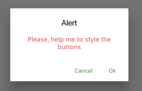
I want to style some how the buttons, for example one on start other on end. I searched in docs but only found how to make them "Stacked full-width buttons". Any ideas how to style the buttons?

MeLean
  • 3,092
  • 6
  • 29
  • 43

7 Answers7

47

Update 2022/10/22

Flutter 2.5 introduced the actionsAlignment property:

AlertDialog(
  title: ..
  actions: ..
  actionsAlignment: MainAxisAlignment.end
),

Customize widget

Edit the the widget itself: Under the AlertDialog there is a ButtonBar widget where you can use alignment: MainAxisAlignment.spaceBetween to align the buttons correctly. See this answer for an example of a custom AlertDialog widget.

Own button row

You could also remove the buttons under actions and add an own custom Row with RaisedButtons in it, somehow like this:

Row (
    mainAxisAlignment: MainAxisAlignment.spaceBetween,
    children: <Widget>[
        RaisedButton(), // button 1
        RaisedButton(), // button 2
    ]
)

In your case you could add a Column around the Row in content and in there add your existing Row and the modified one you created from the above example.

Bostrot
  • 5,767
  • 3
  • 37
  • 47
26

Move buttons to content is a good solution.

showDialog(
              context: context,
              barrierDismissible: false,
              builder: (BuildContext context) {
                return AlertDialog(
                  title: Center(child: Text('Alert')),
                  content: Column(
                    mainAxisSize: MainAxisSize.min,
                    children: <Widget>[
                      Container(
                        child: Text(
                          "message",
                          textAlign: TextAlign.center,
                          style: TextStyle(
                            color: Colors.red,
                          ),
                        ),
                      ),
                      Row(
                        mainAxisAlignment: MainAxisAlignment.spaceBetween,
                        children: <Widget>[
                          FlatButton(
                              child: Text('Yes'),
                              onPressed: () {
                                Navigator.of(context).pop();
                              }),
                          FlatButton(
                              child: Text('No'),
                              onPressed: () {
                                Navigator.of(context).pop();
                              })
                        ])
                    ],
                  ),
                );
              });
Jack Sun
  • 2,012
  • 1
  • 16
  • 20
10

Changing the theme is a good option.

MaterialApp(
  theme: ThemeData(
      buttonBarTheme: ButtonBarThemeData(
    alignment: MainAxisAlignment.center,
  )),
  ...
Erli
  • 448
  • 5
  • 10
8

Don't add button in actions of AlertDialog. As you can see.

_onSubmit(message) {
    if (message.isNotEmpty) {
      showDialog(
        context: context,
        barrierDismissible: false,
        builder: (BuildContext context) {
          return AlertDialog(
            title: Center(child: Text('Alert')),
            content: Row(
              mainAxisAlignment: MainAxisAlignment.center,
              crossAxisAlignment: CrossAxisAlignment.center,
              children : <Widget>[
                Expanded(
                  child: Text(
                    message,
                    textAlign: TextAlign.center,
                    style: TextStyle(
                      color: Colors.red,

                    ),
                  ),
                ),

         FlatButton(
                  child: Text('Cancel'),
                  onPressed: () {
                    Navigator.of(context).pop();
                  }),
              FlatButton(
                  child: Text('Ok'),
                  onPressed: () {
                    _inputTextController.clear();
                    Navigator.of(context).pop();
                  })
              ],
            ),
          );
        },
      );
    }
  }
Bostrot
  • 5,767
  • 3
  • 37
  • 47
Sunil
  • 3,211
  • 3
  • 21
  • 21
7

I use this method to align buttons in actions of AlertDialog.

How this works::

The SizedBox takes the full width of the alertdialog using its context(In the statement MediaQuery.of(context).size.width. After that, a row is used which places space between its children in the main axis(mainAxisAlignment => the x-axis for a row).

AlertDialog style:

AlertDialog(
        title: Row(
            mainAxisAlignment: MainAxisAlignment.spaceBetween,
            children: [
              Text('Title'),
              CloseButton(
                  color: Color(0xFFD5D3D3),
                  onPressed: () {
                    Navigator.of(context).pop();
                  })
            ]),
        content: SingleChildScrollView(child: Text("Boby")),
        actions: [
          SizedBox(
              width: MediaQuery.of(context).size.width,
              child: Row(
                  mainAxisAlignment: MainAxisAlignment.center,
                  children: [
                    ButtonTheme(
                        minWidth: 25.0,
                        height: 25.0,
                        child: OutlineButton(
                            borderSide: BorderSide(color: Colors.blueAccent),
                            child: new Text("Save"),
                            shape: RoundedRectangleBorder(
                                borderRadius: BorderRadius.circular(20)),
                            onPressed: () {})),
                    SizedBox(width: 8.0),
                    ButtonTheme(
                        minWidth: 25.0,
                        height: 25.0,
                        child: OutlineButton(
                            borderSide: BorderSide(color: Colors.black26),
                            textColor: Colors.blue,
                            child: new Text("Close"),
                            shape: RoundedRectangleBorder(
                                borderRadius: BorderRadius.circular(20)),
                            onPressed: () {}))
                  ]))
        ]);
Anteino
  • 1,044
  • 7
  • 28
sweetnandha cse
  • 705
  • 7
  • 16
  • 1
    Please don't post only code as answer, but also provide an explanation what your code does and how it solves the problem of the question. Answers with an explanation are usually more helpful and of better quality, and are more likely to attract upvotes. – Pouria Hemi Nov 05 '20 at 12:52
5

Here is the straightforward answer for your problem: Just use actionsAlignment property of AlertDialog class in flutter. Like so

AlertDialog(
  actions: ...,
  actionsAlignment: MainAxisAlignment.spaceBetween
)
2

Or you can use RFlutter Alert library for that. It is easily customizable and easy-to-use. Its default style includes rounded corners and you can add buttons as much as you want.

Alert Style:

var alertStyle = AlertStyle(
    animationType: AnimationType.fromTop,
    isCloseButton: false,
    isOverlayTapDismiss: false,
    descStyle: TextStyle(fontWeight: FontWeight.bold),
    animationDuration: Duration(milliseconds: 400),
    alertBorder: RoundedRectangleBorder(
    borderRadius: BorderRadius.circular(0.0),
    side: BorderSide(
        color: Colors.grey,
    ),
    ),
    titleStyle: TextStyle(
    color: Colors.red,
    ),
);

And assing your AlertStyle object to Alert's style field.

Alert(
    context: context,
    style: alertStyle,
    type: AlertType.info,
    title: "RFLUTTER ALERT",
    desc: "Flutter is more awesome with RFlutter Alert.",
    buttons: [
    DialogButton(
        child: Text(
        "COOL",
        style: TextStyle(color: Colors.white, fontSize: 20),
        ),
        onPressed: () => Navigator.pop(context),
        color: Color.fromRGBO(0, 179, 134, 1.0),
        radius: BorderRadius.circular(0.0),
    ),
    ],
).show();

*I'm one of developer of RFlutter Alert.

ibrahimdevs
  • 163
  • 7