Is there any way of getting rounded corners on the outline of a div element, similar to border-radius?
Asked
Active
Viewed 5.6e+01k times
704
Armen Michaeli
- 8,625
- 8
- 58
- 95
Marc Guerin
- 7,192
- 3
- 16
- 12
-
3Well I have got a Div box with a 2px Gray Border with 20px border-radius, I was wandering if I can then have a 10px Outine around that Border that follows the Border rather than being square – Marc Guerin Mar 22 '11 at 16:12
-
5This is a good question. An element with `border: 5px red` and `outline: 5px blue` and `border-radius: 5px`, the border is rounded, but the outline is square. – Matthew Rudy Aug 20 '12 at 10:37
-
5So far we can only use it in Firefox: `-moz-outline-radius` – Wojciech Bednarski May 13 '13 at 14:37
-
It should be part of CSS3... If I think about it - I hate W3C :D – m93a May 27 '13 at 13:34
-
42you all need a `box-shadow` in your life.. – Muhammad Umer Dec 29 '14 at 06:35
-
3This is a huge misstep by the CSS gods. – Michael Fever Feb 28 '18 at 20:12
-
Muhammad Umer, thanks for the box-shadow suggestion! Peace be upon you – Ted Fitzpatrick Feb 11 '20 at 22:34
-
Why can't you use `border` instead `outline`? – Michael M Jul 08 '20 at 13:30
-
@StartupGuy The reason is because `border` affects box sizing, whereas `outline` does not. – Matthias Nov 11 '20 at 04:21
25 Answers
779
I had an input field with rounded border and wanted to change colour of focus outline. I couldn't tame the horrid square outline to the input control.
So instead, I used box-shadow. I actually preferred the smooth look of the shadow, but the shadow can be hardened to simulate a rounded outline:
input, input:focus {
    border: none;
    border-radius: 2pt;
    box-shadow: 0 0 0 1pt grey;
    outline-color: transparent; /* for high contrast modes */
    transition: .1s;
}
/* Smooth outline with box-shadow: */
.text1:focus {
    box-shadow: 0 0 3pt 2pt cornflowerblue;
}

/* Hard "outline" with box-shadow: */
.text2:focus {
    box-shadow: 0 0 0 2pt red;
}
<input class="text1">
<br>
<br>
<input type=text class="text2">
-
37IMO, this is the answer you're looking for. I've done this method but don't overlook turning your outline to 0. – John Morton Jul 23 '12 at 22:40
-
2This is exactly what I was looking for, and fits even better than an outline radius. – Zenexer Jun 08 '13 at 16:15
-
2The hard outline example does not work. It's just a rectangle without a corner radius. – Dec 15 '14 at 16:44
-
Perfect... :o I used to do `border: 2px on focus;`, it worked. I have to adjust padding to not to move the value inside the input. But now with this technique, it works great, instantly. Thank you. – Steffi Feb 10 '15 at 16:10
-
Although it doesn't use `outline`, this should be marked as the solution since there is no such solution for `outline`. – Michael Yaeger Aug 19 '16 at 21:34
-
7`outline: 0` breaks web accessibility; read http://www.outlinenone.com/ – ianstarz Aug 23 '16 at 14:58
-
2
-
So if you have already box-shadow styles on your component this wont work – Simon Franzen May 06 '18 at 00:26
-
@SimonFranzen maybe nest elements to use `box-shadow` twice. I suspect that you could use `.whatever:after { content: "", ... }` – Lea Hayes May 07 '18 at 13:59
-
I found adding `box-shadow: 0 0 0 1pt red; outline-width: 1px` gets a really nice clean finish – fidev Sep 10 '18 at 09:21
-
`opacity` affects `box-shadow` but doesn't affect `outline`, so this solution won't work in my situation – David Callanan Oct 04 '18 at 11:43
-
21@ianstarz, it breaks accessibility when you provide no alternative styling. `box-shadow` is the alternative styling (which, as presented here, is actually very similar in appearance as `outline`). – ACJ Jun 03 '19 at 14:32
-
5This is not a good substitute for `outline` since box-shadows are often hidden in high contrast mode. – Steven Petryk Jul 17 '19 at 19:17
-
thanks so much. It's strange we don't have a outline-radius attribute. – Joseph Kreifels II Jul 19 '19 at 13:50
-
-
5@user10398534 OP has a **problem** and needs a solution. `outline-radius` *doesn't exist*. This answer tries to offer the best available solution and has clearly helped a lot of people. You should strive to be so constructive. – snarf Sep 22 '20 at 17:41
-
4Box shadow is ignored on windows high contrast thus should not be relied as focus indicator for accessibility reasons. – daghan Nov 26 '20 at 12:36
-
Note that the positioning of `outline` is inside the content box, while the positioning of `box-shadow` is half inside and half outside the content box. If you are looking for a solution that is positioned in the same way as `outline`, look at the `::after` element solution below. – cdauth Mar 24 '22 at 09:40
-
1another pitfall here is that outline gets layer to top while box-shadow doesn't. therefore in some scenarios box shadow will get cut by properties affecting the containment (`overflow: hidden`, `contain: strict` etc'.) – Yinon Jun 28 '22 at 08:54
119
I usually accomplish this using the :after pseudo-element:
of course it depends on usage, this method allows control over individual borders, rather than using the hard shadow method.
you could also set -1px offsets and use a background linear gradient (no border) for a different effect once again.
body {
  margin: 20px;
}

a {
  background: #999;
  padding: 10px 20px;
  border-radius: 5px;
  text-decoration: none;
  color: #fff;
  position: relative;
  border: 2px solid #000;
}

a:after {
  content: '';
  display: block;
  position: absolute;
  top: 0;
  bottom: 0;
  left: 0;
  right: 0;
  border-radius: 5px;
  border: 2px solid #ccc;
}
<a href="#">Button</a>
-
6A modified and a little more spectacular version: http://jsfiddle.net/rh6j3cdm/ . – Dávid Horváth Sep 09 '15 at 17:07
-
3
-
thanks, this worked VERY well with react-sortable-tree's search query outlines! – Monarch Wadia Aug 03 '18 at 09:38
-
I like this solution because it's much more flexible than the `box-shadow` version. For example, if you want the "outline" to be spaced away from the element (i.e. simulating `outline-offset`) it becomes possible with this technique. – Kirk Woll Jan 04 '19 at 22:30
-
If you use this on a div you should leave the `content` property out because it removes all functionality inside – Radllaufer Mar 12 '21 at 10:35
-
-
It's useful to add `pointer-events: none` to the after element to allow interacting with the element. – cdauth Mar 23 '22 at 13:52
50
Similar to Lea Hayes above, but here's how I did it:
div {
  background: #999;
  height: 100px;
  width: 200px;
  border: #999 solid 1px;
  border-radius: 10px;
  margin: 15px;
  box-shadow: 0px 0px 0px 1px #fff inset;
}<div></div>No nesting of DIVs or jQuery necessary, Altho for brevity I have left out the -moz and -webkit variants of some of the CSS. You can see the result above
dota2pro
- 7,220
- 7
- 44
- 79
Heraldmonkey
- 2,111
- 2
- 19
- 29
-
7He's talking about the OUTLINE, not the border... "outline" radius – android.nick Mar 02 '12 at 12:40
-
6correct, but since outline-radius is not available, my method gives the appearance of a border as well as an outline. This is a visual effect, so unless Marc's design is specified-down-to-the-pixel, the the fact that it doesn't actually use the outline property makes no difference. And since it's a practical solution, I'd appreciate the vote back – Heraldmonkey Mar 04 '12 at 07:28
-
2This worked great. I didn't use `inset`, though, and got what I wanted. – Paul Schreiber Aug 29 '13 at 19:09
26
We may see our wishes soonish by setting outline-style: auto It's on WebKits radar: http://trac.webkit.org/changeset/198062/webkit
See ya in 2030.
Marc
- 2,659
- 3
- 34
- 41
-
Very cool, although this still leaves something to be desired, my use case is `outline-style: dashed` with a radius as well (like you can do with a border). Currently only firefox supports this through its `-moz-outline-radius` – xec Jan 13 '21 at 10:16
-
Use case is severely limited. You can't set the width or much else. – Mark Fisher Jul 19 '21 at 16:30
23
I wanted some nice focus accessibility for dropdown menus in a Bootstrap navbar, and was pretty happy with this:
     a.dropdown-toggle:focus {
         display: inline-block;
         box-shadow: 0 0 0 2px #88b8ff;
         border-radius: 2px;
     }
<a href="https://stackoverflow.com" class="dropdown-toggle">Visit Stackoverflow</a>
dota2pro
- 7,220
- 7
- 44
- 79
StackOverflowUser
- 945
- 12
- 10
14
You're looking for something like this, I think.
div {
    -webkit-border-radius: 10px;
    -moz-border-radius: 10px;
    border-radius: 10px;
    border: 1px solid black;
    background-color: #CCC;
    height: 100px;
    width: 160px;
}
Edit
There is a Firefox-only -moz-outline-radius properly, but that won't work on IE/Chrome/Safari/Opera/etc. So, it looks like the most cross-browser-compatible way* to get a curved line around a border is to use a wrapper div:
div.inner {
  -webkit-border-radius: 10px;
  -moz-border-radius: 10px;
  border-radius: 10px;
  border: 1px solid black;
  background-color: #CCC;
  height: 100px;
  width: 160px;
}

div.outer {
  display: inline-block;
  -webkit-border-radius: 10px;
  -moz-border-radius: 10px;
  border-radius: 10px;
  border: 1px solid red;
}
<div class="outer">
<div class="inner"></div>
</div>*aside from using images
-
36No , I know how to get the Border Radius I was wandering if you could get an Outline-Radius – Marc Guerin Mar 22 '11 at 16:08
-
Meaning what, exactly? A thicker outline, like this? http://jsfiddle.net/mattball/NXZFv/1/ – Matt Ball Mar 22 '11 at 16:09
-
13@Matt: a curved *outline* instead of a *border*, obviously. See http://www.w3.org/TR/CSS21/ui.html#dynamic-outlines – Joey Mar 22 '11 at 16:10
-
Well I have got a Div box with a 2px Gray Border with 20px border-radius, I was wandering if I can then have a 10px Outine around that Border that follows the Border rather than being square. – Marc Guerin Mar 22 '11 at 16:11
-
-
1Just one addition to your code matt, if you drop the border radius a few px on the inner box the corner then becomes much tighter, thanks for your help – Marc Guerin Mar 22 '11 at 16:36
-
12
Firefox 88+: border-radius
From April 2021 you will be able to use a simple CSS for Firefox:
.actual {
outline: solid red;
border-radius: 10px;
}
.expected {
border: solid red;
border-radius: 10px;
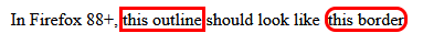
}In Firefox 88+,
<span class="actual">this outline</span>
should look like
<span class="expected">this border</span>Current behaviour in Firefox 86.0:
Webkit: no solution
Using outline-style: auto will tell the «user agent to render a custom outline style»: see [MDN](https://developer.mozilla.org/en-US/docs/Web/CSS/outline-style(.
Webkit-based browsers will then draw the outline over the border, when you use outline-style: auto. It's difficult to style it properly.
.actual {
  outline: auto red;
  border-radius: 10px;
}

.expected {
  border: solid red;
  border-radius: 10px;
}
In WebKit browsers (Chrome, Edge),
<span class="actual">this outline</span>
should look close to
<span class="expected">this border</span>Current behaviour in Chrome 89.0:

More information
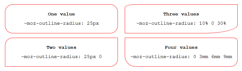
From Firefox 88 (to be released April 20 2021), outline will follow the shape of border-radius.
The current -moz-outline-radius will become redundant and will be removed.
See MDN's entry about -moz-outline-radius:
From Firefox 88 onwards, the standard outline property will follow the shape of border-radius, making -moz-outline-radius properties redundant. As such, this property will be removed.
ANeves
- 6,219
- 3
- 39
- 63
-
1I currently see the same rounded outlines for both Firefox and Chrome (version 104.0), so I suspect that Chrome solved it. – Deykun Sep 08 '22 at 08:49
8
I just found a great solution for this, and after looking at all the responses so far, I haven't seen it posted yet. So, here's what I did:
I created a CSS Rule for the class and used a pseudo-class of :focus for that rule. I set outline: none to get rid of that default light-blue non-border-radius-able 'outline' that Chrome uses by default. Then, in that same :focus pseudo-class, where that outline no longer exists, I added my radius and border properties. Leading to the following
outline: none;
border-radius: 5px;
border: 2px solid maroon;
to have a maroon-colored outline with a border radius that now appears when the element is tab-selected by the user.
Bram Vanroy
- 27,032
- 24
- 137
- 239
Branden Pinney
- 97
- 2
- 3
-
1Using "outline: 0", or "outline: none" is considered bad practice and messes up user accessibility. At this point, I do not have a fix, but here is an article about why you should not remove the outline if possible and what to do if you absolutely must. [Never remove CSS outlines](https://a11yproject.com/posts/never-remove-css-outlines) – AndrewBrntt May 28 '20 at 20:54
6
Chrome 94.0+
I tested it in chrome 94.0 and it seems that the outline property honors the border-radius now.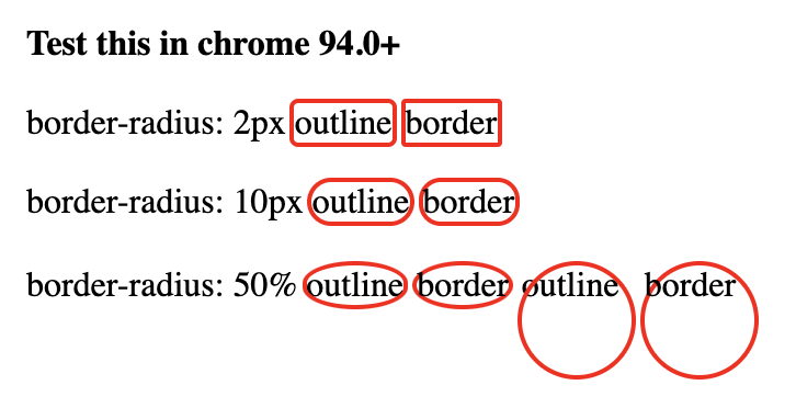
.outline {
  outline: 2px solid red;
}

.border {
  border: 2px solid red;
}

.outline-10 {
  border-radius: 10px;
}

.border-2 {
  border-radius: 2px;
}

.outline-2 {
  border-radius: 2px;
}

.border-10 {
  border-radius: 10px;
}

.outline-50 {
  border-radius: 50%;
}

.border-50 {
  border-radius: 50%;
}

.circle {
  display: inline-block;
  width:50px;
  height: 50px;
}
<strong>Test this in chrome 94.0+</strong>
<br/><br/>
border-radius: 2px
<span class="outline outline-2">outline</span>
<span class="border border-2">border</span>
<br/><br/>
border-radius: 10px
<span class="outline outline-10">outline</span>
<span class="border border-10">border</span>
<br/><br/>
border-radius: 50%
<span class="outline outline-50">outline</span>
<span class="border border-50">border</span>
<span class="outline circle outline-50">outline</span>
<span class="border circle border-50">border</span>
sergej
- 1,077
- 1
- 14
- 20
5
If you want to get an embossed look you could do something like the following:
.embossed {
  background: #e5e5e5;
  height: 100px;
  width: 200px;
  border: #FFFFFF solid 1px;
  outline: #d0d0d0 solid 1px;
  margin: 15px;
}

.border-radius {
  border-radius: 20px 20px 20px 20px;
  -webkit-border-radius: 20px;
  -moz-border-radius: 20px;
  -khtml-border-radius: 20px;
}

.outline-radius {
  -moz-outline-radius: 21px;
}
<div class="embossed"></div>
<div class="embossed border-radius"></div>
<div class="embossed border-radius outline-radius">-MOZ ONLY</div>I have not found a work around to have this work in other browsers.
EDIT: The only other way you can do this is to use box-shadow, but then this wont work if you already have a box shadow on that element.
Anders
- 8,307
- 9
- 56
- 88
James Kyle
- 4,138
- 4
- 28
- 41
-
1You can use multiple shadows on the same element, separating them by commas. – Bangash Apr 08 '14 at 19:49
4
As others have said, only firefox supports this. Here is a work around that does the same thing, and even works with dashed outlines.
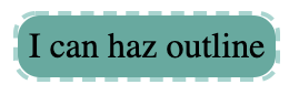
.has-outline {
    display: inline-block;
    background: #51ab9f;
    border-radius: 10px;
    padding: 5px;
    position: relative;
}
.has-outline:after {
  border-radius: 10px;
  padding: 5px;
  border: 2px dashed #9dd5cf;
  position: absolute;
  content: '';
  top: -2px;
  left: -2px;
  bottom: -2px;
  right: -2px;
}
<div class="has-outline">
I can haz outline
</div>
RobKohr
- 6,611
- 7
- 48
- 69
-
This is inexact. In your picture, I can see the small white gap between the outline rounded corner and the background rounded corner. – Nayuki Mar 12 '21 at 05:29
2
No. Borders sit on the outside of the element and on the inside of the box-model margin area. Outlines sit on the inside of the element and the box-model padding area ignores it. It isn't intended for aesthetics. It's just to show the designer the outlines of the elements. In the early stages of developing an html document for example, a developer might need to quickly discern if they have put all of the skeletal divs in the correct place. Later on they may need to check if various buttons and forms are the correct number of pixels apart from each other.
Borders are aesthetic in nature. Unlike outlines they are actually apart of the box-model, which means they do not overlap text set to margin: 0; and each side of the border can be styled individually.
If you're trying to apply a corner radius to outline I assume you are using it the way most people use border. So if you don't mind me asking, what property of outline makes it desirable over border?
Musixauce3000
- 549
- 1
- 3
- 11
-
15The purpose of outlines is for keyboard navigation/accessibility, not to show developers where elements are – danwellman May 10 '16 at 08:48
-
2Well that's what browsers use them for, by default. But I have always used them to see where my divs are, to great effect. – Musixauce3000 May 10 '16 at 16:16
-
1+1 for mentionning that "Borders sit on the outside of the element and on the inside of the box-model margin area. Outlines sit on the inside of the element and the box-model padding area ignores it." – Jacques Oct 07 '18 at 00:59
-
@danwellman Perhaps you don't, but many people do, especially with commercial designs where margins are defined by strict rules and standards. – user10398534 Sep 06 '20 at 12:01
-
2"what property of outline makes it desirable over border" Outline lets you use outline-offset, making it appear farther from the element as if it were scaled up. I was not able to achieve similar results easily with border or shadow. – user10398534 Sep 06 '20 at 12:02
1
There is the solution if you need only outline without border. It's not mine. I got if from Bootstrap css file. If you specify outline: 1px auto certain_color, you'll get thin outer line around div of certain color. In this case the specified width has no matter, even if you specify 10 px width, anyway it will be thin line. The key word in mentioned rule is "auto".
If you need outline with rounded corners and certain width, you may add css rule on border with needed width and same color. It makes outline thicker.
Aleks Sid
- 37
- 9
1
I was making custom radio buttons and the best customisable way i've found is using pseudo elements like this: Codepen
/*CSS is compiled from SCSS*/

.product-colors {
  margin-bottom: 1em;
  display: flex;
  align-items: center;
}
.product-colors label {
  position: relative;
  width: 2.1em;
  height: 2.1em;
  margin-right: 0.8em;
  cursor: pointer;
}
.product-colors label:before {
  opacity: 0;
  width: inherit;
  height: inherit;
  padding: 2px;
  border: 2px solid red;
  border-radius: 0.2em;
  content: "";
  position: absolute;
  z-index: 1;
  background: transparent;
  top: -4px;
  left: -4px;
}
.product-colors input {
  position: absolute;
  opacity: 0;
  width: 0;
  height: 0;
}
.product-colors input:checked + label:before, .product-colors input:focus + label:before {
  opacity: 1;
}
<div class="product-colors">
<input type="radio" name="cs" id="cs1" value="black">
<label for="cs1" style="background:black"></label>
<input type="radio" name="cs" id="cs2" value="green">
<label for="cs2" style="background:green"></label>
<input type="radio" name="cs" id="cs3" value="blue">
<label for="cs3" style="background:blue"></label>
<input type="radio" name="cs" id="cs4" value="yellow">
<label for="cs4" style="background:yellow"></label>
</div>
HMZ
- 2,949
- 1
- 19
- 30
0
clip-path: circle(100px at center);
This will actually make clickable only circle, while border-radius still makes a square, but looks as circle.
Martin Zvarík
- 2,120
- 22
- 27
0
The simple answer to the basic question is no. The only cross-browser option is to create a hack that accomplishes what you want. This approach does carry with it certain potential issues when it comes to styling pre-existing content, but it provides for more customization of the outline (offset, width, line style) than many of the other solutions.
On a basic level, consider the following static example (run the snippent for demo):
.outline {
    border: 2px dotted transparent;
    border-radius: 5px;
    display: inline-block;
    padding: 2px;
    margin: -4px;
}

/* :focus-within does not work in Edge or IE */
.outline:focus-within, .outline.edge {
    border-color: blue;
}

br {
    margin-bottom: 0.75rem;
}
<h3>Javascript-Free Demo</h3>
<div class="outline edge"><input type="text" placeholder="I always have an outline"/></div><br><div class="outline"><input type="text" placeholder="I have an outline when focused"/></div> *<i>Doesn't work in Edge or IE</i><br><input type="text" placeholder="I have never have an outline" />
<p>Note that the outline does not increase the spacing between the outlined input and other elements around it. The margin (-4px) compensates for the space that the outlines padding (-2px) and width (2px) take up, a total of 4px.</p>Now, on a more advanced level, it would be possible to use JavaScript to bootstrap elements of a given type or class so that they are wrapped inside a div that simulates an outline on page load. Furthermore, event bindings could be established to show or hide the outline on user interactions like this (run the snippet below or open in JSFiddle):
h3 {
  margin: 0;
}

div {
  box-sizing: border-box;
}

.flex {
  display: flex;
}

.clickable {
  cursor: pointer;
}

.box {
  background: red;
  border: 1px solid black;
  border-radius: 10px;
  height: 5rem;
  display: flex;
  align-items: center;
  text-align: center;
  color: white;
  font-weight: bold;
  padding: 0.5rem;
  margin: 1rem;
}
<h3>Javascript-Enabled Demo</h3>
<div class="flex">
<div class="box outline-me">I'm outlined because I contain<br>the "outline-me" class</div>
<div class="box clickable">Click me to toggle outline</div>
</div>
<hr>
<input type="text" placeholder="I'm outlined when focused" />
<script>
// Called on an element to wrap with an outline and passed a styleObject
// the styleObject can contain the following outline properties:
// style, width, color, offset, radius, bottomLeftRadius,
// bottomRightRadius, topLeftRadius, topRightRadius
// It then creates a new div with the properties specified and
// moves the calling element into the div
// The newly created wrapper div receives the class "simulated-outline"
Element.prototype.addOutline = function (styleObject, hideOutline = true) {
var element = this;
// create a div for simulating an outline
var outline = document.createElement('div');
// initialize css formatting
var css = 'display:inline-block;';
// transfer any element margin to the outline div
var margins = ['marginTop', 'marginBottom', 'marginLeft', 'marginRight'];
var marginPropertyNames = {
marginTop: 'margin-top',
marginBottom: 'margin-bottom',
marginLeft: 'margin-left',
marginRight: 'margin-right'
}
var outlineWidth = Number.parseInt(styleObject.width);
var outlineOffset = Number.parseInt(styleObject.offset);
for (var i = 0; i < margins.length; ++i) {
var computedMargin = Number.parseInt(getComputedStyle(element)[margins[i]]);
var margin = computedMargin - outlineWidth - outlineOffset;
css += marginPropertyNames[margins[i]] + ":" + margin + "px;";
}
element.style.cssText += 'margin:0px !important;';
// compute css border style for the outline div
var keys = Object.keys(styleObject);
for (var i = 0; i < keys.length; ++i) {
var key = keys[i];
var value = styleObject[key];
switch (key) {
case 'style':
var property = 'border-style';
break;
case 'width':
var property = 'border-width';
break;
case 'color':
var property = 'border-color';
break;
case 'offset':
var property = 'padding';
break;
case 'radius':
var property = 'border-radius';
break;
case 'bottomLeftRadius':
var property = 'border-bottom-left-radius';
break;
case 'bottomRightRadius':
var property = 'border-bottom-right-radius';
break;
case 'topLeftRadius':
var property = 'border-top-left-radius-style';
break;
case 'topRightRadius':
var property = 'border-top-right-radius';
break;
}
css += property + ":" + value + ';';
}
// apply the computed css to the outline div
outline.style.cssText = css;
// add a class in case we want to do something with elements
// receiving a simulated outline
outline.classList.add('simulated-outline');
// place the element inside the outline div
var parent = element.parentElement;
parent.insertBefore(outline, element);
outline.appendChild(element);
// determine whether outline should be hidden by default or not
if (hideOutline) element.hideOutline();
}
Element.prototype.showOutline = function () {
var element = this;
// get a reference to the outline element that wraps this element
var outline = element.getOutline();
// show the outline if one exists
if (outline) outline.classList.remove('hide-outline');
}
Element.prototype.hideOutline = function () {
var element = this;
// get a reference to the outline element that wraps this element
var outline = element.getOutline();
// hide the outline if one exists
if (outline) outline.classList.add('hide-outline');
}
// Determines if this element has an outline. If it does, it returns the outline
// element. If it doesn't have one, return null.
Element.prototype.getOutline = function() {
var element = this;
var parent = element.parentElement;
return (parent.classList.contains('simulated-outline')) ? parent : null;
}
// Determines the visiblity status of the outline, returning true if the outline is
// visible and false if it is not. If the element has no outline, null is returned.
Element.prototype.outlineStatus = function() {
var element = this;
var outline = element.getOutline();
if (outline === null) {
return null;
} else {
return !outline.classList.contains('hide-outline');
}
}
// this embeds a style element in the document head for handling outline visibility
var embeddedStyle = document.querySelector('#outline-styles');
if (!embeddedStyle) {
var style = document.createElement('style');
style.innerText = `
.simulated-outline.hide-outline {
border-color: transparent !important;
}
`;
document.head.append(style);
}
/*########################## example usage ##########################*/
// add outline to all elements with "outline-me" class
var outlineMeStyle = {
style: 'dashed',
width: '3px',
color: 'blue',
offset: '2px',
radius: '5px'
};
document.querySelectorAll('.outline-me').forEach((element)=>{
element.addOutline(outlineMeStyle, false);
});
// make clickable divs get outlines
var outlineStyle = {
style: 'double',
width: '4px',
offset: '3px',
color: 'red',
radius: '10px'
};
document.querySelectorAll('.clickable').forEach((element)=>{
element.addOutline(outlineStyle);
element.addEventListener('click', (evt)=>{
var element = evt.target;
(element.outlineStatus()) ? element.hideOutline() : element.showOutline();
});
});
// configure inputs to only have outline on focus
document.querySelectorAll('input').forEach((input)=>{
var outlineStyle = {
width: '2px',
offset: '2px',
color: 'black',
style: 'dotted',
radius: '10px'
}
input.addOutline(outlineStyle);
input.addEventListener('focus', (evt)=>{
var input = evt.target;
input.showOutline();
});
input.addEventListener('blur', (evt)=>{
var input = evt.target;
input.hideOutline();
});
});
</script>In closing, let me reiterate, that implementing this approach may require more styling than what I have included in my demos, especially if you have already styled the element you want outlined.
b_laoshi
- 443
- 6
- 12
0
outline-style: auto has had full browser support for ages now.
Shorthand is:
outline: auto blue;
This let's you set a custom color, but not a custom thickness, unfortunately (although I think the browser default thickness is a good default).
You can also set a custom outline-offset when using outline-style: auto.
outline: auto blue;
outline-offset: 0px;
Ollie Williams
- 1,996
- 3
- 25
- 41
0
you can use box-shadow instead of outline like this
    box-shadow: 0 0 1px #000000;
    border-radius: 50px;
    outline: none;
sinasho
- 180
- 2
- 6
0
Just set border-radius. Outline radius will follow.
.item
{
      outline: 2px solid blue;
      border-radius: 15%;
}
Shadman Fatin
- 27
- 3
-1
I just set outline transparent.
input[type=text] {
  outline: rgba(0, 0, 0, 0);
  border-radius: 10px;
}

input[type=text]:focus {
  border-color: #0079ff;
}
Mohammad Usman
- 37,952
- 20
- 92
- 95
-1
Try using padding and a background color for the border, then a border for the outline:
.round_outline {
  padding: 8px;
  background-color: white;
  border-radius: 50%;
  border: 1px solid black;
}
Worked in my case.
Eric
- 1
-1
I like this way.
.circle:before {
   content: "";
   width: 14px;
   height: 14px;
   border: 3px solid #fff;
   background-color: #ced4da;
   border-radius: 7px;
   display: inline-block;
   margin-bottom: -2px;
   margin-right: 7px;
   box-shadow: 0px 0px 0px 1px #ced4da;
}
It will create gray circle with wit border around it and again 1px around border!
Andris
- 3,895
- 2
- 24
- 27