85

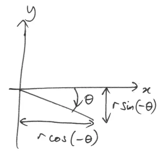
I regularly do all kinds of scatter plots in R using the plot command.

Sometimes both, sometimes only one of the plot axes is labelled in scientific notation. I do not understand when R makes the decision to switch to scientific notation. Surprisingly, it often prints numbers which no sane human would write in scientific notation when labelling a plot, for example it labels 5 as 5e+00. Let's say you have a log-axis going up to 1000, scientific notation is unjustified with such "small" numbers.

I would like to suppress that behaviour, I always want R to display integer values. Is this possible?

I tried options(scipen=10) but then it starts writing 5.0 instead of 5, while on the other axis 5 is still 5 etc. How can I have pure integer values in my R plots?

I am using R 2.12.1 on Windows 7.

Marek
  • 49,472
  • 15
  • 99
  • 121
  • There's more advice on formatting numbers in https://stackoverflow.com/questions/5812493/adding-leading-zeros-using-r/5816779 – Richie Cotton Oct 11 '18 at 18:46

7 Answers7

61

Use options(scipen=5) or some other high enough number. The scipen option determines how likely R is to switch to scientific notation, the higher the value the less likely it is to switch. Set the option before making your plot, if it still has scientific notation, set it to a higher number.

Greg Snow
  • 48,497
  • 6
  • 83
  • 110
  • 4
    If you had actually read my original question, you would have read that "I tried options(scipen=10) but then it starts writing 5.0 instead of 5". And that I want numbers written as 5 not 5.0, and so on. –  May 12 '11 at 03:13
  • @gojira But did you try other values of `scipen`? Did you try `scipen=5`? – Marek May 12 '11 at 10:54
  • You are right, I missed that you had already tried that. Others have pointed out that you can use the axis function to put exactly what you want where you want it with functions like format, sprintf, and pretty. – Greg Snow May 12 '11 at 16:00
19

You can use format or formatC to, ahem, format your axis labels.

For whole numbers, try

x <- 10 ^ (1:10)
format(x, scientific = FALSE)
formatC(x, digits = 0, format = "f")

If the numbers are convertable to actual integers (i.e., not too big), you can also use

formatC(x, format = "d")

How you get the labels onto your axis depends upon the plotting system that you are using.

Richie Cotton
  • 118,240
  • 47
  • 247
  • 360
  • 1
    This isn't particularly helpful because the OP had already stated they are using `plot()` – Peter Ellis Oct 07 '18 at 02:56
  • @PeterEllis How it's not helpful? If using `plot` tou got control over axis, see other answer in this thread: https://stackoverflow.com/a/5968136/168747 (line starts with `axis(`. – Marek Oct 09 '18 at 07:55
14

Try this. I purposely broke out various parts so you can move things around.

library(sfsmisc)

#Generate the data
x <- 1:100000
y <- 1:100000

#Setup the plot area
par(pty="m", plt=c(0.1, 1, 0.1, 1), omd=c(0.1,0.9,0.1,0.9))

#Plot a blank graph without completing the x or y axis
plot(x, y, type = "n", xaxt = "n", yaxt="n", xlab="", ylab="", log = "x", col="blue")
mtext(side=3, text="Test Plot", line=1.2, cex=1.5)

#Complete the x axis
eaxis(1, padj=-0.5, cex.axis=0.8)
mtext(side=1, text="x", line=2.5)

#Complete the y axis and add the grid
aty <- seq(par("yaxp")[1], par("yaxp")[2], (par("yaxp")[2] - par("yaxp")[1])/par("yaxp")[3])
axis(2, at=aty, labels=format(aty, scientific=FALSE), hadj=0.9, cex.axis=0.8, las=2)
mtext(side=2, text="y", line=4.5)
grid()

#Add the line last so it will be on top of the grid
lines(x, y, col="blue")

enter image description here

bill_080
  • 4,692
  • 1
  • 23
  • 30
13

You can use the axis() command for that, eg :

x <- 1:100000
y <- 1:100000
marks <- c(0,20000,40000,60000,80000,100000)
plot(x,y,log="x",yaxt="n",type="l")
axis(2,at=marks,labels=marks)

gives :

enter image description here

EDIT : if you want to have all of them in the same format, you can use the solution of @Richie to get them :

x <- 1:100000
y <- 1:100000
format(y,scientific=FALSE)
plot(x,y,log="x",yaxt="n",type="l")
axis(2,at=marks,labels=format(marks,scientific=FALSE))
Joris Meys
  • 106,551
  • 31
  • 221
  • 263
  • I just had the idea of using axis and strings instead of numbers to get "pure integers" (i.e. quote the numbers")? – Henrik May 11 '11 at 19:55
  • @Henrik : works as well, but the idea about using format is that you can give one vector for both position and labels. And you can reuse that one in different plots. I adjusted my code to show that. – Joris Meys May 12 '11 at 08:20
  • In rstudio, if you import a dataset and do train_sample_10k = format(train_sample_10k,scientific=FALSE) and reload, it will change the scientific notations. – mixdev Nov 23 '14 at 05:13
  • @mixdev Obviously. If you check `?format`, you see that it returns a character string with the notations. If you reload, you overwrite the character string with the original values. `format()` doesn't set some format attribute, it generates text. Hence the use as a value for the argument `labels` – Joris Meys Nov 25 '14 at 13:57
  • 1
    How have I never seen the `scientific = FALSE` part of this answer/the documentation before `format(x, scientific = FALSE, trim = TRUE, big.mark = ',')` is a life changer – MichaelChirico Jul 04 '18 at 09:23
4

You could try lattice:

require(lattice)
x <- 1:100000
y <- 1:100000
xyplot(y~x, scales=list(x = list(log = 10)), type="l")

enter image description here

Marek
  • 49,472
  • 15
  • 99
  • 121
2

The R graphics package has the function axTicks that returns the tick locations of the ticks that the axis and plot functions would set automatically. The other answers given to this question define the tick locations manually which might not be convenient in some situations.

myTicks = axTicks(1)
axis(1, at = myTicks, labels = formatC(myTicks, format = 'd'))

A minimal example would be

plot(10^(0:10), 0:10, log = 'x', xaxt = 'n')
myTicks = axTicks(1)
axis(1, at = myTicks, labels = formatC(myTicks, format = 'd'))

There is also an log parameter in the axTicks function but in this situation it does not need to be set to get the proper logarithmic axis tick location.

daniel.heydebreck
  • 768
  • 14
  • 22
-3

Normally setting axis limit @ max of your variable is enough

a <- c(0:1000000)
b <- c(0:1000000)

plot(a, b, ylim = c(0, max(b)))
Goibniu
  • 2,212
  • 3
  • 34
  • 38