75

I am trying to make a simple page with the following characteristics:

  1. Its body must be at least 60em wide.
  2. Its left and right margins must be equally wide and at most 3em wide.
  3. When the browser window is resized, the document's margins should be resized so that the browser window's horizontal scrollbar covers the least wide possible range.

Transforming these requirements into a linear programming problem, we get:

DEFINITIONS:
BRWS = (width of the browser window, not a variable)
BODY = (width of the document's body)
LRMG = (width of the document's left and right margins)
HSCR = (range of the browser window's horizontal scroll bar)

OBJECTIVE:
MIN HSCR   /* Third requirement */

CONSTRAINTS:
HSCR = BODY + 2*LRMG - BRWS  /* From the definition of how a browser's
                              * horizontal scrollbar works. */
BODY >= 60  /* First requirement */
LRMG <= 3   /* Second requirement */
LRMG >= 0   /* Physical constraint, margins cannot be negative */
HSCR >= 0   /* Physical constraint, scroll bars cannot have negative ranges */

Solving this linear program, we get:

BODY = (BRWS <= 66) ? 60 : (BRWS - 6)
HSCR = (BRWS >= 60) ?  0 : (60 - BRWS)
LRMG = (BRWS + HSCR - BODY) / 2

(Sorry for the boring math, but I am not confident that the original explanation in English was clear enough.)


Now back to the actual page. After googling to find what I could do with CSS, I managed to implement the first two requirements using the following code:

body {
  min-width: 60em; /* First requirement */
}

/* The document's body has only two children, both of which are divs. */
body > div {
  margin: 0 3em;    /* Second requirement, but in a way that makes */
  max-width: 100%;  /* it impossible to satisfy the third one. */
}

If CSS had a max-margin property, satisfying all requirements would be easy:

body > div {
  max-margin: 0 3em;
  max-width: 100%;
}

But, of course, max-margin does not exist. How could I fake it?

ThinkingStiff
  • 64,767
  • 30
  • 146
  • 239
isekaijin
  • 19,076
  • 18
  • 85
  • 153
  • 1
    javascript out of the question? – Niklas Jun 08 '11 at 21:10
  • Hope not, because that's the only way he's going to get it done ;) – Chris Pratt Jun 08 '11 at 21:13
  • Are you trying to create a centred layout? i.e. a div that is fixed width wise, but stays in the centre even when the browser is resized? – Darknight Jun 08 '11 at 21:14
  • @Niklas: Yes. I know how to do this with JavaScript, but this is something JavaScript should not be required for. – isekaijin Jun 08 '11 at 21:14
  • @Darknight: I already have a centered layout. What I want is that _both_ the document's body and the document's margins be resized in an sensible way. – isekaijin Jun 08 '11 at 21:15
  • do you have a link to an demo/example of the page, because I'm still not clear on what exactly you are trying to achieve? – Darknight Jun 08 '11 at 21:16
  • 1
    If I am reding this corectly he is trying to create a centered layout where the content's width is variable, but a minimum of 60em. aditionally the content should have a margin of 3em that is to shrink if the browser window is not wide enough. – skajfes Jun 08 '11 at 21:18
  • @skajfes: Exactly! Why couldn't I say it that way? – isekaijin Jun 08 '11 at 21:27
  • probably because you didn't have enough to drink :) – skajfes Jun 08 '11 at 21:30
  • 1
    Can you use css3 media queries? – chrisjlee Jun 08 '11 at 21:32
  • @skajfes: Also probably because I am too mathematically-inclined for my own good. – isekaijin Jun 08 '11 at 21:33
  • @Chris J. Lee: What are CSS3 media queries? :-o – isekaijin Jun 08 '11 at 21:38
  • 1
    ok that makes a lot more sense now. So when the user expands the browser, are you saying in effect the central div will expand (but keep 3em margins either side)? And as the browser is reduced (width wise), the central div should also shrink BUT not **less** then 60em. And it can even eat into the 3em margins in order to attempt to maintain the minimum 60em? – Darknight Jun 08 '11 at 21:40
  • @Eduardo: I understand you completly because I am also like that. I've also noticed that I can express myself more clearly to humans when I have a couple of beers in me (disclaimer: I am not advocating drinking, I am just stating an observation) – skajfes Jun 08 '11 at 21:44
  • Dammit, I wish I could downvote my own question, because this is totally stupid. – isekaijin Aug 12 '16 at 17:30

11 Answers11

67

Spacer divs on either side of the content divs. Those are your margins. Set their max width using the max-width property.

Matthew
  • 694
  • 6
  • 2
  • 5
    This looks ugly, but let's see. Yep, it works. Thanks. – isekaijin Jun 08 '11 at 21:37
  • 2
    Just read the comments. Sorry... @media query would give you the browser width and you could say if the browser width is less than the min width (if media queries don't work with ems - not sure - then 960 px is 60em in most browsers) then make the margin 0. – Matthew Jun 08 '11 at 21:41
  • 2
    Spacer divs are a technique from like five years ago. I hate them, but if you gotta you gotta. – Matthew Jun 08 '11 at 21:44
  • 17
    You could use the :before and :after pseudo classes to generate ghost spacer divs that don't actually appear in your markup. – Katie Kilian Jul 17 '13 at 21:05
  • floating spacer divs work, but won't it stop you from clearing floats inside your page? Since the cleared content will also clear the floating spacer divs and appear below the bottom of your page. – macguru2000 Jul 19 '13 at 15:20
  • ^^ This is nice.. :-) – TryingToImprove May 30 '14 at 08:49
  • 1
    What's a spacer div? Could we see a code example here? Thanks. – 2540625 Jun 12 '15 at 18:16
  • While this seems like a work-around, it's really the best solution given that max-margin should be feature in CSS3 – Ian Steffy Jul 01 '20 at 12:15
18

To mimic a variable-width left margin:

.div-class {
    display: inline-block;
}
.div-class:before {
    content: '';
    width: 10%;
    min-width: 100px;
    max-width: 200px;
    display: inline-block;
}
Jonathan Lin
  • 19,922
  • 7
  • 69
  • 65
14

For pure CSS that works in any scenario:

  1. use @media to create a break point.
  2. Set a max-width rule below a certain size using responsive width measurements such as an em or % and over that size use static widths such as px.

You'll just need to do the math to figure out the static sizes at the break point to make sure it scales fluidly.

Sample Code:

.my_class {
   margin: 0px 10%;
} 
@media screen and (min-width: 480px) {
   .my_class { 
      margin: 0px 10px;
   } 
}

This will make .my_class follow both:

  • The margin: 0px 10%; at over a screen width of 480px
  • The margin: 0px 10px; at under 480px.
Kmeixner
  • 1,664
  • 4
  • 22
  • 32
nosajimiki
  • 241
  • 1
  • 3
  • 7
  • This is not only better because it works, but because it actually works! With an extra `
    ` on the left (or right) you have to use `float: left` or equivalent and you cannot use a `width: 100%` for the inner `
    ` so you either have to add a JavaScript or use your solution which is just perfect!
    – Alexis Wilke Mar 24 '17 at 01:02
7

Matthew's answer is the correct one here, but to expand on what he's saying:

<div id="left"></div>
<div id="content">Content goes here</div>
<div id="right"></div>
<!-- probably need a cleanup div to fix floats here -->

CSS:

#left, #right {
    float: left;
    max-width: 3em;
}

#content {
    min-width: 60em;
}
Jordan
  • 31,971
  • 6
  • 56
  • 67
7

For anyone coming to this post in 2021. I would like to point you to the answer given in this post: Can we define min-margin and max-margin, max-padding and min-padding in css?.

TLDR: Use css math function min

3

None of the answers worked for me 100%.

Best way is to use CSS table and table-cell. Supported by all browsers (even IE 8). This handles wrapping way better than float or inline-block solutions, when the page is too narrow.

CSS

.wrapper {
    display: table;
    position: relative;
    width: 100%;
}

.wrapper:before {
    content: '';
    display: table-cell;
    min-width: 100px;
    width: 25%;
    max-width: 300px;
}

.wrapper > .content {
    display: table-cell;
    width: 100%;
}

HTML

<div class="wrapper>
    <div class="content>
        <!-- content here -->
    </div>
</div>
Onur Yıldırım
  • 32,327
  • 12
  • 84
  • 98
3

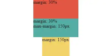
Easy as that

margin-left: min(30%, 150px);
margin-right: min(30%, 150px);

enter image description here

enter image description here

.margin-flat {
  margin-left: 150px;
  margin-right: 150px;
  background: #F6D55C;
}

.margin-max {
  margin-left: min(30%, 150px);
  margin-right: min(30%, 150px);
  background: #3CAEA3;
}

.margin-variable {
  margin-left: 30%;
  margin-right: 30%;
  background: #ED553B;
}

.inner {
  height: 100%;
}

.outer {
  display: flex;
  flex-direction: column;
  width: 100%;
  height: 100%;
}

html, body {
  height: 100%;
  padding: 0;
  margin: 0;
}
<div class="outer">
  <div class="inner margin-variable">margin: 30%</div>
  <div class="inner margin-max">margin: 30%<br/>max-margin: 150px</div>
  <div class="inner margin-flat">margin: 150px</div>
</div>
Qwerty
  • 29,062
  • 22
  • 108
  • 136
3
body {
    margin-left: auto;
    margin-right: auto;
    width: 60em;
}
Erikai
  • 31
  • 1
1

Spacer divs are bad practice. Setup another DIV on top of your DIV on your template with text-align:right (if you want to maximize the margin-left) or text-align:left if you want to maximize the margin-right, this will do the job.

PalDev
  • 566
  • 8
  • 12
1

I've seen some very appealing solutions alreaady, but here's a solution that require's relatively little code:

Place the contents of the body in a div inside it, and use display: flex; justify-content: space-around;

body {
    display: flex;
    justify-content: space-around;
}

div {
    margin: 3em;
    width: 100%;
    min-width: 60em;
    background-color: gray;
}
<body>
<div>
... contents of the page ...
</div>
</body>

The gray background is only to visualize the resulting body.

Yoran
  • 11
  • 2
0

See http://www.labite.com/

Re-size the window to observe the changes to the ui.

The website uses min-width max-width with width:100%

The black frame has max-width which is little wider then the container.

Emil
  • 8,449
  • 3
  • 27
  • 44