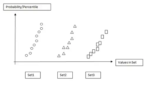
I'm not entirely clear on what you want, so I'm going to guess, here...
You want the "Probability/Percentile" values to be a cumulative histogram?
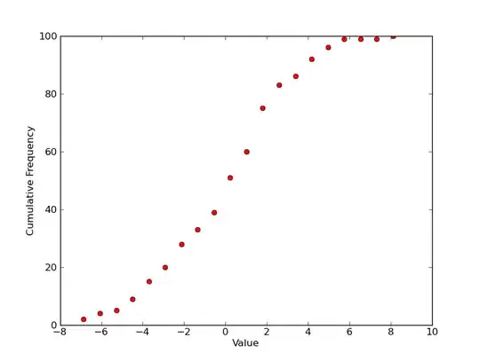
So for a single plot, you'd have something like this? (Plotting it with markers as you've shown above, instead of the more traditional step plot...)
import scipy.stats
import numpy as np
import matplotlib.pyplot as plt

# 100 values from a normal distribution with a std of 3 and a mean of 0.5
data = 3.0 * np.random.randn(100) + 0.5

counts, start, dx, _ = scipy.stats.cumfreq(data, numbins=20)
x = np.arange(counts.size) * dx + start

plt.plot(x, counts, 'ro')
plt.xlabel('Value')
plt.ylabel('Cumulative Frequency')

plt.show()
If that's roughly what you want for a single plot, there are multiple ways of making multiple plots on a figure. The easiest is just to use subplots.
Here, we'll generate some datasets and plot them on different subplots with different symbols...
import itertools
import scipy.stats
import numpy as np
import matplotlib.pyplot as plt
# Generate some data... (Using a list to hold it so that the datasets don't
# have to be the same length...)
numdatasets = 4
stds = np.random.randint(1, 10, size=numdatasets)
means = np.random.randint(-5, 5, size=numdatasets)
values = [std * np.random.randn(100) + mean for std, mean in zip(stds, means)]
# Set up several subplots
fig, axes = plt.subplots(nrows=1, ncols=numdatasets, figsize=(12,6))
# Set up some colors and markers to cycle through...
colors = itertools.cycle(['b', 'g', 'r', 'c', 'm', 'y', 'k'])
markers = itertools.cycle(['o', '^', 's', r'$\Phi$', 'h'])
# Now let's actually plot our data...
for ax, data, color, marker in zip(axes, values, colors, markers):
counts, start, dx, _ = scipy.stats.cumfreq(data, numbins=20)
x = np.arange(counts.size) * dx + start
ax.plot(x, counts, color=color, marker=marker,
markersize=10, linestyle='none')
# Next we'll set the various labels...
axes[0].set_ylabel('Cumulative Frequency')
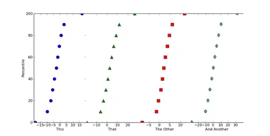
labels = ['This', 'That', 'The Other', 'And Another']
for ax, label in zip(axes, labels):
ax.set_xlabel(label)
plt.show()

If we want this to look like one continuous plot, we can just squeeze the subplots together and turn off some of the boundaries. Just add the following in before calling plt.show()
# Because we want this to look like a continuous plot, we need to hide the
# boundaries (a.k.a. "spines") and yticks on most of the subplots
for ax in axes[1:]:
    ax.spines['left'].set_color('none')
    ax.spines['right'].set_color('none')
    ax.yaxis.set_ticks([])
axes[0].spines['right'].set_color('none')

# To reduce clutter, let's leave off the first and last x-ticks.
for ax in axes:
    xticks = ax.get_xticks()
    ax.set_xticks(xticks[1:-1])

# Now, we'll "scrunch" all of the subplots together, so that they look like one
fig.subplots_adjust(wspace=0)
Hopefully that helps a bit, at any rate!
Edit: If you want percentile values, instead a cumulative histogram (I really shouldn't have used 100 as the sample size!), it's easy to do.
Just do something like this (using numpy.percentile instead of normalizing things by hand):
# Replacing the for loop from before...
plot_percentiles = range(0, 110, 10)
for ax, data, color, marker in zip(axes, values, colors, markers):
    x = np.percentile(data, plot_percentiles)
    ax.plot(x, plot_percentiles, color=color, marker=marker,
            markersize=10, linestyle='none')