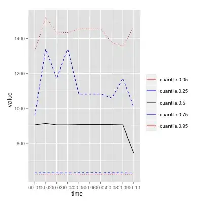
I need to plot a time series with ggplot2. For each point of the time series I also have some quantiles, say 0.05, 0.25, 0.75, 0.95, i.e. I have five data for each point. For example:
time           quantile=0.05  quantile=0.25 quantile=0.5  quantile=0.75   quantile=0.95
00:01          623.0725       630.4353      903.8870       959.1407       1327.721
00:02          623.0944       631.3707      911.9967      1337.4564       1518.539
00:03          623.0725       630.4353      903.8870      1170.8316       1431.893
00:04          623.0725       630.4353      903.8870      1336.3212       1431.893
00:05          623.0835       631.3557      905.4220      1079.6623       1452.260
00:06          623.0835       631.3557      905.4220      1079.6623       1452.260
00:07          623.0835       631.3557      905.4220      1079.6623       1452.260
00:08          623.0780       631.3483      905.3496      1056.3719       1375.610
00:09          623.0671       630.4275      903.8839      1170.8196       1356.963
00:10          623.0507       630.0261      741.8475      1006.1208       1462.271
Ideally, I would like to have the 0.5 quantile as a black line and the others as shaded color intervals surrounding the black line. What's the best way to do this? I've been looking around with no luck, I can't find examples of this, even less with ggplot2.
Any help would be appreciated.
Salud!