9

Frequently I have to visualize multiple datasets simultaneously, usually in ListPlot or its Log-companions. Since the number of datasets is usually larger than the number of easily distinguishable line styles and creating large plot legends is still somewhat unintuitiv I am still searching for a good way to annotate the different lines/sets in my plots. Tooltip is nice when working on screen, but they don't help if I need to pritn the plot.

Recently, I played around with the Mesh option to enumerate my datasets and found some weird stuff

GraphicsGrid[Partition[Table[ListPlot[
Transpose@
 Table[{Sin[x], Cos[x], Tan[x], Cot[x]}, {x, 0.01, 10, 0.1}], 
PlotMarkers -> {"1", "2", "3", "4"}, Mesh -> i, Joined -> True, 
PlotLabel -> "Mesh\[Rule]" <> ToString[i], ImageSize -> 180], {i, 
1, 30}], 4]]

The result looks like this on my machine (Windows 7 x64, Mathematica 8.0.1):

 Mesh = i, with i running from 1 to 30

Funnily, for Mesh->2, 8 , and 10 the result looks like I expected it, the rest does not. Either I don't understand the Mesh option, or it doesn't understand me.

Here are my questions:

  1. is Mesh in ListPLot bugged or do I use it wrongly?
  2. how could I x-shift the mesh points of successive sets to avoid overprinting?
  3. do you have any other suggestions how to annotate/enumerate multiple datasets in a plot?
Markus Roellig
  • 530
  • 3
  • 13
  • 3
    The problem of the interplay between `Mesh` and `PlotMarkers` came up in [this SO question](http://stackoverflow.com/questions/4789047/custom-intervals-of-markers-in-mathematica-plotmarkers/4790805#4790805). I reported it to WRI at the time and tech support forwarded it onto the development group to look at. Hopefully it will be fixed in the next release. – Simon Aug 08 '11 at 22:57
  • 1
    I am curious why some Mesh options work while many others don't. – Markus Roellig Aug 09 '11 at 07:54
  • 2
    As to your third question, you might want to look at the graph I used here: http://stackoverflow.com/questions/5745298/how-do-i-access-the-stackoverflow-api-from-mathematica/5745783#5745783. This involves manual annotations (which can be made to work semi-automatically). I feel the end result is visually much more pleasing than many other methods. – Sjoerd C. de Vries Aug 09 '11 at 08:42

3 Answers3

12

You could try something along these lines. Make each line into a button which, when clicked, identifies itself.

plot=Plot[{Sin[x],Cos[x]},{x,0,2*Pi}];
sinline=plot[[1,1,3,2]];
cosline=plot[[1,1,4,2]];
message="";
altplot=Append[plot,PlotLabel->Dynamic[message]];
altplot[[1,1,3,2]]=Button[sinline,message="Clicked on the Sin line"];
altplot[[1,1,4,2]]=Button[cosline,message="Clicked on the Cos line"];
altplot

If you add an EventHandler you can get the location where you clicked and add an Inset with the relevant positioned label to the plot. Wrap the plot in a Dynamic so it updates itself after each button click. It works fine.

In response to comments, here is a fuller version:

plot = Plot[{Sin[x], Cos[x]}, {x, 0, 2*Pi}];
sinline = plot[[1, 1, 3, 2]];
cosline = plot[[1, 1, 4, 2]];
AddLabel[label_] := (AppendTo[plot[[1]],
    Inset[Framed[label, Background -> White], pt]];
   (* Remove buttons for final plot *)
   plainplot = plot;
   plainplot[[1, 1, 3, 2]] = plainplot[[1, 1, 3, 2, 1]];
   plainplot[[1, 1, 4, 2]] = plainplot[[1, 1, 4, 2, 1]]);
plot[[1, 1, 3, 2]] = Button[sinline, AddLabel["Sin"]];
plot[[1, 1, 4, 2]] = Button[cosline, AddLabel["Cos"]];
Dynamic[EventHandler[plot,
  "MouseDown" :> (pt = MousePosition["Graphics"])]]

To add a label click on the line. The final annotated chart, set to 'plainplot', is printable and copyable, and contains no dynamic elements.

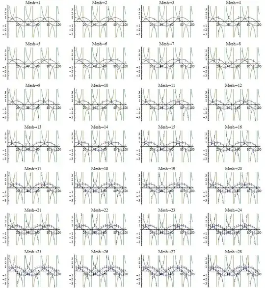
[Later in the day] Another version, this time generic, and based on the initial chart. (With parts of Mark McClure's solution used.) For different plots 'ff' and 'spec' can be edited as desired.

ff = {Sin, Cos, Tan, Cot};
spec = Range[0.1, 10, 0.1];
(* Plot functions separately to obtain line counts *)
plots = Array[ListLinePlot[ff[[#]] /@ spec] &, Length@ff];
plots = DeleteCases[plots, Line[_?(Length[#] < 3 &)], Infinity];
numlines = Array[Length@Cases[plots[[#]], Line[_], Infinity] &,
   Length@ff];
(* Plot functions together for annotation plot *)
plot = ListLinePlot[#@spec & /@ ff];
plot = DeleteCases[plot, Line[_?(Length[#] < 3 &)], Infinity];
lbl = Flatten@Array[ConstantArray[ToString@ff[[#]],
      numlines[[#]]] &, Length@ff];
(* Line positions to substitute with buttons *)
linepos = Position[plot, Line, Infinity];
Clear[line];
(* Copy all the lines to line[n] *)
Array[(line[#] = plot[[Sequence @@ Most@linepos[[#]]]]) &,
  Total@numlines];
(* Button function *)
AddLabel[label_] := (AppendTo[plot[[1]],
    Inset[Framed[label, Background -> White], pt]];
   (* Remove buttons for final plain plot *)
   plainplot = plot;
   bpos = Position[plainplot, Button, Infinity];
   Array[(plainplot[[Sequence @@ Most@bpos[[#]]]] =
       plainplot[[Sequence @@ Append[Most@bpos[[#]], 1]]]) &,
    Length@bpos]);
(* Substitute all the lines with line buttons *)
Array[(plot[[Sequence @@ Most@linepos[[#]]]] = Button[line[#],
      AddLabel[lbl[[#]]]]) &, Total@numlines];
Dynamic[EventHandler[plot,
  "MouseDown" :> (pt = MousePosition["Graphics"])]]

Here's how it looks. After annotation the plain graphics object can be found set to the 'plainplot' variable.

Annotated Chart

Chris Degnen
  • 8,443
  • 2
  • 23
  • 40
  • 2
    Very interesting idea for presentation! It is a nice alternative for tooltips (especially if the line will be highlighted in some way, for example will be made bold - and we need not to click it, just put the mouse over it!). Thank you. +1 – Alexey Popkov Aug 09 '11 at 00:24
  • Very nice idea, however, it is similar to Tooltip, which tends to be useless if you need the plot printed. For presentation though, thast is a nice way. – Markus Roellig Aug 09 '11 at 07:52
  • 3
    @ Markus - I have added a fuller example which shows the labels stick after they are placed, so the annotated plot can be printed. – Chris Degnen Aug 09 '11 at 09:21
  • 1
    Just an illustration for my first comment here: [working example of such functionality for Graphics3D](http://groups.google.com/group/comp.soft-sys.math.mathematica/msg/9a53fae615288733). – Alexey Popkov Aug 11 '11 at 05:17
8

One approach is to generate the plots separately and then show them together. This yields code that is more like yours than the other post, since PlotMarkers seems to play the way we expect when dealing with one data set. We can get the same coloring using ColorData with PlotStyle. Here's the result:

ff = {Sin, Cos, Tan, Cot};
plots = Table[ListLinePlot[ff[[i]] /@ Range[0.1, 10, 0.1],
    PlotStyle -> {ColorData[1, i]},
    PlotMarkers -> i, Mesh -> 22], {i, 1, Length[ff]}];
(* Delete the spurious asymptote looking thingies. *)
plots = DeleteCases[plots, Line[ll_?(Length[#] < 4 &)], Infinity];
Show[plots, PlotRange -> {-4, 4}]

enter image description here

Sjoerd C. de Vries
  • 16,122
  • 3
  • 42
  • 94
Mark McClure
  • 4,862
  • 21
  • 34
  • +1, this is the method I use, as sometimes you need to track several additional dimensions using symbols and colors, and nothing works quite as well. – rcollyer Aug 09 '11 at 04:35
  • I was aware that splitting the example above into separate individual plots is a workaround - maybe that is the way to go. – Markus Roellig Aug 09 '11 at 07:58
4

Are you going to be plotting computable curves or actual data?

If it's computable curves, then it's common to use a plot legend (key). You can use different dashings and thicknesses to differentiate between the lines on a grayscale printer. There are many examples in the PlotLegends documentation.

If it's real data, then normally the data is sparse enough that you can use PlotMarkers for the actual data points (i.e. don't specify Mesh). You can use automatic PlotMarkers, or you can use custom PlotMarkers including BoxWhisker markers to indicate the various uncertainties.

Simon
  • 14,631
  • 4
  • 41
  • 101
  • 1
    This would indeed be the standard way of doing this. However, the PlotLegend package is seriously flawed (see http://stackoverflow.com/questions/3463437/plotting-legends-in-mathematica/3533152#3533152) and besides, I feel it has aesthetic issues. – Sjoerd C. de Vries Aug 09 '11 at 08:35
  • @Sjoerd: I hadn't noticed that question. The way that `PlotLegend` rescales the `Plot` is not good... – Simon Aug 09 '11 at 09:45