29

I need to visualize some data. It's basic 2D grid, where each cell have float value. I know how to e.g. assign color to value and paint grid in OpenCV. But the point here is that there are so many values so it's nearly impossible to do that. I am looking for some method, where I could use gradient. For example value -5.0 will be represented by blue, 0 - black, and +5.0 as red. Is there any way to do that in Python?

Here is sample data I am talking about

        A       B       C        D
A    -1.045    2.0     3.5    -4.890
B    -5.678    3.2     2.89    5.78
Seanny123
  • 8,776
  • 13
  • 68
  • 124
Mateusz Korycinski
  • 1,037
  • 3
  • 10
  • 24

2 Answers2

55

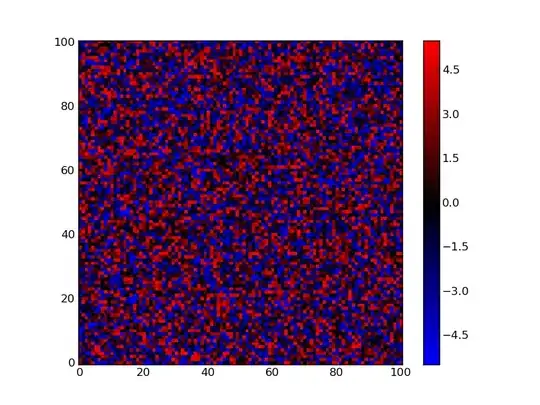
Matplotlib has the imshow method for plotting arrays:

import matplotlib as mpl
from matplotlib import pyplot
import numpy as np

# make values from -5 to 5, for this example
zvals = np.random.rand(100,100)*10-5

# make a color map of fixed colors
cmap = mpl.colors.ListedColormap(['blue','black','red'])
bounds=[-6,-2,2,6]
norm = mpl.colors.BoundaryNorm(bounds, cmap.N)

# tell imshow about color map so that only set colors are used
img = pyplot.imshow(zvals,interpolation='nearest',
                    cmap = cmap,norm=norm)

# make a color bar
pyplot.colorbar(img,cmap=cmap,
                norm=norm,boundaries=bounds,ticks=[-5,0,5])

pyplot.show()

This is what it looks like:

enter image description here

The details for the color bar setup were taken from a matplotlib example: colorbar_only.py. It explains that the number of boundaries need to be one larger then then number of colors.

EDIT

You should note, that imshow accepts the origin keyword, which sets the where the first point is assigned. The default is 'upper left', which is why in my posted plot the y axis has 0 in the upper left and 99 (not shown) in the lower left. The alternative is to set origin="lower", so that first point is plotted in the lower left corner.

EDIT 2

If you want a gradient and not a discrete color map, make a color map by linearly interpolating through a series of colors:

fig = pyplot.figure(2)

cmap2 = mpl.colors.LinearSegmentedColormap.from_list('my_colormap',
                                           ['blue','black','red'],
                                           256)

img2 = pyplot.imshow(zvals,interpolation='nearest',
                    cmap = cmap2,
                    origin='lower')

pyplot.colorbar(img2,cmap=cmap2)

fig.savefig("image2.png")

This produces: enter image description here

EDIT 3

To add a grid, as shown in this example, use the grid method. Setting the grid color to 'white' works well with the colors used by the colormap (ie the default black does not show up well).

pyplot.grid(True,color='white')

Including this before the savefig call produces this plot (made using 11x11 grid for clarity): enter image description here There are many options for grid, which are described in the matplotlib documentation. One you might be interested in is linewidth.

ImportanceOfBeingErnest
  • 321,279
  • 53
  • 665
  • 712
Yann
  • 33,811
  • 9
  • 79
  • 70
  • It's great! That's exactly what I meant. Thanks! But one more thing. Is there any chance to change coloring? I mean that I need sth like [here](http://matplotlib.sourceforge.net/plot_directive/mpl_examples/pylab_examples/contour_image.hires.png), since my data looks like this: (5.541036443901248E-5, 3.51784925442189E-4, -2.0). – Mateusz Korycinski Aug 29 '11 at 14:15
  • I mean that I need as colorbar gradient, which will be calculated automatically since I have many different values in range from -2.0 to 2.0. It seems that your solution colors -5 by blue, 0 by black, and 5 as red. I need to color values between them as well. After 'sth' I've put [link](http://matplotlib.sourceforge.net/plot_directive/mpl_examples/pylab_examples/contour_image.hires.png) to example. I don't need map like there, I just need similar coloring. EDIT: Bar like in answer below (one with 3D plot). – Mateusz Korycinski Aug 29 '11 at 14:30
  • Now it's workin perfectly. I just need to think about some cutoff because it turns out, that my data is not proper to show as gradient. I need to settle that every value below, or higher than let's say 0.2 will be represented as 1 so plot will be more readable. Thanks a lot! – Mateusz Korycinski Aug 29 '11 at 14:59
  • Maybe one more thing which come to my mind right now. Would it be possible to draw grid? I mean something like here: [link](http://matplotlib.sourceforge.net/examples/pylab_examples/axes_props.html) to better trace each cell? Thanks in advance! – Mateusz Korycinski Aug 29 '11 at 15:13
  • The example shows you how to set a grid, but I added this info. to the answer. Good luck. – Yann Aug 29 '11 at 15:26
9

How about using matplotlib?

from mpl_toolkits.mplot3d import Axes3D
from matplotlib import cm
from matplotlib.ticker import LinearLocator, FixedLocator, FormatStrFormatter
import matplotlib.pyplot as plt
import numpy as np

fig = plt.figure()
ax = Axes3D(fig)

Z = np.array([[-1.045, 2.0, 3.5, -4.890],
              [-5.678, 3.2, 2.89, 5.78]])

X = np.zeros_like(Z)
X[1,:] = 1
Y = np.zeros_like(Z)
Y[:,1] = 1
Y[:,2] = 2
Y[:,3] = 3

surf = ax.plot_surface(X, Y, Z, rstride=1, cstride=1, cmap=cm.jet,
        linewidth=0, antialiased=False)
ax.set_zlim3d(-10.0, 10.0)

ax.w_zaxis.set_major_locator(LinearLocator(10))
ax.w_zaxis.set_major_formatter(FormatStrFormatter('%.03f'))

m = cm.ScalarMappable(cmap=cm.jet)
m.set_array(Z)
fig.colorbar(m)

plt.show()

This shows:

enter image description here

jterrace
  • 64,866
  • 22
  • 157
  • 202
  • 1
    Wouldn't it be more right for that legend to show only three colors? – Rook Aug 29 '11 at 13:04
  • I messed up the range of the colorbar. Updated my answer, thanks – jterrace Aug 29 '11 at 13:18
  • It looks pretty nice. ;] But it's not exactly what I meant. I need to have sth like this: [link](http://www.pnas.org/content/102/29/10141/F4.small.gif). I meant that It will be 2d where color intensity will illustrate value. It doesn't have to show exact values. I just need to know which cells represent the highest values. – Mateusz Korycinski Aug 29 '11 at 13:25