11

I've been poking around with R graphical parameters trying to make my plots look a little more professional (e.g., las=1, bty="n" usually help). Started playing with tikzDevice, which was a huge improvement in my mind. It's amazing how much better things look when the font sizes and styles in the figure match those of the surrounding document.

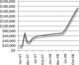
I would like to add several effects to my plots and am interested in methods of doing so in a reproducible fashion. I realize that these might be considered "chart junk," but I find that in my field adding them is helpful to have output be considered professional.

Specifically, I would like to produce any or all of the following effects:

  1. Gradient shading gradient shading
  2. Rounded corners rounded corners
  3. Shadow effects

shadows

Code, references to appropriate packages, or outlines of strategies for accomplishing these effects would be helpful. Thank you.

Iterator
  • 20,250
  • 12
  • 75
  • 111
lowndrul
  • 3,715
  • 7
  • 36
  • 54
  • 34
    Let me just briefly note that few (actually: probably none) of the R users I know consider Excel to be a standard to emulate.... – Dirk Eddelbuettel Nov 13 '11 at 04:50
  • 3
    https://github.com/hadley/ggplot2/wiki/Recommended-Reading lists many well-recognised references for what makes a good graphic. I doubt any of them considers shadow effects a good feature, or even nice-looking. Or professional for that matter (though I imagine that might depend on one's profession). Just something to consider. – baptiste Nov 13 '11 at 05:25
  • Both `pgfSweave` and `knitr` have options to support tikz graphics, but I believe it is really hard to emulate Excel graphics, as Dirk said... – Yihui Xie Nov 13 '11 at 05:49
  • 7
    As a side-note, rectangles with rounded corners are available in grid; adding a shadow (e.g. to text) is possible in both base and grid graphics; there have been examples of gradients using the recently introduced raster graphic functions. All these features are here, if one wants to use them on a specific example. – baptiste Nov 13 '11 at 06:02
  • 9
    Is there a way to make Jessica Alba look like Roseanne? – Matt Bannert Nov 13 '11 at 10:36
  • 3
    it's a good idea to try to make the most effective graphics to communicate your data. I propose that you'll be more effective by spending time learning to use your data tell a story than by trying to make software A look more like software B. – JD Long Nov 13 '11 at 14:05
  • 6
    Might be better broken into three separate questions: How to get (1) gradient shading, (2) rounded corners, and (3) shadow effects. – Ari B. Friedman Nov 13 '11 at 14:09
  • 9
    The snark here may be justified, but I'm not sure the downvotes are: http://meta.stackexchange.com/questions/54914/proper-reasons-to-downvote-a-question . The OP isn't asking for help lying with statistics, just for help making graphs that hard-core R users and Tufte-ites (like me) disapprove of. baptiste and @gsk3's comments are the relevant ones ... – Ben Bolker Nov 13 '11 at 14:43
  • 4
    Gave it a huge edit. I don't usually do so, but felt it really needed it and was still a worthwhile enough question to merit the attention. Tried to keep the tone of the original question intact and not put words into @brianjd's mouth. Let me know or just revert if my edit was out of line. – Ari B. Friedman Nov 13 '11 at 15:45
  • @BenBolker The original version of the question didn't have the more recent specifics. It's now clear which problems might be tackled. I also think it's good to have these as separate questions. – Iterator Nov 13 '11 at 16:21
  • 2
    @Iterator It did have the specifics, they were just buried. brianjd Countering snark with more snark is rarely helpful :-) – Ari B. Friedman Nov 13 '11 at 16:45
  • @gsk3. Yes, your edits do make it a better question. It's definitely clearer. Thank you. But I think we know the edits were made for reasons other than clarity. Without an apologetic tone, the pro-Tufte element on the site will not accept any questions/comments that show a preference for shiny visuals! :) – lowndrul Nov 13 '11 at 17:15
  • For those with constructive comments, thank you. As for the snark and down-voting, it's unjustified and ignorant. I wish chart junk weren't important---my analytical currency would be more valuable. But it is. E.g., [[1](http://eagereyes.org/criticism/chart-junk-considered-useful-after-all)] [[2, pg 159-160](http://www.amazon.com/Predictably-Irrational-Hidden-Forces-Decisions/dp/006135323X)]. Of course this point will be lost on the religious acolytes of Edward Tufte. – lowndrul Nov 13 '11 at 17:17
  • @brianjd I suggest you post a new question. This question is unlikely to get answered since it actually asks more than one question. – Andrie Nov 13 '11 at 17:25
  • 1
    @brianjd I also suggest you post a reproducible example as detailed here: http://stackoverflow.com/questions/5963269/how-to-make-a-great-r-reproducible-example – Ari B. Friedman Nov 13 '11 at 17:54
  • 1
    The questions raised by the OP are actually interesting challenges. While the Excel graphics are not journal friendly some audiences (particularly in presentations with folks who are used to less preofessional graphics being presented as professional)prefer the shading and chart chunk. So if we are to give the people what they want how would we approach the OP's questions with R. I think that is a fun challenge. MAny of you came to my aid to make a heart in R, which I'm pretty sure is not professional: ) because it was a fun challenge, so this could be an interesting set of challenges. – Tyler Rinker Nov 13 '11 at 17:57
  • @brianjd: Strictly out of curiosity, in which field you find yourself? – jthetzel Nov 14 '11 at 22:19
  • @jthetzel: The "I find that in my field adding them [chart junk] is helpful..." bit in my question above was actually an edit from gsk3. Based on experimental evidence cited above, replacing "my" with "any" would be more appropriate. Viva chart junk! – lowndrul Nov 15 '11 at 00:27
  • The paper you cite makes a good point, but (from the summary, not the article itself): "This study was not about reading and remembering exact numbers; the authors were only concerned with understanding the elements of the chart (what time span, what kind of data, etc.), the trend, and the message. This is a good assumption when dealing with communication-style charts as they are used in newspapers and on most websites, but not for data analysis." Also, I think we can all (?) agree that there is a heavy cultural element here -- my audiences would *not* appreciate the chartjunk ... – Ben Bolker Nov 15 '11 at 03:05
  • Your question is interesting, understandable but unfortunately a bit too broad (for a Q&A format). If you can narrow this down to just one effect, I'd be happy to re-open it. Questions should convey one problem, which (in theory) should be solved with one (best, as chosen by votes) solution. – Tim Post Nov 15 '11 at 09:34
  • 1
    Bit late to answer this, but by far the easiest way to beautify a lot of what R produces is to export it to svg, and then edit it with [inkscape](http://www.inkscape.org). – naught101 Apr 20 '12 at 01:05

4 Answers4

17

I couldn't help myself: used this picture and adapted this example from Paul Murrell. People who want do this sort of thing might find this link from the R wiki useful as well, although it's a little older and doesn't take advantage of the new(ish) raster capabilities. This post is an example of putting ggplot graphics in a rounded-corner frame of sorts.

edit: lots of help from Baptiste.

library(png)
library(grid)
imgfile <- "http://upload.wikimedia.org/wikipedia/commons/e/e1/Tie-dye.png"   
download.file(imgfile,dest="tiedye.png")
r <- readPNG("tiedye.png")
rmat <- matrix(rgb(r[,,1],r[,,2],r[,,3],alpha=0.4),
               nrow=dim(r)[1])

Function for shadowed points:

shadow.points <- function(x, y, size=unit(1, "char"), default.units="native", ...) {
 if(!is.unit(x)) {x <- unit(x, default.units) } 
 if(!is.unit(y)) { y <- unit(y, default.units) }
 grid::grid.points(x+0.2*size, y-0.2*size, size=size, gp=gpar(col="black"), pch=20) 
 grid::grid.points(x, y, size=size, default.units=default.units, ...)
} 

Set up mask based on grid.roundrect:

png("mask.png",width=ncol(r), height=nrow(r), res=1)
grid.roundrect(gp=gpar(fill="black"))
dev.off()
m <- readPNG("mask.png", native=FALSE)
mask <- matrix(rgb(m[,,1],m[,,2],m[,,3]),
               nrow=dim(m)[1])
rmat[mask == "#FFFFFF"] <- "#FFFFFF"

(Watch out, I think there is some variation in the support for per-pixel variation in transparency across platforms (e.g. this may not work on Windows??)) warning: there may be artifacts across other platforms, too -- the background didn't show up on a PNG, I had to export as PDF ...

grid.newpage()
pushViewport(plotViewport(),
             viewport(xscale=c(0, 10), yscale=c(0, 10)))

grid.raster(rmat,x=unit(0,"native"),y=unit(0,"native"),
            width=1,height=1,just=c(0,0))
grid.roundrect()  ## frame
grid.xaxis(at=seq(2,8,by=2))  ## axes -- shorter to avoid going beyond end of frame
grid.yaxis(at=seq(2,8,by=2))
shadow.points(x=rnorm(10,mean=5),y=rnorm(10,mean=5),pch=20,
            gp=gpar(col="cyan"))

tiedye

Ben Bolker
  • 211,554
  • 25
  • 370
  • 453
  • I posted one (inefficient) way to use roundrectGrob for the clipping. – baptiste Nov 13 '11 at 21:36
  • 3
    +1 That has to be the best thing I've seen since [Zombo.com](http://www.zombo.com). I just need to have R play: "Welcome to R. Anything is possible in R. The only limit is yourself." – Iterator Nov 13 '11 at 21:41
  • Now I just have to scrape the data from here http://firstmonday.org/htbin/cgiwrap/bin/ojs/index.php/fm/article/view/2273/2064 (!! looks like the histogram was drawn with R ??) – Ben Bolker Nov 13 '11 at 21:46
  • @BenBolker Given that the Y-axis falls short, it certainly looks like R or a cheap knock-off. – Iterator Nov 13 '11 at 22:39
  • 2
    +1 I wish they'd reopen the competition for the r-project.org website banner :) Failing that, how about posting it to the R graph gallery? – baptiste Nov 14 '11 at 05:06
  • 1
    Where's the +10 button when you need it? And +1 on @baptiste's suggestion to post it to the graph gallery. – Ari B. Friedman Nov 14 '11 at 12:14
  • 1
    done. http://addictedtor.free.fr/graphiques/RGraphGallery.php?graph=168 – Romain Francois Nov 16 '11 at 10:53
16

You can make shadow lines by drawing several lines at an offset from the line generating the shadow. Start with a wide line (lwd=30, say) drawn in a pale grey (gray(1)) and then draw thinner lines coloured down to gray(.5). There's one shadow.

package:grid has a function for rounded rectangles. Or you can draw them in base graphics using segment and line and a bit of ancient greek geometry.

Psychedelic backgrounds can be splatted onto a base graphics canvas using 'image'. Generate the image using the 'raster' package in whatever resolution you like.

You could also use a package called something like RGoogleVis to interface with Google's charting, or export to JSON, and use something like D3 to do enterprise interactive graphics:

http://mbostock.github.com/d3/ex/

Or just load the darn data into Excel already.

Spacedman
  • 92,590
  • 12
  • 140
  • 224
6

Adding a shadow to Ben Bolker's example,

grid.points <- function(x, y, size=unit(1, "char"), default.units="native", ...) {
 if(!is.unit(x)) {x <- unit(x, default.units) } 
 if(!is.unit(y)) { y <- unit(y, default.units) }
 grid::grid.points(x+0.2*size, y-0.2*size, size=size, gp=gpar(col="black"), pch=20) 
 grid::grid.points(x, y, size=size, default.units=default.units, ...)
} 
baptiste
  • 75,767
  • 19
  • 198
  • 294
5

Using rounded rectangles as a clip mask in @Ben Bolker's example,

png("mask.png",width=ncol(r), height=nrow(r), res=1); grid.roundrect(gp=gpar(fill="black")); dev.off()
m <- readPNG("mask.png", native=FALSE)

mask <- matrix(rgb(m[,,1],m[,,2],m[,,3]),
               nrow=dim(m)[1])

rmat[mask == "#FFFFFF"] <- "#FFFFFF"
grid.raster(rmat)
grid.roundrect()
baptiste
  • 75,767
  • 19
  • 198
  • 294