18

Early I posted a question about plotting county names on a map using ggplot and maps found HERE. My first approach was to take the means of all the lat and long coordinates per county as seen here: enter image description here

Thankfully Andrie had 2 suggestions to improve the centering using a center of ranges and then the coord_map() {which appears to keep the aspect ratio correct}. This imporved the centering a great deal as seen here: enter image description here

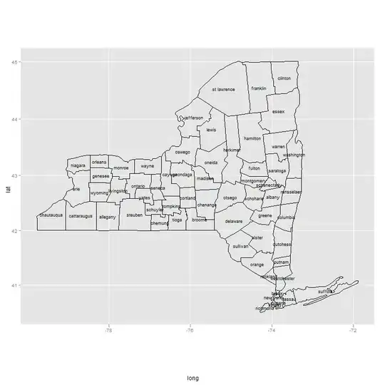
I think this looks better but still has some difficulties with overlap problems. I am hoping to further improve the centering (In that same thread Justin suggested a kmeans approach). I am ok with rotating text if necessary but am hoping for names that are centered and rotated if necessary (they extend beyond the county borders) to best display the county names on the map.

Any ideas?

library(ggplot2); library(maps)

county_df <- map_data('county')  #mappings of counties by state
ny <- subset(county_df, region=="new york")   #subset just for NYS
ny$county <- ny$subregion
p <- ggplot(ny, aes(long, lat, group=group)) +  geom_polygon(colour='black', fill=NA)

#my first approach to centering
cnames <- aggregate(cbind(long, lat) ~ subregion, data=ny, FUN=mean)
ggplot(ny, aes(long, lat)) +  
    geom_polygon(aes(group=group), colour='black', fill=NA) +
    geom_text(data=cnames, aes(long, lat, label = subregion), size=3)

#Andrie's much improved approach to centering
cnames <- aggregate(cbind(long, lat) ~ subregion, data=ny, 
                    FUN=function(x)mean(range(x)))
ggplot(ny, aes(long, lat)) +  
    geom_polygon(aes(group=group), colour='black', fill=NA) +
    geom_text(data=cnames, aes(long, lat, label = subregion), size=3) +
    coord_map()
Community
  • 1
  • 1
Tyler Rinker
  • 108,132
  • 65
  • 322
  • 519

5 Answers5

9

As I worked this out last night over at Talk Stats (link), it's actually pretty easy (as a product of the hours I spent into the early morning!) if you use the R spatial package (sp). I tested some of their other functions to create a SpatialPolygons object that you can use coordinates on to return a polygon centroid. I only did it for one county, but the label point of a Polygon (S4) object matched the centroid. Assuming this is true, then label points of Polygon objects are centroids. I use this little process to create a data frame of centroids and use them to plot on a map.

library(ggplot2)  # For map_data. It's just a wrapper; should just use maps.
library(sp)
library(maps)
getLabelPoint <- # Returns a county-named list of label points
function(county) {Polygon(county[c('long', 'lat')])@labpt}

df <- map_data('county', 'new york')                 # NY region county data
centroids <- by(df, df$subregion, getLabelPoint)     # Returns list
centroids <- do.call("rbind.data.frame", centroids)  # Convert to Data Frame
names(centroids) <- c('long', 'lat')                 # Appropriate Header

map('county', 'new york')
text(centroids$long, centroids$lat, rownames(centroids), offset=0, cex=0.4)

This will not work well for every polygon. Very often the process of labeling and annotation in GIS requires that you adjust labels and annotation for those peculiar cases that do not fit the automatic (systematic) approach you want to use. The code-look-recode approach we would take to this is not apt. Better to include a check that a label of a given size for the given plot will fit within the polygon; if not, remove it from the record of text labels and manually insert it later to fit the situation--e.g., add a leader line and annotate to the side of the polygon or turn the label sideways as was displayed elsewhere.

Bryan Goodrich
  • 741
  • 4
  • 7
  • This improves centering even more but as you pointed out some of the fine tuning is going to have to be twisting and turning, pulling and poking (well maybe not poking but...). I think this is the answer I was looking for. – Tyler Rinker Feb 26 '12 at 04:58
  • 1
    For more information on locating points (a locator function for ggplot) see [HERE](http://stackoverflow.com/questions/9450873/locator-equivalent-in-ggplot2-for-maps). This function from David Kahle allows you to generate a dataframe of clicked points for easy manipulation of county labels via the methods I describe above. – Tyler Rinker Feb 27 '12 at 19:13
2

This was a very helpful discussion. For the benefit of those who grew up with dplyr, here is a minor tweak, using pipes in place of aggregate:

library(maps); library(dplyr); library(ggplot2)
ny <- map_data('county', 'new york') 

cnames1 <- aggregate(cbind(long, lat) ~ subregion, data=ny, 
                     FUN=function(x)mean(range(x)))
cnames2 <- ny %>% group_by(subregion) %>%
    summarize_at(vars(long, lat), ~ mean(range(.)))

all.equal(cnames1, as.data.frame(cnames2))
Robert McDonald
  • 1,250
  • 1
  • 12
  • 20
1

I think that the easiest answer to this question is Andrie has already solved the majority of the hand work. The rest needs to be completed with some good ol' adjust and see methods. When you look at the plot after Andrie's suggestion the majority of everything is decent with the exception of some pesky placements that could be improved with a lat/long change or a rotation. I have an example for suffolk (bottom right) and herkimer (center) as suffolk's placement could be improved via a lat/long adjust and herkimer via a rotation.

Before:Before

cnames <- aggregate(cbind(long, lat) ~ subregion, data=ny, 
                    FUN=function(x)mean(range(x))) #Andrie's code

cnames[52, 2:3] <- c(-73, 40.855)  #adjust the long and lat of poorly centered names
cnames$angle <- rep(0, nrow(cnames)) #create an angle column
cnames[22, 4] <- -90    #adjust the angle of atypically shaped

ggplot(ny, aes(long, lat)) +  
    geom_polygon(aes(group=group), colour='black', fill=NA) +
    geom_text(data=cnames, aes(long, lat, label = subregion, colour=col, 
    angle=angle), size=3) + coord_map()

This gives us: enter image description here

Unless someone has a better way I will mark this answer as correct.

Community
  • 1
  • 1
Tyler Rinker
  • 108,132
  • 65
  • 322
  • 519
0

There is the PAL labeling library which seems to do exactly what you are looking for, automatically. This screenshot is taken from their website:

PAL website screenshot

I haven't found an R interface for it, though. The quick guide to perform your own integration of PAL within your favourite GIS application suggests that the integration itself should be doable. However, in the ggplot2 context this means that the label placement has to be performed during rendering -- I have no idea if this is possible or what to do to achieve this.

krlmlr
  • 25,056
  • 14
  • 120
  • 217
  • This looks promising. Thanks for sharing. If someone were to create and R package that interfaces in a sensible way you have a very useful package (though this is beyond my current skill level). – Tyler Rinker Feb 11 '13 at 15:08
0

You can take a look at the directlabels package, this provides automatic labels placement using a number of algorithms that avoid overlap. I'm not sure if it can be used to solve your problem, but you could take a look.

Paul Hiemstra
  • 59,984
  • 12
  • 142
  • 149
  • I played with the direct labels for this problem and didn't see a way to apply it. `directlabels` seems to work with a legend (as a replacement) – Tyler Rinker Feb 26 '12 at 02:52