139

I am testing Twitter Bootstrap and got stuck with basic scaffolding with rows. I revisited their documentation number of times and I can see nesting columns where you can basically nest columns within a column but I cannot locate the capability of combining rows into one and have it aligned with column next to the uncombined rows.

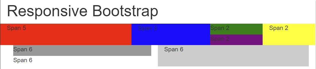
Below picture should illustrate what I want to accomplish.

rowspan layout sample

The only workaround solution I came across is using tables but I don't like this idea as my view is that the responsiveness wouldn't work with the use of tables.

Does anyone have any elegant solution to this? Most of the web layout I do will need fine level of flexibility so it will be great if I could pick up something useful here.

naXa stands with Ukraine
  • 35,493
  • 19
  • 190
  • 259
Seong Lee
  • 10,314
  • 25
  • 68
  • 106

6 Answers6

110

Divs stack vertically by default, so there is no need for special handling of "rows" within a column.

div {
  height:50px;
}
.short-div {
  height:25px;
}
<link href="https://maxcdn.bootstrapcdn.com/bootstrap/3.3.6/css/bootstrap.min.css" rel="stylesheet" />

<div class="container">
  <h1>Responsive Bootstrap</h1>
  <div class="row">
    <div class="col-lg-5 col-md-5 col-sm-5 col-xs-5" style="background-color:red;">Span 5</div>
    <div class="col-lg-3 col-md-3 col-sm-3 col-xs-3" style="background-color:blue">Span 3</div>
    <div class="col-lg-2 col-md-2 col-sm-3 col-xs-2" style="padding:0px">
      <div class="short-div" style="background-color:green">Span 2</div>
      <div class="short-div" style="background-color:purple">Span 2</div>
    </div>
    <div class="col-lg-2 col-md-2 col-sm-3 col-xs-2" style="background-color:yellow">Span 2</div>
  </div>
</div>
<div class="container-fluid">
  <div class="row-fluid">
    <div class="col-lg-6 col-md-6 col-sm-6 col-xs-6">
      <div class="short-div" style="background-color:#999">Span 6</div>
      <div class="short-div">Span 6</div>
    </div>
    <div class="col-lg-6 col-md-6 col-sm-6 col-xs-6" style="background-color:#ccc">Span 6</div>
  </div>
</div>

Output:

enter image description here

Here's the fiddle.

Ian Kemp
  • 28,293
  • 19
  • 112
  • 138
Paul Keister
  • 12,851
  • 5
  • 46
  • 75
  • 2
    Thanks very much. That's what I was looking for! I wish Bootstrap documentation mentioned this additionally under nesting columns as the approach is basically the same. – Seong Lee May 03 '13 at 05:43
  • 1
    in your example you define `1row=25px`, `2row=50px`. can you make the spanned div to be as high as the entire row ? tried adding `.row{height:100%;}` but it didn't go. – Tomer W Feb 08 '14 at 08:39
  • Yes, @carter the original example was not compliant with bootstrap 3; I've corrected it. – Paul Keister Jan 20 '15 at 00:43
  • 1
    The example has gutters on the second row which looks odd. – Connie DeCinko Sep 10 '15 at 17:22
99

You should use bootstrap column nesting.

See Bootstrap 3 or Bootstrap 4:

<div class="row">
    <div class="col-md-5">Span 5</div>
    <div class="col-md-3">Span 3<br />second line</div>
    <div class="col-md-2">
        <div class="row">
            <div class="col-md-12">Span 2</div>
        </div>
        <div class="row">
            <div class="col-md-12">Span 2</div>
        </div>
    </div>
    <div class="col-md-2">Span 2</div>
</div>
<div class="row">
    <div class="col-md-6">
        <div class="row">
            <div class="col-md-12">Span 6</div>
            <div class="col-md-12">Span 6</div>
        </div>
    </div>
    <div class="col-md-6">Span 6</div>
</div>

http://jsfiddle.net/DRanJ/125/

(In Fiddle screen, enlarge your test screen to see the result, because I'm using col-md-*, then responsive stacks columns)

Note: I am not sure that BS2 allows columns nesting, but in the answer of Paul Keister, the columns nesting is not used. You should use it and avoid to reinvente css while bootstrap do well.

The columns height are auto, if you add a second line (like I do in my example), column height adapt itself.

Ian Kemp
  • 28,293
  • 19
  • 112
  • 138
Alcalyn
  • 1,531
  • 14
  • 25
  • 11
    This should be the accepted answer because it works with Bootstrap out of the box and doesn't require any CSS tweaking – cheenbabes Feb 04 '15 at 16:25
  • The accepted answer is more readable; it contains a code snippet and a link to JSfiddle and IMHO Paul Keister's examples are more clear than Alcalyn's examples. That's why I think that Paul Keister's should be kept as the accepted answer, at least until the Alcalyn's answer is improved. – naXa stands with Ukraine Mar 28 '18 at 13:07
  • 1
    @Alcalyn in my browser (Chrome) the linked fiddle from your answer does not produce the expected result (see picture in the question). The actual result is all divs aligned in a column. – naXa stands with Ukraine Mar 28 '18 at 13:12
  • 1
    If you see a single column with all aligned spans, this is because the `-md-` responsive rule. You must enlarge your screen to see expected result. If you need your spans to display as columns on smaller screens, replace `-md-` by `-sm-` or `-xs-`. This is a breakpoint question (See http://bootstrapdocs.com/v3.0.3/docs/css/#grid). – Alcalyn Mar 29 '18 at 12:52
12

Note: This was for Bootstrap 2 (relevant when the question was asked).

You can accomplish this by using row-fluid to make a fluid (percentage) based row inside an existing block.

<div class="row">
   <div class="span5">span5</div>
   <div class="span3">span3</div>
   <div class="span2">
      <div class="row-fluid">
         <div class="span12">span2</div>
         <div class="span12">span2</div>
      </div>
   </div>
   <div class="span2">span2</div>
</div>
<div class="row">
   <div class="span6">
      <div class="row-fluid">
         <div class="span12">span6</div>
         <div class="span12">span6</div>
      </div>
   </div>
   <div class="span6">span6</div>
</div>

Here's a JSFiddle example.

I did notice that there was an odd left margin that appears (or does not appear) for the spans inside of the row-fluid after the first one. This can be fixed with a small CSS tweak (it's the same CSS that is applied to the first child, expanded to those past the first child):

.row-fluid [class*="span"] {
    margin-left: 0;
}
pickypg
  • 22,034
  • 5
  • 72
  • 84
  • Thanks for your effort but it looks like a row doesn't have to use row-fluid to accomplish this as suggested by my selected answer. I really appreciate it though! – Seong Lee May 03 '13 at 05:36
  • 1
    Very true, but don't forget `row-fluid` when it comes time to start sub-splitting the inner rows. – pickypg May 03 '13 at 05:46
7

Check this one. hope it will help full for you.

http://jsfiddle.net/j6amM/

.row-fix { margin-bottom:20px;}

.row-fix > [class*="span"]{ height:100px; background:#f1f1f1;}

.row-fix .two-col{ background:none;}

.two-col > [class*="col"]{ height:40px; background:#ccc;}

.two-col > .col1{margin-bottom:20px;}
Manish Sharma
  • 1,670
  • 14
  • 20
2

Paul's answer seems to defeat the purpose of bootstrap; that of being responsive to the viewport / screen size.

By nesting rows and columns you can achieve the same result, while retaining responsiveness.

Here is an up-to-date response to this problem;

<div class="container-fluid">
  <h1>  Responsive Nested Bootstrap </h1> 
  <div class="row">
    <div class="col-md-5" style="background-color:red;">Span 5</div>
    <div class="col-md-3" style="background-color:blue;">Span 3</div>
    <div class="col-md-2">
      <div class="row">
        <div class="container" style="background-color:green;">Span 2</div>
      </div>
      <div class="row">
        <div class="container" style="background-color:purple;">Span 2</div>
      </div>
    </div>
    <div class="col-md-2" style="background-color:yellow;">Span 2</div>
  </div>
  
  <div class="row">
    <div class="col-md-6">
      <div class="row">
        <div class="container" style="background-color:yellow;">Span 6</div>
      </div>
      <div class="row">
        <div class="container" style="background-color:green;">Span 6</div>
      </div>
    </div>
    <div class="col-md-6" style="background-color:red;">Span 6</div>
  </div>
</div>

You can view the codepen here.

vasavest
  • 21
  • 1
1

div {
  height:50px;
}
.short-div {
  height:25px;
}
<link href="https://maxcdn.bootstrapcdn.com/bootstrap/3.3.6/css/bootstrap.min.css" rel="stylesheet" />

<div class="container">
  <h1>Responsive Bootstrap</h1>
  <div class="row">
    <div class="col-lg-5 col-md-5 col-sm-5 col-xs-5" style="background-color:red;">Span 5</div>
    <div class="col-lg-3 col-md-3 col-sm-3 col-xs-3" style="background-color:blue">Span 3</div>
    <div class="col-lg-2 col-md-2 col-sm-3 col-xs-2" style="padding:0px">
      <div class="short-div" style="background-color:green">Span 2</div>
      <div class="short-div" style="background-color:purple">Span 2</div>
    </div>
    <div class="col-lg-2 col-md-2 col-sm-3 col-xs-2" style="background-color:yellow">Span 2</div>
  </div>
</div>
<div class="container-fluid">
  <div class="row-fluid">
    <div class="col-lg-6 col-md-6 col-sm-6 col-xs-6">
      <div class="short-div" style="background-color:#999">Span 6</div>
      <div class="short-div">Span 6</div>
    </div>
    <div class="col-lg-6 col-md-6 col-sm-6 col-xs-6" style="background-color:#ccc">Span 6</div>
  </div>
</div>