392

I want to use the Bootstrap 3 default navbar with an image logo instead of text branding. What's the proper way of doing this without causing any issues with different screen sizes? I assume this a common requirement, but I haven't yet seen a good code sample. A key requirement other than having acceptable display on all screen sizes is the menu collapsibility on smaller screens.

I tried just putting an IMG tag inside the A tag that has the navbar-brand class, but that caused the menu not to function properly on my android phone. I also tried increasing the height of the navbar class, but that screwed things up even more.

By the way, my logo image is larger than the height of the navbar.

KyleMit
  • 30,350
  • 66
  • 462
  • 664
stepanian
  • 11,373
  • 8
  • 43
  • 63
  • 2
  • 29
    With all the answers submitted to this question, why hasn't one of them been marked as the solution? – Chris22 Oct 23 '14 at 14:53
  • 1
    Two reasons, I think: 1. If someone restyles the site, the dimension is fixed in the HTML rather than in the CSS, so it creates a maintenance nightmare. 2. Shouldn't it be height="27px" anyway? It's the height, not the width, that's the constraint. – Canuck Dec 15 '15 at 22:24
  • Both the width and height-attribute assume their value to be in pixels, therefore you shouldn't add 'px' in gthe value. `width="27"` – jmmeijer Mar 30 '17 at 08:56
  • All things considered, this is the best answer and should be accepted http://stackoverflow.com/a/26333342/171456. It serves the need of the broader SO community who have visited this question since 2013. – Carol Skelly Apr 14 '17 at 19:36
  • @ZimSystem My main issue was that my logo image was larger than the height of the navbar. That answer assumes the image fits into the navbar, which makes things very simple. – stepanian Apr 15 '17 at 19:08
  • Why can't you apply a style to allow your image to overflow the navbar? Lots of sites do it. – Michael Oct 27 '17 at 22:01

29 Answers29

429

Why is everyone trying to do it the hard way? Sure, some of these approaches will work, but they're more complicated than is necessary.

OK, first - you need an image that will fit within your navbar. You can adjust your image via css height attribute (allowing width to scale) or you can just use an appropriately sized image. Whatever you decide to do - the way this looks will depend on how well you size your image.

For some reason, everyone wants to stick the image inside of an anchor with navbar-brand, and this isn't necessary. navbar-brand applies text styles that aren't necessary to an image, as well as the navbar-left class (just like pull-left, but for use in a navbar). All you really need is to add navbar-left.

<a href="#" class="navbar-left"><img src="/path/to/image.png"></a>

You can even follow this with a navbar-brand item, which will appear to the right of the image.

Michael
  • 9,223
  • 3
  • 25
  • 23
  • 1
    I like this answer better than the accepted. However, it does mean that you have to include one extra anchor tag. – Simon Bengtsson Mar 09 '15 at 22:18
  • 44
    I guess the reason why people put the image inside an anchor tag is beacause that's how the Boostrap doc does it: http://getbootstrap.com/components/#navbar-brand-image – cafonso Apr 08 '15 at 08:41
  • 11
    what if you want to use a larger image? – StevenP Apr 30 '15 at 10:46
  • 5
    @cafonso - I'm not saying it doesn't belong in an anchor - just that the anchor doesn't need the "navbar-brand" class. When that class is present - it really messes with the way images are displayed. – Michael Jun 15 '15 at 16:48
  • 4
    @cafonso makes a great point. I believe TWBS intended this to be used for an image or text. And considering how many people have had trouble with this should be an indication that it's time they fix this or clarify it in their docs. – Bryan Willis Oct 04 '15 at 06:43
  • 3
    @Michael, the official Bootstrap documentation examples show the anchor with the class `navbar-brand`. This is the source of confusion. – Justin Skiles Nov 17 '15 at 17:04
  • Feel free to do it your way. I posted the method I use and it's worked for a lot of people. – Michael Dec 11 '15 at 04:16
  • 3
    Thanks.. this is by far the simplest method. Here's a working example: http://bootply.com/R4QOp0DI8D – Carol Skelly Feb 06 '16 at 16:08
  • If you just add a `pull-left` class on the enclosing anchor, the margin goes way off on smaller screen sizes (the margin vanishes, pulling the image to the window border). Class `navbar-brand` takes care of this. You can of course adjust the left margin with media queries for smaller screen sizes. But that would be hardly an elegant solution. I'm downvoting. – zmippie Jun 04 '16 at 07:40
  • According to the Bootstrap docs, Helper classes for quick floats like `pull-left` or `pull-right` are not meant to be used in navbars : https://getbootstrap.com/css/#callout-helper-pull-navbar – EnKrypt Jun 14 '16 at 11:03
  • navbar-left and navbar-right are mixed from pull-left and pull-right. But, yes, you're right - Bootstrap docs show different so I'll update my answer. – Michael Jun 14 '16 at 16:14
  • @Michael: Good call, removing `.navbar-brand` instantly fixed my logo's positioning, which was half outside the navbar container with the code from the Brand image section of the Bootstrap docs. – SexxLuthor Jul 07 '16 at 23:29
  • "OK, first - you need an image that will fit within your navbar" - OK, first: the image which fits there is painfully slow. Magnifier glass is needed. So that's the problem. – Csaba Toth Oct 09 '16 at 22:57
  • 2
    using `pull-left` instead of `navbar-left` works much better for mobile view – Cesar Bielich Jan 01 '17 at 01:57
  • I used this as well as a class on the tag, using scss/bootstrap vars: `.navbar-brand-image { padding: $navbar-padding-vertical; height: ($line-height-computed + ($navbar-padding-vertical * 2));}` – KFunk Jun 30 '17 at 21:49
  • @ZimSystem thanks for that working example it really helped me piece this together. – eric Oct 03 '17 at 14:04
152
<div class="navbar-header">
    <button type="button" class="navbar-toggle" data-toggle="collapse" 
            data-target=".navbar-ex1-collapse">
        <span class="sr-only">Toggle navigation</span>
        <span class="icon-bar"></span>
        <span class="icon-bar"></span>
        <span class="icon-bar"></span>
    </button>
    <a class="navbar-brand" rel="home" href="#" title="Buy Sell Rent Everyting">
        <img style="max-width:100px; margin-top: -7px;"
             src="/img/transparent-white-logo.png">
    </a>
</div>
KyleMit
  • 30,350
  • 66
  • 462
  • 664
Vicky
  • 9,515
  • 16
  • 71
  • 88
  • 6
    what is the negative margin for? – Ayrad Jun 15 '14 at 17:39
  • 3
    The negative margin helped vertically center it for me. – Jesus is Lord Jul 06 '14 at 18:19
  • 3
    Following Edward's comment... or at least a working demo – Matías Cánepa Dec 18 '14 at 22:43
  • You shouldn't have to be messing with negative margins (unless the image was cropped funny). This way isn't a sound solution though because it completely depends on the logo size and will have to be adjusted on a case by case basis. [Here is a working demo of this method](http://codepen.io/candid/details/RWpYJM/). – Bryan Willis Oct 04 '15 at 06:06
  • 1
    A better option that will consistently work no matter the logo size/ration is to do what .img-responsive does except reverse it. Since .navbar-brand has float:left applied it becomes a block element and because it has a height of 50px we can set max-height of the image to to 100%; and it will NEVER overflow or cause the entire navbar to grow. It becomes constrained to fit the .navbar-brand height. If it looks too small in the default 50px navbar just adjust the .navbar-brand>img top and bottom padding. [Here is the complete answer](http://stackoverflow.com/a/30702646/3123861) with working demo – Bryan Willis Oct 04 '15 at 06:13
  • This answer was fantastic. It worked perfectly with my modern-bootstrap template. I ended up adding two `` tags, one containing my logo, then one containing my title to get these side-by-side in the header. – Stewart Nov 29 '16 at 20:49
  • `max-width` on a media query got me squared away. Thank you, Vicky! – Adrian Sep 10 '17 at 17:03
75

Bootstrap 3 navbar logo resizing

COMPLETE DEMO WITH MANY EXAMPLES

IMPORTANT UPDATE: 12/21/15

There is currently a bug in Mozilla I discovered that breaks the navbar on certain browser widths with MANY DEMOS ON THIS PAGE. Basically the mozilla bug is including the left and right padding on the navbar brand link as part of the image width. However, this can be fixed easily and I've tested this out and I fairly sure it's the most stable working example on this page. It will resize automatically and works on all browsers.

Just add this to your css and use navbar-brand the same way you would .img-responsive. Your logo will automatically fit

.navbar-brand {
  padding: 0px; /* firefox bug fix */
}
.navbar-brand>img {
  height: 100%;
  padding: 15px; /* firefox bug fix */
  width: auto;
}

Another option is to use a background image. Use an image of any size and then just set the desired width:

.navbar-brand {
  background: url(http://disputebills.com/site/uploads/2015/10/dispute.png) center / contain no-repeat;
  width: 200px;
}


ORIGINAL ANSWER BELOW (for reference only)

People seem to forget about object-fit a lot. Personally I think it's the easiest one to work with because the image automatically adjusts to the menu size. If you just use object fit on the image it will auto resize to the menus height.

    .navbar-brand > img {
      max-height: 100%;
      height: 100%;
      -o-object-fit: contain;
      object-fit: contain;
    }

It was pointed out that this does not work in IE "yet". There is a polyfill, but that might be excessive if you don't plan on using it for anything else. It does look like object-fit is being planned for a future release of IE so once that happens this will work in all browsers.

However, if you notice the .img-responsive class in bootstrap the max-width is assuming you are putting these images in columns or something that has an explicit with set. This would mean that 100% specifically means 100% width of the parent element.

    .img-responsive
        max-width: 100%;
        height: auto;
    }

The reason we can't use that with the navbar is because the parent (.navbar-brand) has a fixed height of 50px, but the width is not set.

If we take that logic and reverse it to be responsive based on the height we can have a responsive image that scales to the .navbar-brand height and by adding and auto set width it will adjust to proportion.

max-height: 100%;
width: auto;

Usually we would have to add display:block; to the scenario, but since navbar-brand already has float:left; applied to it, it automatically acts as a block element.


You may run into the rare situation where your logo is too small. The img-responsive approach does not take this into account, but we will. By also adding the "height" attribute to the .navbar-brand > img you can be assured that it will scale up as well as down.

max-height: 100%;
height: 100%;
width: auto;

So to complete this I put them both together and it seems to work perfectly in all browsers.

<style type="text/css">
.navbar-brand>img {
   max-height: 100%;
   height: 100%;
   width: auto;
   margin: 0 auto;


   /* probably not needed anymore, but doesn't hurt */
   -o-object-fit: contain;
   object-fit: contain; 

}
</style>

<nav class="navbar navbar-default">
      <div class="container">
        <div class="navbar-header">
          <button type="button" class="navbar-toggle collapsed" data-toggle="collapse" data-target="#navbar" aria-expanded="false" aria-controls="navbar">
            <span class="sr-only">Toggle navigation</span>
            <span class="icon-bar"></span>
            <span class="icon-bar"></span>
            <span class="icon-bar"></span>
          </button>
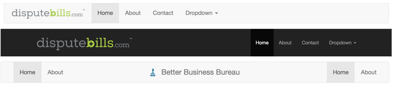
          <a class="navbar-brand" href="http://disputebills.com"><img src="http://disputebills.com/site/uploads/2015/10/dispute.png" alt="Dispute Bills"></a>
        </div>
        <div id="navbar" class="collapse navbar-collapse">
          <ul class="nav navbar-nav">
            <li class="active"><a href="#">Home</a></li>
            <li><a href="#about">About</a></li>
            <li><a href="#contact">Contact</a></li>
          </ul>
        </div>
      </div>
</nav>

DEMO http://codepen.io/bootstrapped/pen/KwYGwq

Bryan Willis
  • 3,552
  • 1
  • 25
  • 34
  • Thanks Jose. It doesn't work in IE which I never knew until now. I edited the answer from your comment. Also, I'm not really sure if height and max-height are both necessary. – Bryan Willis Oct 02 '15 at 18:58
  • Sure! Object-fit has been one of the outstanding additions from the webkit/blink engine. Hope other browser integrate them soon! Meanwhile we will be using background images to do the hard work! – Jose A Oct 02 '15 at 22:31
  • 1
    Hey Jose actually just figured something out. Check the new demo. It actually seems like my original answer was working in all other browsers not because of object fit but because of height and max-height. I think that's all that's really needed... Can you find a situation where the above won't work now? – Bryan Willis Oct 02 '15 at 22:35
  • I don't even think object fit is necessary since max height and height resize to the container height much like .img-responsive would do. – Bryan Willis Oct 02 '15 at 22:37
  • Jose do you think object fit is even doing anything? I'm thinking we can probably drop it in this case, but I'm not sure? – Bryan Willis Oct 04 '15 at 05:35
  • See my update on the top guys. There was a bug found in firefox so bootstrap brand does not work in some situations when applying padding unless you use the updated version. – Bryan Willis Dec 21 '15 at 22:42
  • Should be the answer, works perfectly and is well written! :) – Imdad Dec 12 '16 at 19:36
  • Awesome answer with well needed templates and code snippets. IMHO this should be the accepted answer – V.Vidyasagar May 12 '17 at 07:36
23

Although your question is interesting i don't expect there will be one answer for it. Maybe your question is too broad. Your solution should depend on: other content in the navbar (number of items), sizes of your logo, should your logo act responsive, etc. Adding the logo in the a (with navbar-brand) seems a good starting point. I should use the navbar-brand class because this will add a padding (top / bottom) of 15 pixels.

I test this setting on http://getbootstrap.com/examples/navbar/ with a logo of 300x150 pixels.

Full screen > 1200:

enter image description here

between 768 and 992 pixels (menu not collapsed):

enter image description here

<768 (menu collapsed)

enter image description here

Beside the aesthetic aspects i did not find any technical problem. On small screens a big logo will overlap or break out the viewport maybe. Screens between 768 and 992 pixels also have other problems when the content doesn't fit in a line, see for example: https://github.com/bassjobsen/jamedo-bootstrap-start-theme/issues/18

The default navbar has The default navbar example adds a bottom-margin of 30px so the content of your navbar should never overlap the content of your page. (fixed navbars will have problems when the height of the navbar varies).

You will need some css and media queries to adapt the navbar to your need on different screen sizes. Please try to narrow your question. b.e. describe the problem you found on android.

update see http://bootply.com/77512 for an example.

On smaller screens such as a phone, the collapsed menu appears above the logo

interchange the button and the logo in your code, logo first (set float:left on the logo)

There is no way to align the menu items to anything except top

set the margin-top for .navbar-collapse ul. Use logo height minus navbar height, to align to the bottom or (logo height - navbar height) / 2 to center

user728291
  • 4,138
  • 1
  • 23
  • 26
Bass Jobsen
  • 48,736
  • 16
  • 143
  • 224
  • 1
    I tried this option. The two problems with it are: 1) On smaller screens such as a phone, the collapsed menu appears above the logo (even if I add img-responsive class to the logo img tag) and 2) There is no way to align the menu items to anything except top. Any other adjustment would cause the collapsed menu not to function correctly. – stepanian Aug 27 '13 at 23:11
23

Instruction how to create a bootstrap navbar with a logo which is larger than the default height (50px):

Example with a logo 100px x 100px, standard CSS:

  1. Compute the height and (padding top + padding bottom) of the logo. Here 120px (100px height + padding top (10px) + padding bottom (10px))

  2. Goto bootstrap / customize. Set instead of navbar height 50px > 120px (50 + 70) and navbar-collapse-max-height from 340px to 410px (340 + 70). Download css.

  3. In this example I use this navbar. In navbar-brand:

      <div class="navbar-header">
        ...
        </button>
        <a class="navbar-brand myLogo" href="#">
          <img src="yourLogo.jpg" />
        </a>
      </div>...
    

    add a class, for example myLogo, and an img (your logo)

    <a class="navbar-brand myLogo" href="#"><img src="yourLogo.jpg" /></a>.

  4. Add CSS

    .myLogo { padding: 10px; }

  5. Adequate to other sizes.

Example

15

Well I finally got this same problem working, here is my solution and I tested it on my site in all three major browsers: Chrome, Firefox, and Internet Explorer.

First of all if you are not using a text based logo then remove "navbar-brand" completely as I found this particular class to be the main cause of my collapsed nav menu doubling up.

Shout out to user3137032 for leading me in the right direction.

You have to make a custom responsive image container, I called mine "logo"

Here is the bootstrap HTML mark up:

<div class="navbar navbar-inverse navbar-fixed-top" role="navigation">
  <div class="container">
    <div class="navbar-header">
      <button type="button" class="navbar-toggle collapsed" data-toggle="collapse" data-target=".navbar-collapse">
        <span class="icon-bar"></span>
        <span class="icon-bar"></span>
        <span class="icon-bar"></span>
      </button>
      <a href="@Url.Action(" Index ", "Home ")" class="logo"><img src="~/resources/images/Logo_Concept.png" /></a>
    </div>
    <div class="navbar-collapse collapse">
      <ul class="nav navbar-nav">
        <li>
          <a href="@Url.Action(" About ", "Home ")">
            <i class="glyphicon glyphicon-info-sign"></i> About
          </a>
        </li>
        <li>
          <a href="@Url.Action(" Contact ", "Home ")">
            <i class="glyphicon glyphicon-phone"></i> Contact
          </a>
        </li>
        <li>
          <a href="@Url.Action(" Index ", "Products ")">
            <i class="glyphicon glyphicon-tag"></i> Products
          </a>
        </li>
      </ul>
    </div>
  </div>
</div>

And the CSS code:

.logo img {
width: 100% \9; /*Force IE10 and below to size SVG images correctly*/
max-width: 100%;
}

@media (max-width:480px) { 
.logo img {
    width: 70% \9; /*Force IE10 and below to size SVG images correctly*/
    max-width: 70% !important;
}
}

@media (max-width:400px) { 
.logo img {
    width: 75% \9; /*Force IE10 and below to size SVG images correctly*/
    max-width: 75%;
}
}

@media (max-width:385px) { 
.logo img {
    width: 70% \9; /*Force IE10 and below to size SVG images correctly*/
    max-width: 70%;
}
}

@media (max-width:345px) { 
.logo img {
    width: 65% \9; /*Force IE10 and below to size SVG images correctly*/
    max-width: 65%;
}
}

@media (max-width:335px) { 
.logo img {
    width: 60% \9; /*Force IE10 and below to size SVG images correctly*/
    max-width: 60%;
}
}

@media (max-width:325px) { 
.logo img {
    width: 55% \9; /*Force IE10 and below to size SVG images correctly*/
    max-width: 55%;
}
}

@media (max-width:315px) { 
.logo img {
    width: 50% \9; /*Force IE10 and below to size SVG images correctly*/
    max-width: 50%;
}
}

The value in @media (max-width: x) may vary depending on your logo images width, mine is 368px. The percentages may need to be changed as well depending on your logo's size. The first @media query should be your threshold and mine was image width (368px) + collapsed button size (44px) + about 60px and it came out to 480px which is where I start the responsive image scaling.

Please be sure to remove my razor syntax from the HTML portions. Let me know if it fixes your problem, it fixed mine.

Edit: Sorry, I missed your navbar height issue. There are a couple ways to go about it, personally I compile the Bootstrap LESS with the appropriate navbar height, for my purposes I use 70px, and my image height is 68 px. The second way to do it is in the bootstrap.css file itself, search for ".navbar" and change min-height: to the height of your logo.

Igor Ivancha
  • 3,413
  • 4
  • 30
  • 39
Derek Williams
  • 159
  • 1
  • 4
15

My solution is add css "display: inline-block" to img tag.

<img style="display: inline-block; height: 30px; margin-top: -5px">

DEMO: jsfiddle

Kuofp
  • 384
  • 3
  • 7
13

I use the img-responsive class and then set a max-width on the a element. Like this:

<nav class="navbar">
    <div class="navbar-header">
        <a class="navbar-brand" href="#">
            <img class="img-responsive" src="mylogo.png">
        </a>
    </div>
</nav>

and the CSS:

.navbar-brand {
    max-width: 50%;
}
dustinfarris
  • 1,340
  • 12
  • 15
5

You must use code as this:

<div class="navbar-header">
    <button type="button" class="navbar-toggle" data-toggle="collapse" 
            data-target=".navbar-ex1-collapse">
        <span class="sr-only">Toggle navigation</span>
        <span class="icon-bar"></span>
        <span class="icon-bar"></span>
        <span class="icon-bar"></span>
    </button>
    <a class="logo" rel="home" href="#" title="Buy Sell Rent Everyting">
        <img style=""
             src="/img/transparent-white-logo.png">
    </a>
</div>

Class of A tag must be "logo" not navbar-brand.

NurlanXp
  • 156
  • 2
  • 14
4

It depends on how tall you want your logo to be.

The default <a> height in the navbar is 20px, so if you specify height: 20px on your logo, it will allign nicely.

However that's kind of small for a logo, so what I opted for was this:

<div class="navbar-header">
    <button type="button" class="navbar-toggle" data-toggle="collapse" 
            data-target=".navbar-ex1-collapse">
        <span class="sr-only">Toggle navigation</span>
        <span class="icon-bar"></span>
        <span class="icon-bar"></span>
        <span class="icon-bar"></span>
    </button>
    <a class="navbar-brand" rel="home" href="#" title="Brand">
        <img style="height: 30px; margin-top: -5px;"
             src="/img/brand.png">
    </a>
</div>

This makes the image 30px tall and vertically aligns the image by adding a negative margin to the top (5px is half of the difference between the padding on a and the size of the image).

Alternately you could change the padding on the <a> element, eg:

<div class="navbar-header">
    <button type="button" class="navbar-toggle" data-toggle="collapse" 
            data-target=".navbar-ex1-collapse">
        <span class="sr-only">Toggle navigation</span>
        <span class="icon-bar"></span>
        <span class="icon-bar"></span>
        <span class="icon-bar"></span>
    </button>
    <a class="navbar-brand" rel="home" href="#" title="Brand" style="padding-top: 10px; padding-bottom: 10px">
        <img style="height: 30px;"
             src="/img/transparent-white-logo.png">
    </a>
</div>
cwohlman
  • 763
  • 6
  • 21
4

Quick Fix : Create a class for your logo and set the height to 28px. This works well with the navbar on all devices. Notice I said works "WELL" .

.logo {
  display:block;
  height:28px;
}
Igor Ivancha
  • 3,413
  • 4
  • 30
  • 39
Brian Scramlin
  • 306
  • 2
  • 11
3

My approach is to include FOUR different images of different sizes for phones, tablet, desktop, large desktop but only show ONE using bootstrap's responsive utility classes, as follow:

<!--<a class="navbar-brand" href="<?php echo home_url(); ?>/"><?php bloginfo('name'); ?></a>-->

        <a class="navbar-brand visible-xs" href="<?php echo home_url(); ?>/"><img src="/assets/logo-phone.png" alt="<?php bloginfo('name'); ?> Logo" /></a>
        <a class="navbar-brand visible-sm" href="<?php echo home_url(); ?>/"><img src="/assets/logo-tablet.png" alt="<?php bloginfo('name'); ?> Logo" /></a>
        <a class="navbar-brand visible-md" href="<?php echo home_url(); ?>/"><img src="/assets/logo-desktop.png" alt="<?php bloginfo('name'); ?> Logo" /></a>
        <a class="navbar-brand visible-lg" href="<?php echo home_url(); ?>/"><img src="/assets/logo-large.png" alt="<?php bloginfo('name'); ?> Logo" /></a>

Note: You can replace the commented line with the code provided. Replace the php code if you're not using wordpress.

Edit Note2: Yes, this adds requests to your server when loading the page which might slow down a bit but if you use a background css sprite technique, chances are the logo doesn't get printed when printing a page and the code above should get better SEO.

vascorola
  • 51
  • 3
3

You shouldn't need to add additional CSS, since Bootstrap3 does provide it. Unless you do want to add it. This is my code on putting the logo to the left and links to the right. This navigation is responsive. Make changes to this as you see fit.

HTML:

<nav class="navbar navbar-expand-lg navbar-light fixed-top" style="background-color:white;">
        <div class="container">
        <a class="navbar-brand" href="#"><img style="   width: 150px;" src="image.jpg" alt="Image text"></a>
        <button class="navbar-toggler" type="button" data-toggle="collapse" data-target="#navbarResponsive" aria-controls="navbarResponsive" aria-expanded="false" aria-label="Toggle navigation">
        <span class="navbar-toggler-icon"></span>
        </button>
            <div class="collapse navbar-collapse" id="navbarResponsive">
                <ul class="navbar-nav ml-auto">
                    <li class="nav-item"><a class="nav-link" href="#">Home</a></li>
                    <li class="nav-item"><a class="nav-link" href="#">Projects</a></li>
                    <li class="nav-item"><a class="nav-link" href="#">Blog</a></li>
                    <li class="nav-item"><a class="nav-link" href="#">Contact</a></li>
                </ul>
            </div>
        </div>
    </nav>
Krista A.
  • 96
  • 2
  • 10
2

I had the same problem. I solved it like this:

<a href="#" class="btn btn-link navbar-btn">
  <img class="img-responsive" src="#">
</a>

There is no navbar-brand class. The result looks like logo picture that fits navbar and works like a link. Also I recommend to use navbar-right class for the menu items so they won't go below the logo.

<div class="collapse navbar-collapse navbar-right">
  <ul class="nav navbar-nav" role="navigation">
    <li><a href="#">Item1</a></li>
    <li><a href="#">Item2</a></li>
  </ul>
</div>
Igor Ivancha
  • 3,413
  • 4
  • 30
  • 39
margin
  • 31
  • 2
2

I also implement it via css background property. It works healty in any width value.

.navbar-brand{
    float:left;
    height:50px;
    padding:15px 15px;
    font-size:18px;
    line-height:20px;
    background-image: url("../images/logo.png");
    background-repeat: no-repeat;
    background-position: left center
}
mcanvar
  • 465
  • 6
  • 13
2

Another approach is to implement Bootstrap's built-in .text-hide class alongside of .navbar-brand to replace the brand text/content with a background image.

CSS:

.navbar-brand{ 
  background: url(http://example.com/your-logo-here.png) center / contain no-repeat;
  width: 200px;
}

HTML:

<a class="navbar-brand text-hide" href="#">Navbar Brand</a>

This is a very consistent method and keeps your image centered. To adjust the size of the image all you need to do is adjust .navbar-brand width since the height is already set.

Here's a live demo

Bryan Willis
  • 3,552
  • 1
  • 25
  • 34
2

Add the following to the .navbar-brand class

.navbar-brand
{
  padding: 0px; // this allows the image to occupy all the padding space of the navbar--brand
}

.navbar-brand > img
{
   height: 100%; // set height to occupy full height space on the navbar-brand
   width: auto; // width should be auto to allow img to scale accordingly
   max-height: 100%; // optional
   margin: 0 auto; // optional
}
user2314737
  • 27,088
  • 20
  • 102
  • 114
Jose Mhlanga
  • 805
  • 12
  • 14
1

Maybe this is too simple, but I just copied the navbar-brand line so there are two of them, the image and then the text.

<a class="navbar-brand" href="index.php"><img class="img-responsive" src="images/my-icon.png" width="30" height="25" alt=" "></a>
<a class="navbar-brand" href="index.php">My Brand</a>

And I created an image that fits inside the navbar (roughly 1/2 the height).

twiddly
  • 179
  • 3
  • 13
1

If using LESS, this works:

@navbar-height: 150px;
@navbar-brand-vpadding: 10px;

.navbar-brand img {
  height: @navbar-height - @navbar-brand-vpadding * 2;
  position: absolute;
  top: @navbar-brand-vpadding;
}
XåpplI'-I0llwlg'I -
  • 21,649
  • 28
  • 102
  • 151
1

This code works perfect if you need to see the brand centered and with auto width in toolbar. It contains the Wordpress function to get the image file from right path:

<a class="navbar-brand page-scroll" rel="home" 
    href="#page-top"  title="Title">
    <img style="height: 100%; width: auto;" 
          src="<?php echo get_template_directory_uri();?>/img/logo.png">

Taras Vovkovych
  • 4,062
  • 2
  • 16
  • 21
0
<header class="navbar navbar-inverse header-outer" role="banner">
  <div class="container form-inline">
    <img src="@Url.Content(" ~/Content/img/Logo-Sample.png ")" alt="Image" id="logo" class="img-responsive pull-left" />

    <div class="pull-right padding-top">
      <form class="hidden-xs" role="form">

        <div class="form-group" style="padding-left:10px">
          <input type="email" class="form-control" id="exampleInputEmail2" placeholder="Username">
        </div>

        <div class="form-group">
          <input type="password" class="form-control" id="exampleInputPassword2" placeholder="Password">
        </div>
        <div class="form-group navbar-remember">
          <label class="white-font">
            <input type="checkbox" class="white-font"> Remember me
          </label>
        </div>
        <button type="button" class="btn btn-primary form-group" title="Sign In">Sign In</button>
      </form>
    </div>
  </div>

</header>

Please understand the code at your own effort :D This is my draft code and its already working :) Here's the screenshot.

enter image description here

Igor Ivancha
  • 3,413
  • 4
  • 30
  • 39
LYKS
  • 69
  • 4
  • 13
0

my working code - bootstrap 3.0.3. when navbar-toggle, hidden-xs original logo image.

    <a class="navbar-brand hidden-xs" href="<?=$g4['path']?>/">
    <img src="<?=$g4[path]?>/images/logo_opencode.gif" align=absmiddle alt="brand logo">
    </a>

    <a class="navbar-brand navbar-toggle" href="<?=$g4['path']?>/" style="border:0;margin-bottom:0;">
    <img src="<?=$g4[path]?>/images/logo_opencode.gif" alt="brand logo" style="width:120px;">
    </a>
OpenCode
  • 315
  • 7
  • 19
0

You might try using @media query such as below.

Add a logo class first, then use @media to specify your logo height and width per device size. In the example below, I am targeting devices which have a max width of 320px (iPhone) You can play around with this until you find the best fit. Easy way to test: Use chrome or Firefox with inspect element. Shrink your browser as far as possible. Observe the logo size change based on the @media max width you specify. Test on iPhone, android devices, iPad etc to get the desired results.

.logo {
  height: 42px;
  width: 140px;
}

@media (max-width:320px) { 
.logo {
  height: 33px;
  width: 110px;
}
}
0

In stead of replacing text branding, I divided into two rows like in the code below and gave img-responsive class to the image......

<div class="collapse navbar-collapse navbar-ex1-collapse" style="background: #efefef; height:auto;">
  <div class="container" style="margin-bottom:-1px;">
    <div class="row">
      <div class="col-md-3">
        <div id="menubar-logo">
          <a href="index.html"><img src="img/tl_logo.png" class="img-responsive" alt="Triple Luck IT Service Logo"></a>
        </div>
      </div>
      <div class=" col-md-offset-3 col-md-6">

        <ul class="nav navbar-nav">
          <li><a href="index.php" class="active">Home</a></li>
          <li><a href="about_us.php">About Us</a></li>
          <li><a href="contact_us.php">Contact Us</a></li>
        </ul>
      </div>
    </div>
    <!-- end of "row" -->
  </div>
  <!-- end of "container" -->
</div>
<!-- end of "collapse" -->

and in addition,I added the following css codes.......

#menubar-logo img {
  margin-top: 10px;
  margin-bottom: 20px;
  margin-right: 10px;
}

If my code solves your problem, it's my pleasure.....

Igor Ivancha
  • 3,413
  • 4
  • 30
  • 39
I.Z
  • 1
  • 1
0

Please try following code:

<style>
   .navbar a.navbar-brand {padding: 9px 15px 8px; }
</style>
<a class="navbar-brand" href="#">
   <img src="http://placehold.it/140x34/000000/ffffff/&amp;text=LOGO" alt="">
</a>
0

Failing to make any of the other answers work in my case (I probably didn't pass the intelligence test) and after some experimentation, this is what I am using (which I believe is very close to the Bootstrap default):

   <div class="navbar navbar-default navbar-fixed-top" role="navigation">
      <div class="navbar-header">
         <button type="button" class="navbar-toggle" data-toggle="collapse" data-target="#navbar-collapse">
            <span class="sr-only">Toggle navigation</span>
            <span class="icon-bar"></span>
            <span class="icon-bar"></span>
            <span class="icon-bar"></span>
         </button>
         <div class="navbar-logo">
            <a class="navbar-brand" rel="home" href="@Url.Action("Index", "Home")" title="Home">
               <img src="~/Images/logo.png" class="img-responsive">
            </a>
         </div>
         <div class="collapse navbar-collapse" id="navbar-collapse">
            <ul class="nav navbar-nav">
               <li>@Html.ActionLink("Home", "Index", "Home")</li>
               <li>@Html.ActionLink("Coaching", "Coaching", "Home")</li>
               <li>@Html.ActionLink("Resources", "Resources", "Home")</li>
               <li>@Html.ActionLink("Contact", "Contact", "Home")</li>
               <li>@Html.ActionLink("Blog", "Blog", "Home")</li>
               <li>@Html.ActionLink("About", "About", "Home")</li>
            </ul>
         </div>
      </div>
   </div>

And in the CSS file I have added the following:

.navbar-brand {
   padding-top: 5px;
}

.navbar-collapse {
   float: left;
}

.navbar-logo {
   float: left;
}

Note that @Html.ActionLink() is Razor syntax for an <a> tag. Where it says @Html.ActionLink(...) just replace it with an appropriate <a> tag. Equally where it says @Url.Action(...) replace it with an appropriate URL (no <a> tag in that case).

Manfred
  • 5,320
  • 3
  • 35
  • 29
0

This isn't semantic but I just use the existing a element, set a background image, then create multiple variations for @2x resolution, smaller screen sizes, etc.

Then, you can use the .text-hide class to get some text on the page the ol' fashion way. Simple and effective though not proper use of an image.

Here's a link to the helper class for text-replacement:

http://getbootstrap.com/css/#helper-classes

Ken Prince
  • 1,437
  • 1
  • 20
  • 26
0

The easiest and best answer for this question is to set a max width and height depending on your logo, the image will be a max of 50px high but no longer than 200px.

<a href="index.html">
<img src="imgs/brand-w.png" style="max-height:50px;max-width:200px;">
</a>

This will vary depending on your logo size and the nav bar items you have.

ConnorMcF
  • 50
  • 2
  • 6
Theo Leinad
  • 115
  • 1
  • 7
0
 <div class="navbar navbar-default navbar-fixed-top" role="navigation">
        <div class="container">
            <div class="navbar-header" >
               <button type="button" class="navbar-toggle" data-toggle="collapse" data-target=".navbar-collapse">
                   <span class="sr-only">Toggle navigation</span>
                   <span class="icon-bar"></span>
                   <span class="icon-bar"></span>
                   <span class="icon-bar"></span>

                   </button>
                <a class="navbar-brand" href="Default.aspx"> <span> <img alt="Logo" src="Images/shopify-bag.png"height="35" width="40"/></span> Shopping GO</a>
            </div>
            <div class="navbar-collapse collapse">
                <ul class="nav navbar-nav navbar-right"></ul>

//Don't forgot to add bootstrap in head of your code.

Ch UmarJamil
  • 167
  • 1
  • 14