161

I am creating a simple form to upload file using electron-react-boilerplate with redux form & material ui.

The problem is that I do not know how to create input file field because material ui does not support upload file input.

Any ideas on how to achieve this?

vedran
  • 1,106
  • 2
  • 13
  • 18
gintoki27
  • 1,761
  • 2
  • 13
  • 11

24 Answers24

300

The API provides component for this purpose.

<Button
  variant="contained"
  component="label"
>
  Upload File
  <input
    type="file"
    hidden
  />
</Button>
elijahcarrel
  • 3,787
  • 4
  • 17
  • 21
129

newer MUI version:

<input
  accept="image/*"
  className={classes.input}
  style={{ display: 'none' }}
  id="raised-button-file"
  multiple
  type="file"
/>
<label htmlFor="raised-button-file">
  <Button variant="raised" component="span" className={classes.button}>
    Upload
  </Button>
</label> 
galki
  • 8,149
  • 7
  • 50
  • 62
  • 5
    Thanks, this is from example [here](https://material-ui-next.com/demos/buttons/), you also need to add style `input: {display: 'none'} ` for this element. – Alex Zamai May 15 '18 at 12:04
  • 7
    Or just `` – olefrank Oct 11 '18 at 12:27
  • 5
    Hello - Once a file is uploaded (ie when you highlight a file and click open on the popped-up form) an `onChange` event on the `` is called, but my file isn't available in the `target` property of the event object (or any property on the event object that I can see). Where is the file available? – jboxxx Mar 19 '19 at 00:28
  • 3
    @jboxxx: the file(s) will be on `target.files` (`input` elements have a built in `files` attribute that lists every selected file) – sfletche Nov 05 '19 at 18:50
  • 5
    In the newest version `variant="raised"` is deprecated, it expects one of ["text","outlined","contained"] – Renan Borges Jun 05 '20 at 15:12
  • with this example because we set the component to `span` we lose accessibility in keyboard navigation. – Bryan Lumbantobing Aug 24 '22 at 11:03
40

You need to wrap your input with component, and add containerElement property with value 'label' ...

<RaisedButton
   containerElement='label' // <-- Just add me!
   label='My Label'>
   <input type="file" />
</RaisedButton>

You can read more about it in this GitHub issue.

EDIT: Update 2019.

Check at the bottom answer from @galki

TLDR;

<input
  accept="image/*"
  className={classes.input}
  style={{ display: 'none' }}
  id="raised-button-file"
  multiple
  type="file"
/>
<label htmlFor="raised-button-file">
  <Button variant="raised" component="span" className={classes.button}>
    Upload
  </Button>
</label> 
vedran
  • 1,106
  • 2
  • 13
  • 18
34

Here's an example using an IconButton to capture input (photo/video capture) using v3.9.2:

import React, { Component, Fragment } from 'react';
import PropTypes from 'prop-types';

import { withStyles } from '@material-ui/core/styles';
import IconButton from '@material-ui/core/IconButton';
import PhotoCamera from '@material-ui/icons/PhotoCamera';
import Videocam from '@material-ui/icons/Videocam';

const styles = (theme) => ({
    input: {
        display: 'none'
    }
});

class MediaCapture extends Component {
    static propTypes = {
        classes: PropTypes.object.isRequired
    };

    state: {
        images: [],
        videos: []
    };

    handleCapture = ({ target }) => {
        const fileReader = new FileReader();
        const name = target.accept.includes('image') ? 'images' : 'videos';

        fileReader.readAsDataURL(target.files[0]);
        fileReader.onload = (e) => {
            this.setState((prevState) => ({
                [name]: [...prevState[name], e.target.result]
            }));
        };
    };

    render() {
        const { classes } = this.props;

        return (
            <Fragment>
                <input
                    accept="image/*"
                    className={classes.input}
                    id="icon-button-photo"
                    onChange={this.handleCapture}
                    type="file"
                />
                <label htmlFor="icon-button-photo">
                    <IconButton color="primary" component="span">
                        <PhotoCamera />
                    </IconButton>
                </label>

                <input
                    accept="video/*"
                    capture="camcorder"
                    className={classes.input}
                    id="icon-button-video"
                    onChange={this.handleCapture}
                    type="file"
                />
                <label htmlFor="icon-button-video">
                    <IconButton color="primary" component="span">
                        <Videocam />
                    </IconButton>
                </label>
            </Fragment>
        );
    }
}

export default withStyles(styles, { withTheme: true })(MediaCapture);
Markus Hay
  • 990
  • 1
  • 10
  • 13
15

It is work for me ("@material-ui/core": "^4.3.1"):

    <Fragment>
        <input
          color="primary"
          accept="image/*"
          type="file"
          onChange={onChange}
          id="icon-button-file"
          style={{ display: 'none', }}
        />
        <label htmlFor="icon-button-file">
          <Button
            variant="contained"
            component="span"
            className={classes.button}
            size="large"
            color="primary"
          >
            <ImageIcon className={classes.extendedIcon} />
          </Button>
        </label>
      </Fragment>
Alexei Zababurin
  • 927
  • 12
  • 15
14

If you're using React function components, and you don't like to work with labels or IDs, you can also use a reference.

const uploadInputRef = useRef(null);

return (
  <Fragment>
    <input
      ref={uploadInputRef}
      type="file"
      accept="image/*"
      style={{ display: "none" }}
      onChange={onChange}
    />
    <Button
      onClick={() => uploadInputRef.current && uploadInputRef.current.click()}
      variant="contained"
    >
      Upload
    </Button>
  </Fragment>
);
tomatentobi
  • 3,119
  • 3
  • 23
  • 29
13

Official recommendation

import * as React from 'react';
import { styled } from '@mui/material/styles';
import Button from '@mui/material/Button';
import IconButton from '@mui/material/IconButton';
import PhotoCamera from '@mui/icons-material/PhotoCamera';
import Stack from '@mui/material/Stack';

const Input = styled('input')({
  display: 'none',
});

export default function UploadButtons() {
  return (
    <Stack direction="row" alignItems="center" spacing={2}>
      <label htmlFor="contained-button-file">
        <Input accept="image/*" id="contained-button-file" multiple type="file" />
        <Button variant="contained" component="span">
          Upload
        </Button>
      </label>
      <label htmlFor="icon-button-file">
        <Input accept="image/*" id="icon-button-file" type="file" />
        <IconButton color="primary" aria-label="upload picture" component="span">
          <PhotoCamera />
        </IconButton>
      </label>
    </Stack>
  );
}
Kutalia
  • 519
  • 8
  • 10
  • This works when you click with the mouse, but it appears to disregard keyboard enter keyevent that would normally trigger a click :'(. It works if you also add the ref and click trigger - https://stackoverflow.com/a/63954486/228369 – chrismarx Aug 08 '23 at 19:59
11

Nov 2020

With Material-UI and React Hooks

import * as React from "react";
import {
  Button,
  IconButton,
  Tooltip,
  makeStyles,
  Theme,
} from "@material-ui/core";
import { PhotoCamera } from "@material-ui/icons";

const useStyles = makeStyles((theme: Theme) => ({
  root: {
    "& > *": {
      margin: theme.spacing(1),
    },
  },
  input: {
    display: "none",
  },
  faceImage: {
    color: theme.palette.primary.light,
  },
}));

interface FormProps {
  saveFace: any; //(fileName:Blob) => Promise<void>, // callback taking a string and then dispatching a store actions
}

export const FaceForm: React.FunctionComponent<FormProps> = ({ saveFace }) => {

  const classes = useStyles();
  const [selectedFile, setSelectedFile] = React.useState(null);

  const handleCapture = ({ target }: any) => {
    setSelectedFile(target.files[0]);
  };

  const handleSubmit = () => {
    saveFace(selectedFile);
  };

  return (
    <>
      <input
        accept="image/jpeg"
        className={classes.input}
        id="faceImage"
        type="file"
        onChange={handleCapture}
      />
      <Tooltip title="Select Image">
        <label htmlFor="faceImage">
          <IconButton
            className={classes.faceImage}
            color="primary"
            aria-label="upload picture"
            component="span"
          >
            <PhotoCamera fontSize="large" />
          </IconButton>
        </label>
      </Tooltip>
      <label>{selectedFile ? selectedFile.name : "Select Image"}</label>. . .
      <Button onClick={() => handleSubmit()} color="primary">
        Save
      </Button>
    </>
  );
};

DevLoverUmar
  • 11,809
  • 11
  • 68
  • 98
5

You can use Material UI's Input and InputLabel components. Here's an example if you were using them to input spreadsheet files.

import { Input, InputLabel } from "@material-ui/core";

const styles = {
  hidden: {
    display: "none",
  },
  importLabel: {
    color: "black",
  },
};

<InputLabel htmlFor="import-button" style={styles.importLabel}>
    <Input
        id="import-button"
        inputProps={{
          accept:
            ".csv, application/vnd.openxmlformats-officedocument.spreadsheetml.sheet, application/vnd.ms-excel",
        }}
        onChange={onInputChange}
        style={styles.hidden}
        type="file"
    />
    Import Spreadsheet
</InputLabel>
Jonri2
  • 51
  • 1
  • 2
4

Typescript version of @tomatentobi's javascript solution

const uploadInputRef = useRef<HTMLInputElement | null>(null);

return (
  <>
    <input
      ref={uploadInputRef}
      type="file"
      accept="image/*"
      style={{ display: "none" }}
      onChange={onChange}
    />
    <Button
      onClick={() => uploadInputRef.current && uploadInputRef.current.click()}
      variant="contained">
      Upload
    </Button>
  </>
);
jamesioppolo
  • 457
  • 1
  • 7
  • 15
3
 import AddPhotoIcon from "@mui/icons-material/AddAPhoto";
 import Fab from "@mui/material/Fab";

  <Fab color="primary" aria-label="add-image" sx={{ position: "fixed", bottom: 16, right: 16, overflow: "hidden" }}>
    <input
      type="file"
      onChange={imageHandler}
      accept=".jpg, .jpeg, .png"
      accept="image/*"
      multiple
      style={{ //make this hidden and display only the icon
        position: "absolute", 
        top: "-35px",
        left: 0,
        height: "calc(100% + 36px)",
        width: "calc(100% + 5px)",
        outline: "none",
      }}
    />

    <AddPhotoIcon />
  </Fab>
Chukwuemeka Maduekwe
  • 6,687
  • 5
  • 44
  • 67
2

Just the same as what should be but change the button component to be label like so

<form id='uploadForm'
      action='http://localhost:8000/upload'
      method='post'
      encType="multipart/form-data">
    <input type="file" id="sampleFile" style="display: none;" />
    <Button htmlFor="sampleFile" component="label" type={'submit'}>Upload</Button> 
</form>
Liam
  • 6,517
  • 7
  • 25
  • 47
2
<input type="file"
               id="fileUploadButton"
               style={{ display: 'none' }}
               onChange={onFileChange}
        />
        <label htmlFor={'fileUploadButton'}>
          <Button
            color="secondary"
            className={classes.btnUpload}
            variant="contained"
            component="span"
            startIcon={
              <SvgIcon fontSize="small">
                <UploadIcon />
              </SvgIcon>
            }
          >

            Upload
          </Button>
        </label>

Make sure Button has component="span", that helped me.

Richard Lee
  • 2,136
  • 2
  • 25
  • 33
2

Here an example:

return (
    <Box alignItems='center' display='flex' justifyContent='center' flexDirection='column'>
      <Box>
        <input accept="image/*" id="upload-company-logo" type='file' hidden />
        <label htmlFor="upload-company-logo">
          <Button component="span" >
            <Paper elevation={5}>
              <Avatar src={formik.values.logo} className={classes.avatar} variant='rounded' />
            </Paper>
          </Button>
        </label>
      </Box>
    </Box>
  )

ahmnouira
  • 1,607
  • 13
  • 8
2

This worked for me.

          <Button variant="contained" component="label" >
              UPLOAD
              <input accept="image/*" hidden type="file" />
          </Button>
Aflah PS
  • 21
  • 2
  • Your answer could be improved with additional supporting information. Please [edit] to add further details, such as citations or documentation, so that others can confirm that your answer is correct. You can find more information on how to write good answers [in the help center](/help/how-to-answer). – Community Jan 22 '23 at 16:28
  • This is a correct answer. – Mahmud hasan Aug 16 '23 at 10:43
0

You can pursue all the comments above, those are really great, However, I have another option for customizing your component, if you want to follow.

// Import

import { styled } from '@mui/material/styles';
import { Input } from "@mui/material";

// Custom style

const CustomFileInput = styled(Input)(({ theme }) => {
  return {
    color: "white",
    '::before': {
      border: 'none',
      position: 'static',
      content: 'none'
    },
    '::after': {
      border: 'none',
      position: 'static',
      content: 'none'
    }
  }
});

// Using that component

<CustomFileInput type="file" />
MD SHAYON
  • 7,001
  • 45
  • 38
0

Both @galki and @elijahcarrel method works fine. If anyone trying to do unit-testing(jest) for these two answers.

You wont be able to use the button component with (specially if you are using disabled=true

expect(getByRole("button", {name: "Upload"})).not.toBeEnabled();

instead use this

expect(getByLabelText("Upload")).not.toBeEnabled();
Suvesh
  • 61
  • 1
  • 5
0

This is for Select Image File

<IconButton color="primary" component="label">
   <input type="file" accept="image/*" hidden />
   <AttachFileIcon fontSize="medium" />
</IconButton>

NOTE : React Material UI Component (IconButton, AttachFileIcon)

Mr. A
  • 71
  • 7
0

another way is this and we can add the name of the file as a value for TextField.

<TextField
    value={state.value}
    label="upload profile picture"
    sx={{ m: 1, width: '25ch' }}
    InputProps={{
        fullWidth: true,
        startAdornment: (
            <IconButton component="label">
                <AttachFileIcon />
                <input
                    type="file"
                    hidden
                    onChange={handleUploadInput}
                    name="[name]"
                />
            </IconButton>
        )
    }}
/>
Gangula
  • 5,193
  • 4
  • 30
  • 59
Amir Rezvani
  • 1,262
  • 11
  • 34
0

Or there is library for MUI 5 / React 18 : https://viclafouch.github.io/mui-file-input/

import React from 'react'
import { MuiFileInput } from 'mui-file-input'

const MyComponent = () => {
  const [value, setValue] = React.useState(null)

  const handleChange = (newValue) => {
    setValue(newValue)
  }

  return <MuiFileInput value={value} onChange={handleChange} />
}
Victor dlf
  • 276
  • 3
  • 7
0

Try This

enter image description here enter image description here

import React from 'react'
import { MuiFileInput } from 'mui-file-input'

export default function MyComponent () {
  const [file, setFile] = React.useState(null)

  const handleChange = (newFile) => {
    setFile(newFile)
  }

  return (
    <MuiFileInput value={file} onChange={handleChange} />
  )
}
npm install mui-file-input --save
npm install @mui/icons-material

or

yarn add mui-file-input
yarn add @mui/icons-material
Merrin K
  • 1,602
  • 1
  • 16
  • 27
0

I used the following trick, it works for me.

<div className="relative">
   <TextField value={field.value} variant="standard" label="Image" fullWidth />
   <input
   ref={fileRef}
   type="file"
   accept=".png, .webp"
   onChange={async (event) => {
   try {
   const file = (event.target as HTMLInputElement).files?.item(0);
   field.onChange(file?.name);
   } catch (err) {}
   }}
   className="w-full absolute inset-0 opacity-0"
   />
</div>
0

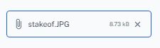
If you want your file input to look and behave just like a regular input:

enter image description here

...you can use a regular TextField component and place a <input type="file"... /> inside its endAdornment:

    <TextField
      name="file"
      value={ value.name }
      onChange={ handleFileChange }
      error={ error }
      readOnly
      InputProps={{
        endAdornment: (
          <input
            ref={ inputRef }
            type="file"
            accept="application/JSON"
            onChange={ handleFileChange }
            tabIndex={ -1 }
            style={{
              position: 'absolute',
              top: 0,
              right: 0,
              bottom: 0,
              left: 0,
              opacity: 0,
            }} />
        ),
      }} />

You can add an onKeyDown listener to open the file picker or clear the file using the keyboard (when the text input is focused):

const handleKeyDow = useCallback((e: React.KeyboardEvent<HTMLInputElement>) => {
  const inputElement = inputRef.current

  if (!inputElement) return

  let preventDefault = true

  if (e.key === ' ' || e.key === 'Enter') {
    inputElement.click()
  } else if (e.key === 'Delete' || e.key === 'Backspace') {
    inputElement.value = ''
  } else {
    preventDefault = false
  }

  if (preventDefault) e.preventDefault()
}, [])
Danziger
  • 19,628
  • 4
  • 53
  • 83
-1

One thing all of these answers didn't mention is where to attach your event handler. You want to attach your event handler to Button but use a ref on input, so that you can access the file. Button elements do not give you access to the file

const fileUpload=useRef();

const handleFileUpload = () =>{
   const file = fileRef.current.files?.[0];
  //...do whatever else you need here
}

<Button
  variant="contained"
  component="label"
  onClick={handleFileUpload}
>
  Upload File
  <input
    type="file"
    hidden
    ref={fileRef}
  />
</Button>
guest
  • 2,185
  • 3
  • 23
  • 46