Not a duplicate of this.
I trying to create two columns on a webpage have different background colours that extend to the screen edges. But the content of the columns needs to stay within the bootstrap boxed width.
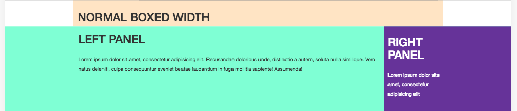
It should look like this:
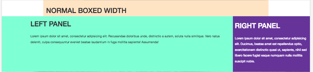
I found this answer which almost worked but the inner content wasn't correctly aligned within the boxed width, especially on large screens over 1600px. It basically ended up looking like:
Below, is a code snippet of the closest I could get to it working, it may be the wrong approach entirely:
<link href="https://maxcdn.bootstrapcdn.com/bootstrap/3.3.7/css/bootstrap.min.css" rel="stylesheet"/>
<div class="container" style="background: bisque;">
 <div class="row">
  <div class="col-xs-12">
   <h1>Normal Boxed Width</h1>
  </div>
 </div>
</div>
<div class="container-fluid">
 <div class="row" style="background-color: aquamarine; padding: 0">
  <div>
   <div class="col-sm-8 col-sm-offset-1">
                <h1>Left Panel</h1>
    <p>Lorem ipsum dolor sit amet, consectetur adipisicing elit. Recusandae doloribus unde, distinctio a autem, soluta nulla similique. Vero natus deleniti, culpa consequuntur eveniet beatae laudantium in fuga mollitia sapiente! Assumenda!</p>
   </div>
   <div class="col-sm-3 gray-background" style="background-color: rebeccapurple;padding: 10px;color:#fff">
              <h1>Right Panel</h1>
    <p>Lorem ipsum dolor sit amet, consectetur adipisicing elit. Ducimus, beatae amet est repellendus optio, exercitationem distinctio quasi ut, sapiente, nihil sed libero facere fugiat eaque numquam nulla mollitia suscipit nobis.</p>
   </div>
  </div>
 </div><!--  .row -->
</div><!--  .container-fluid -->