3

I need to code the next example:

enter image description here

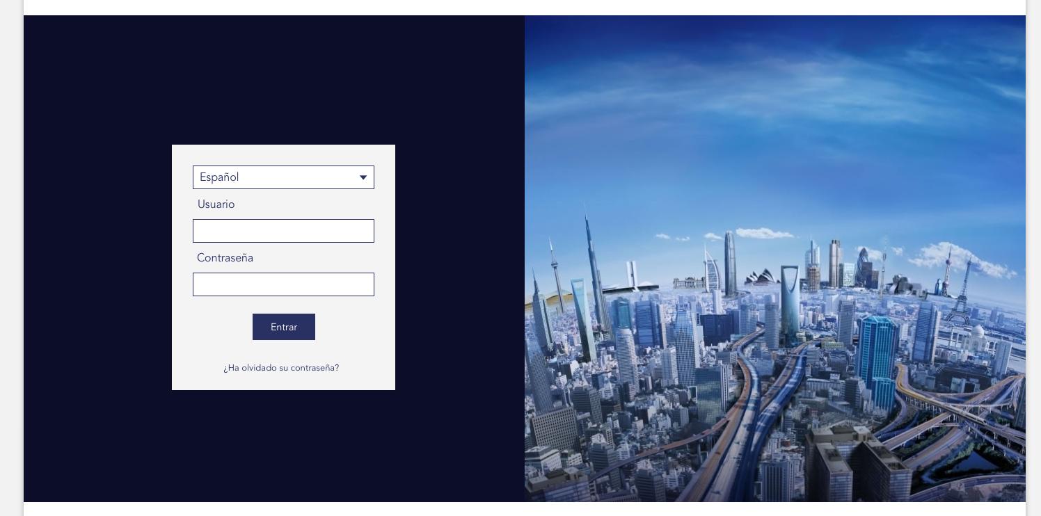
I'm coding all website using bootstrap and the code of this section is this:

`<div class="bg_blue">
        <div class="container">
            <!-- Example row of columns -->
            <div class="row">
                <div class="col-md-6">
                    <div id="login-form-box" class="form-box">
                        <div id="login-form-info" class="form-info">
                            <?php if (isset($content['info']) && !empty($content['info'])) {
                            echo $content['info'];
                            }
                            ?>
                        </div>
                        <?php if (isset($error_message)) {
                        echo '<div id="login-form-info" class="form-error">'.$error_message.'</div>';
                        }
                        ?>
                        <form id="login-form" class="form" action="<?php echo api_get_path(WEB_PATH)?>index.php" method="post">
                            <div>
                                <label for="login"><?php echo custompages_get_lang('User');?></label>
                                <input name="login" type="text" /><br />
                                <label for="password"><?php echo custompages_get_lang('Password');?></label>
                                <input name="password" type="password" /><br />
                            </div>
                        </form>
                        <div id="login-form-submit" class="form-submit" onclick="document.forms['login-form'].submit();">
                            <span><?php echo custompages_get_lang('LoginEnter');?></span>
                            </div> <!-- #form-submit -->
                            <div id="links">
                                <?php if (api_get_setting('allow_registration') === 'true') { ?>
                                <a href="<?php echo api_get_path(WEB_CODE_PATH); ?>auth/inscription.php?language=<?php echo api_get_interface_language(); ?>">
                                    <?php echo custompages_get_lang('Registration')?>
                                </a><br />
                                <?php } ?>
                                <a href="<?php echo api_get_path(WEB_CODE_PATH); ?>auth/lostPassword.php?language=<?php echo api_get_interface_language(); ?>">
                                    <?php echo custompages_get_lang('LostPassword')?>
                                </a>
                            </div>
                        </div>
                    </div>
                <div class="col-md-6">
                    <!-- <img class="img" src="<?php echo api_get_path(WEB_PATH)?>/custompages/images/bgimage.png" alt="Background" /> -->
                </div>
            </div> <!-- /row -->
        </div><!-- /container -->
    </div>`

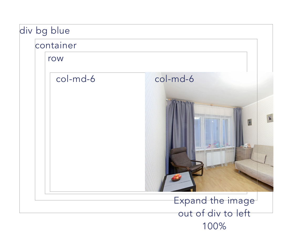
The problem is that I cant set the image background to the second column that resizes and that covers the full with out of the column-md-6 to the right.

Here's a little sketch:

enter image description here

davidcafor
  • 55
  • 1
  • 4
  • instead of col-md-6 give background-image to row. – priya_singh Mar 16 '17 at 08:23
  • Hi @davidcafor. You could set the cold-md-6 as children, directly, of div bg blue (like container div), and set a margin to it. For showing it, between the others divs you can play with z-index property. – Kenzo_Gilead Mar 16 '17 at 08:32
  • Yes, but If I remove the container... both col-md-6 will not have margin left and right respectively... isn't it? – davidcafor Mar 16 '17 at 09:18

3 Answers3

5

Updated 2018

Bootstrap 4, the concept is still the same: https://codeply.com/go/ffaQgse2SU

I have answered similar questions on this, but yours is a little different because the background-image. The best way I've found is using a CSS pseudo element becuase it adjusts along with right col-md-6 and therefore works responsively.

Bootstrap 3 Demo: http://codeply.com/go/rWOGi4LrU1

.right {
    z-index: 0;
    color: #fff;
}

.right:before {
    background-image:url(..);
    content: '';
    display: block;
    position: absolute;
    z-index: -1;
    width: 999em;
    /* allow for bootstrap column padding */
    top: -15px;
    left: -15px;
    bottom: -15px;
}

Demo

Also see: Get Two Columns with different background colours that extend to screen edge

Carol Skelly
  • 351,302
  • 90
  • 710
  • 624
2

If you would like to target only medium screen sizes you can do it in the following way. give width: 120% to your img element and it will overflow and take the full size at the left.

working snippet

.img {
  width: 120%;
}

.col-md-6 {
  background-color: green;
}
<html>

<head>
  <link rel="stylesheet" href="http://maxcdn.bootstrapcdn.com/bootstrap/3.3.6/css/bootstrap.min.css">
  <script src="https://ajax.googleapis.com/ajax/libs/jquery/1.12.4/jquery.min.js"></script>
  <script src="http://maxcdn.bootstrapcdn.com/bootstrap/3.3.6/js/bootstrap.min.js"></script>

</head>

<body>
  <div class="bg_blue">
    <div class="container">
      <!-- Example row of columns -->
      <div class="row">
        <div class="col-md-6">
          <div id="login-form-box" class="form-box">
            <div id="login-form-info" class="form-info">

            </div>

            <form id="login-form" class="form" action="" method="post">
              <div>
                <label for="login"></label>
                <input name="login" type="text" /><br />
                <label for="password"></label>
                <input name="password" type="password" /><br />
              </div>
            </form>
            <div id="login-form-submit" class="form-submit" onclick="document.forms['login-form'].submit();">
              <span></span>
            </div>
            <!-- #form-submit -->
            <div id="links">

              <a href="">

              </a><br />

              <a href="">

              </a>
            </div>
          </div>
        </div>
        <div class="col-md-6">
          <img class="img" src="https://www.w3schools.com/css/trolltunga.jpg" alt="Background" />
        </div>
      </div>
      <!-- /row -->
    </div>
    <!-- /container -->
  </div>
</body>

</html>

NOTE:

If you want to target all screen sizes media then just use col-lg-* col-xs-* col-sm-* i.e different responsive bootstrap classes.

Hope this helps!

neophyte
  • 6,540
  • 2
  • 28
  • 43
-1

I finally did it by removing the "container" div.

Now I got a big problem in mobile, that the background image is lost on mobile.

http://www.thalescampusvirtual.com/index.php

davidcafor
  • 55
  • 1
  • 4