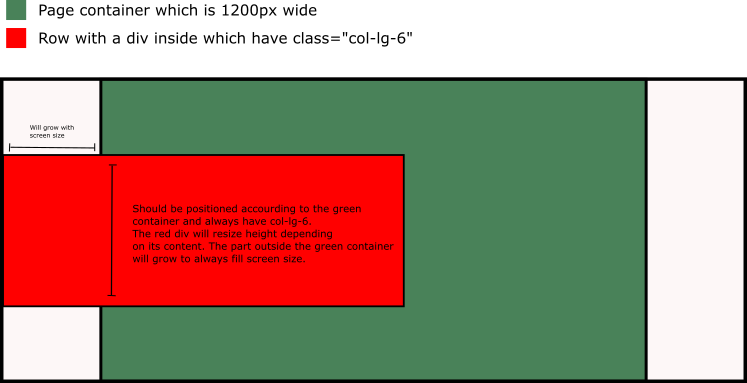
Here is a variant of solution. You need to create absolute positioned div, include it into col-xs-6, but this container should have position: static
As for screen width 1200px and more container width is 1170px, you can calculate padding-left for floating div: padding-left: calc((100% - 1170px) / 2);
.blk {
    background: lightgreen;
    width: 50%;
    position: absolute;

}
.container {
    background: tomato;
    height: 100vh;
    padding: 40px 0;
}
@media only screen and (min-width: 1200px) {
 .cell {
    position: static;
 }
 .blk {
    left: 0;
    right: 50%;
    padding-left: calc((100% - 1170px) / 2);
 }
}
<div class="container">
<div class="row">
    <div class="col-lg-6 cell">
        <div class="blk">Lorem ipsum dolor</div>
     </div>
  <div class="col-lg-6">Lorem ipsum dolor</div>
</div>
</div>
http://www.codeply.com/go/CikO35yioi