13

This question is related to two different questions I have asked previously:

1) Reproduce frequency matrix plot

2) Add 95% confidence limits to cumulative plot

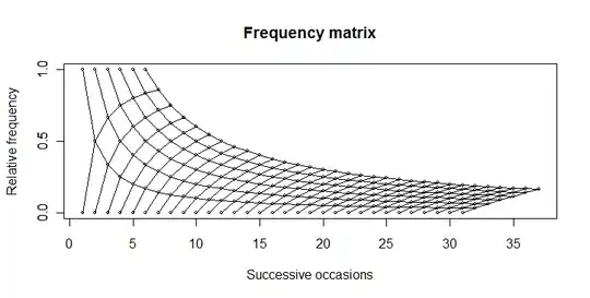
I wish to reproduce this plot in R:boringmatrix

I have got this far, using the code beneath the graphic:multiplot

#Set the number of bets and number of trials and % lines
numbet <- 36 
numtri <- 1000 
#Fill a matrix where the rows are the cumulative bets and the columns are the trials
xcum <- matrix(NA, nrow=numbet, ncol=numtri)
for (i in 1:numtri) {
x <- sample(c(0,1), numbet, prob=c(5/6,1/6), replace = TRUE)
xcum[,i] <- cumsum(x)/(1:numbet)
}
#Plot the trials as transparent lines so you can see the build up
matplot(xcum, type="l", xlab="Number of Trials", ylab="Relative Frequency", main="", col=rgb(0.01, 0.01, 0.01, 0.02), las=1)

My question is: How can I reproduce the top plot in one pass, without plotting multiple samples?

Thanks.

Community
  • 1
  • 1
Frank Zafka
  • 829
  • 9
  • 30
  • Despite the fact that you had a more path-deterministic graphic in mind, I thought your transparency-weighted graph was better at illustrating the statistical nature of this question. I suppose it could have been outlined by: `lines(6:36, 6/(6:36), lty=3)` to show that extremal possibilities.) – IRTFM Sep 04 '11 at 19:47
  • @DWin Funnily enough I am now banging my head trying to create some kind of density heatmap (or hexbin) so it's more like the transparent-weighted version. If you've got a good idea how to create it, I can ask a new question? I was thinking of something like [this](http://www.actualanalytics.com/density-plot-heatmap-using-r-a58). – Frank Zafka Sep 04 '11 at 20:01
  • That link's not working for me at the moment, but I have learned a lot from your questions so I encourage you to ask more. – IRTFM Sep 04 '11 at 20:03
  • @DWin This is making my brain hurt. Here is the link to my new [question](http://stackoverflow.com/questions/7305803/plot-probability-heatmap-hexbin-with-different-sized-bins). – Frank Zafka Sep 05 '11 at 08:55

3 Answers3

6

You can produce this plot...

enter image description here

... by using this code:

boring <- function(x, occ) occ/x

boring_seq <- function(occ, length.out){
  x <- seq(occ, length.out=length.out)
  data.frame(x = x, y = boring(x, occ))
}

numbet <- 31
odds <- 6
plot(1, 0, type="n",  
    xlim=c(1, numbet + odds), ylim=c(0, 1),
    yaxp=c(0,1,2),
    main="Frequency matrix", 
    xlab="Successive occasions",
    ylab="Relative frequency"
    )

axis(2, at=c(0, 0.5, 1))    

for(i in 1:odds){
  xy <- boring_seq(i, numbet+1)
  lines(xy$x, xy$y, type="o", cex=0.5)
}

for(i in 1:numbet){
  xy <- boring_seq(i, odds+1)
  lines(xy$x, 1-xy$y, type="o", cex=0.5)
}
Andrie
  • 176,377
  • 47
  • 447
  • 496
  • 1
    That really helps. I have been banging my head against a brick wall for days now, and with a deadline looming. I can now get on with some things. :) – Frank Zafka Sep 04 '11 at 10:29
3

You can also use Koshke's method, by limiting the combinations of values to those with s<6 and at Andrie's request added the condition on the difference of Ps$n and ps$s to get a "pointed" configuration.

 ps <- ldply(0:35, function(i)data.frame(s=0:i, n=i))
 plot.new()
 plot.window(c(0,36), c(0,1))
 apply(ps[ps$s<6 & ps$n - ps$s < 30, ], 1, function(x){
   s<-x[1]; n<-x[2];
   lines(c(n, n+1, n, n+1), c(s/n, s/(n+1), s/n, (s+1)/(n+1)), type="o")})
 axis(1)
 axis(2)
 lines(6:36, 6/(6:36), type="o")
 # need to fill in the unconnected points on the upper frontier

Resulting plot (version 2)

IRTFM
  • 258,963
  • 21
  • 364
  • 487
  • Except that the number of trials aren't limited to 31, as in the original question. (Compare the shape of the graphs at the right hand edge.) – Andrie Sep 04 '11 at 19:23
  • Oh. Alright. Will add the logical condition to accomplish that. – IRTFM Sep 04 '11 at 19:35
  • Andrie : Thanks for the vote. Returned the favor. I did try using your `boring` function when I first tackled thi,s but confess that I did not understand it as well as the plyr approach that koshke used. I didn't really understand how the 4-tuples worked with `lines` but I could see the structure of @koshke's "ps" object better. – IRTFM Sep 04 '11 at 21:15
  • @Dwin Agreed. My first attempt at the boring function (in previous question) was rather muddled and didn't extend easily. I had to re-engineer it from scratch to make this new plot. In its new form I think it is easier to comprehend. – Andrie Sep 05 '11 at 07:58
0

Weighted Frequency Matrix is also called Position Weight Matrix (in bioinformatics). It can be represented in a form of a sequence logo. This is at least how I plot weighted frequency matrix.

library(cosmo)
data(motifPWM); attributes(motifPWM) # Loads a sample position weight matrix (PWM) containing 8 positions.
plot(motifPWM) # Plots the PWM as sequence logo. 
mjp
  • 215
  • 2
  • 11