What is the difference between align-items and align-content?
Asked
Active
Viewed 3e+01k times
695
Peter Mortensen
- 30,738
- 21
- 105
- 131
Dinh
- 7,081
- 3
- 13
- 3
-
2[align items](http://css-tricks.com/almanac/properties/a/align-items/) and [align content](http://css-tricks.com/almanac/properties/a/align-content/) – jbutler483 Dec 18 '14 at 09:40
-
3I already also digged Chris's Almanac but still did not get clear – Dinh Dec 18 '14 at 13:41
-
3https://stackoverflow.com/q/42613359/3597276 – Michael Benjamin Jul 08 '17 at 11:54
-
1I am never going to truly understand this one :-/ – Simon_Weaver Oct 29 '21 at 20:02
-
4align-content manages the space between the lines when items wrap. align-items aligns the items relative to each other when sizes of items are different. When the size of the items are the same and there is only one line, they behave similarly. – Jens Frandsen Dec 21 '21 at 23:12
15 Answers
702
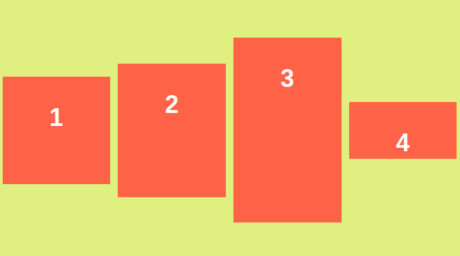
The align-items property of flex-box aligns the items inside a flex container along the cross axis just like justify-content does along the main axis. (For the default flex-direction: row the cross axis corresponds to vertical and the main axis corresponds to horizontal. With flex-direction: column those two are interchanged respectively).
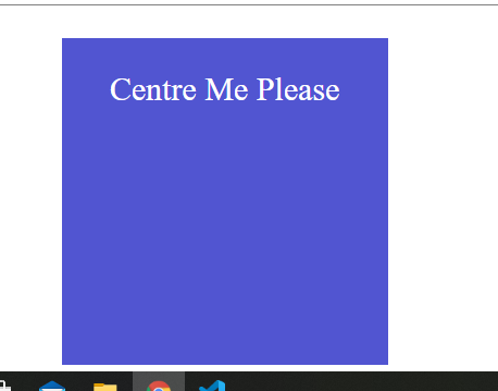
Here's an example of how align-items:center looks:
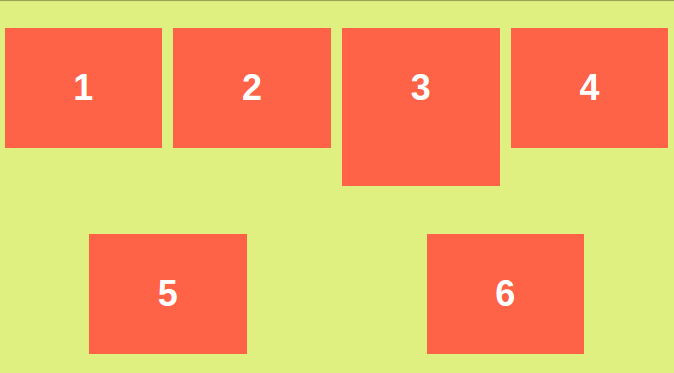
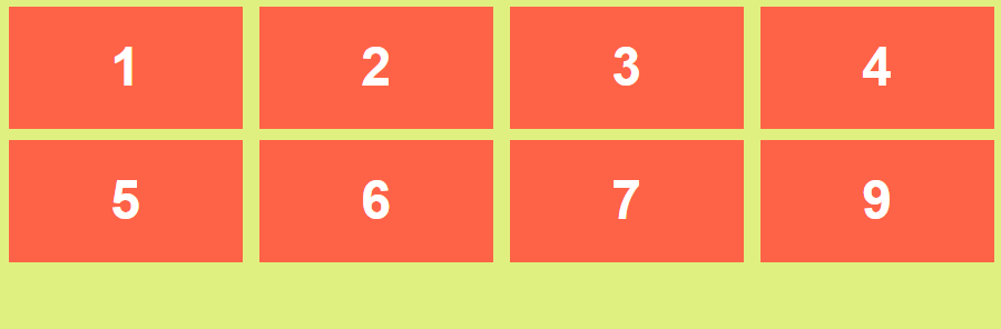
But align-content is for multi line flexible boxes. It has no effect when items are in a single line. It aligns the whole structure according to its value. Here's an example for align-content: space-around;:
And here's how align-content: space-around; with align-items:center looks: 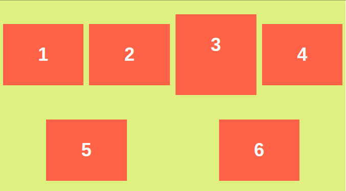
Note the 3rd box and all other boxes in first line change to vertically centered in that line.
Here are some codepen links to play with:
http://codepen.io/asim-coder/pen/MKQWbb
http://codepen.io/asim-coder/pen/WrMNWR
Here's a super cool pen which shows and lets you play with almost everything in flexbox.
-
10Note that the `align-*` properties can also shift flex items horizontally. It depends on the `flex-direction`. http://stackoverflow.com/q/32551291/3597276 – Michael Benjamin Jan 29 '16 at 17:09
-
1> "But align-content is for multi line flexible boxes. It has no effect when items are in a single line" -- this appears to not be true, or not be honoured, in latest Firefox (May 2020). Instead, if there's a single flex-line (all content fits within less than the main-axis length) which is less than full height (cross-axis size is less than full available), then align-content *if set* will obliterate align-items. This makes sense: it applies to ANY lines it finds? – Adam May 02 '20 at 22:07
-
React native layout arrangement is a joke. The property terms are so misleading! Its just my personal opinion after dealing with much, much simpler layout android SDK offers – MathematicsBeginner Oct 26 '22 at 16:17
-
You said that align-items is like justify-content, but in the perpendicular axis. Then why it don't have values like “space-evenly”? Also, You said align-content only works in multi-line flex but for me, it's also working on single line flex. Here's the pen: https://codepen.io/Utsav_0/pen/oNMKZXV – Utsav Meena Feb 11 '23 at 02:58
237
From the example at flexboxfroggy.com:
It will take you 10-20 minutes and at level 21 you will find the answer to your question.
align-content determines the spacing between lines
align-items determines how the items as a whole are aligned within the container.
When there is only one line, align-content has no effect
Alireza Fattahi
- 42,517
- 14
- 123
- 173
-
19Indeed, I did find the froggy example really useful. Learned a lot from it. – Spikatrix Feb 18 '19 at 05:44
-
2Actually, `align-content` does have effect for a single line content, too, if the container has non-shrink-wrap height (that is, container is higher than any of the child items). The `align-items` positions each child relative to the line of content and `align-content` positions each line of content relative to the container. And the names are "align" and "justify" because the real orientation depends on `flex-flow`. I'd prefer "parallel" and "orthogonal" instead. – Mikko Rantalainen Mar 19 '21 at 08:42
-
@MikkoRantalainen: I don't observe any effect of `align-content` on single line/column flex content. Also, MDN disagrees with you (https://developer.mozilla.org/en-US/docs/Web/CSS/align-content). – wortwart Oct 11 '21 at 10:23
-
1@wortwart See demo at https://jsfiddle.net/n2ruogLt/ – note how row with letters a,b,c,d end up at the end of the container even when it doesn't have `align-content`. – Mikko Rantalainen Oct 11 '21 at 14:43
-
@Spikatrix I couldnt finish level 24. Certain things didnt seem to have effect anymore like changing justify-content – West Jul 23 '22 at 13:45
-
According to Chrome Dev tool: "The flex-wrap: nowrap property prevents align-content from having an effect. Try setting flex-wrap to something other than nowrap." – user4617883 May 16 '23 at 17:15
87
First, align-items is for items in a single row. So for a single row of elements on main axis, align-items will align these items respective of each other and it will start with fresh perspective from the next row.
Now, align-content doesn't interfere with items in a row but with rows itself. Hence, align-content will try to align rows with respect to each other and flex container.
Check this fiddle : https://jsfiddle.net/htym5zkn/8/
MauroPorras
- 5,079
- 5
- 30
- 41
Uday Hiwarale
- 4,028
- 6
- 45
- 48
-
So for a flex-direction of row, does align content only do something if the flexbox has a height set and therefore doesn't just use the child element's height leaving no room to add space between/around the rows? – Kevin Wheeler Feb 22 '23 at 17:31
41
I had the same confusion. After some tinkering based on many of the answers above, I can finally see the differences. In my humble opinion, the distinction is best demonstrated with a flex container that satisfies the following two conditions:
- The flex container itself has a height constraint (e.g.,
min-height: 60rem) and thus can become too tall for its content - The child items enclosed in the container have uneven heights
Condition 1 helps me understand what content means relative to its parent container. When the content is flush with the container, we will not be able to see any positioning effects coming from align-content. It is only when we have extra space along the cross axis, we start to see its effect: It aligns the content relative to the boundaries of the parent container.
Condition 2 helps me visualize the effects of align-items: it aligns items relative to each other.
Here is a code example. Raw materials come from Wes Bos' CSS Grid tutorial (21. Flexbox vs. CSS Grid)
- Example HTML:
  <div class="flex-container">
    <div class="item">Short</div>
    <div class="item">Longerrrrrrrrrrrrrr</div>
    <div class="item"></div>
    <div class="item" id="tall">This is Many Words</div>
    <div class="item">Lorem, ipsum.</div>
    <div class="item">10</div>
    <div class="item">Snickers</div>
    <div class="item">Wes Is Cool</div>
    <div class="item">Short</div>
  </div>
- Example CSS:
.flex-container {
  display: flex;
  /*dictates a min-height*/
  min-height: 60rem;
  flex-flow: row wrap;
  border: 5px solid white;
  justify-content: center;
  align-items: center;
  align-content: flex-start;
 }

#tall {
  /*intentionally made tall*/
  min-height: 30rem;
}

.item {
  margin: 10px;
  max-height: 10rem;
}
Example 1: Let's narrow the viewport so that the content is flush with the container. This is when align-content: flex-start; has no effects since the entire content block is tightly fit inside the container (no extra room for repositioning!)
Also, note the 2nd row--see how the items are center aligned among themselves.
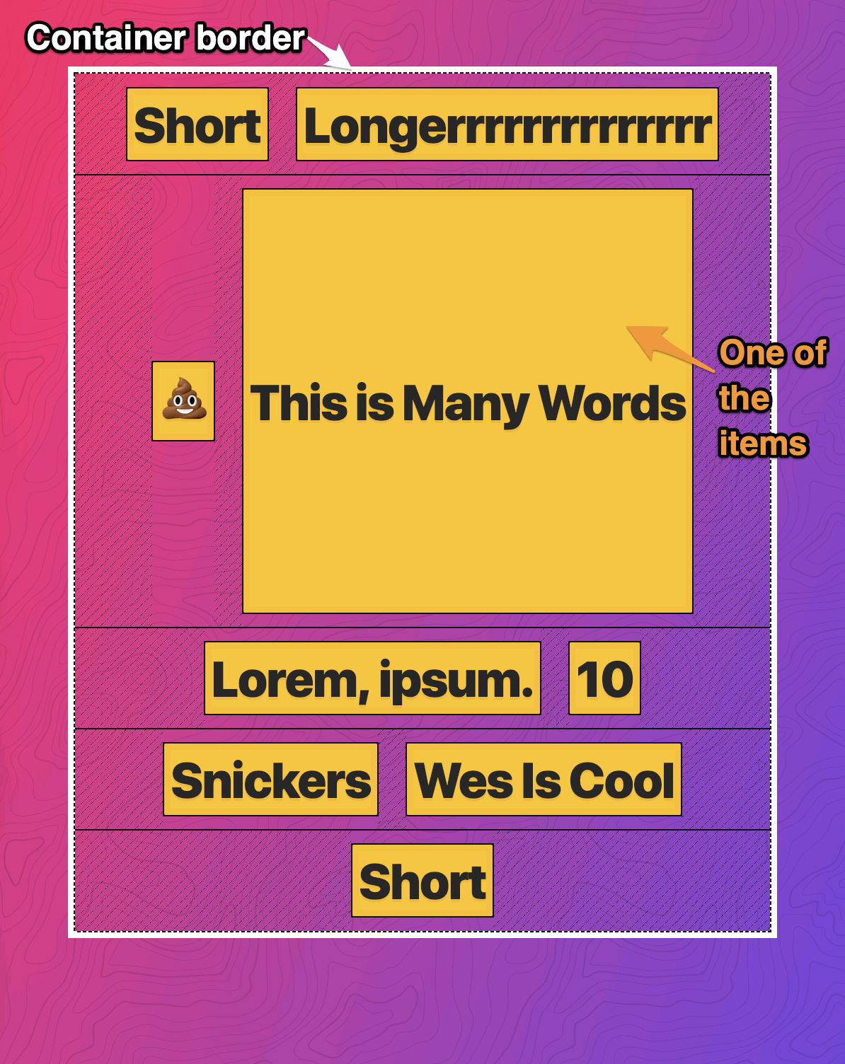
Example 2: As we widen the viewport, we no longer have enough content to fill the entire container. Now we start to see the effects of align-content: flex-start;--it aligns the content relative to the top edge of the container.
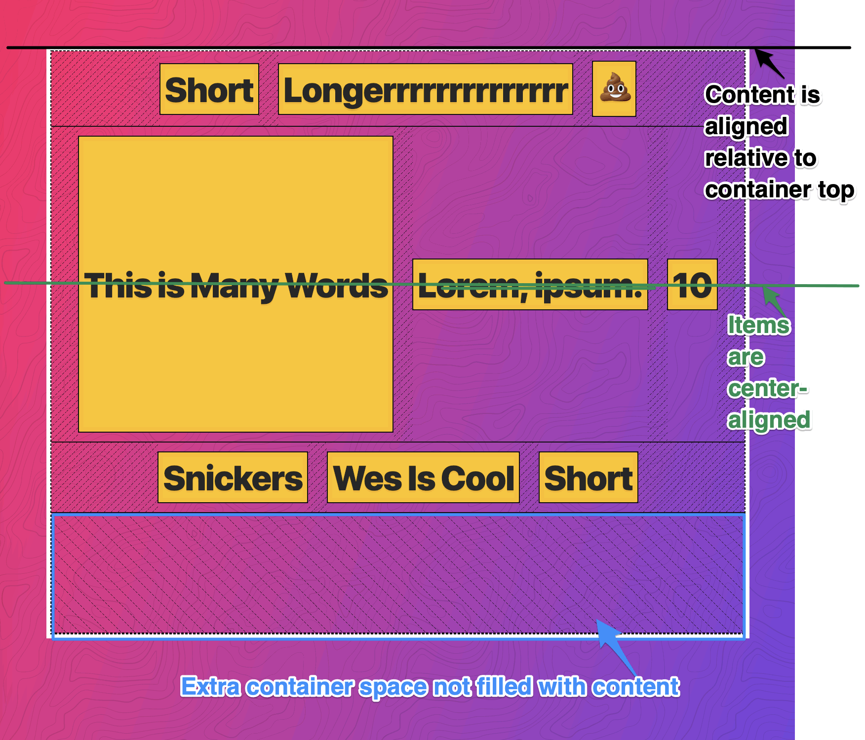
These examples are based on flexbox, but the same principles are applicable to CSS grid. Hope this helps :)
Shan Dou
- 3,088
- 1
- 20
- 18
-
1
-
Fantastic explanation. `Condition 1` and `Condition 2` were what was missing from most of the other explanations here. Thanks! – Eliezer Berlin Jun 13 '23 at 11:24
17
The effect of both align-items and align-content is along the cross-axis.
Let say if flex-direction is row then the main axis is Left to Right and if flex-direction is column then the main axis is from top to bottom.
So In the below examples, we gonna assume that flex-direction is row i.e. main axis is from Left to Right and cross-axis is from top to bottom.
align-contentonly works if there isflex-wrap: wrapand if there is more than oneflex-linein container.
align-contenthas higher priority thanalign-itemsif there are multiple flex-line.
What is flex-line?
Each row or column of flex items in a flex container is a flex line. Multiple lines occur when there is not enough space in a container and flex-items would take the next line(in flex-direction: row;) to fit in. In flex-direction: column it will add flex items to next line.
By default, the flex is a flexible container i.e. it can accommodate any number of elements unless we have specified flex-wrap: wrap. Without wrap, flex-items will overflow the container(if flex-direction is row).
align-content example
.container{
  border: 5px solid #000;
  height: 100vh;
  display: flex;
  flex-wrap: wrap;
  align-content: flex-end;
}

.box{
  height:100px;
  font-size: 2rem;
  width: 33.33%;
}

.box1{
  background: purple;
}

.box2{
  background:   #ff8c00;
}

.box3{
  background: lime;
}

.box4{
  background: #008080;
}

.box5{
  background-color: red;
}
<div class="container">
<div class="box box1">box 1</div>
<div class="box box2">box 2</div>
<div class="box box3">box 3</div>
<div class="box box4">box 4</div>
<div class="box box5">box 5</div>
</div>In the above example, If there would have been flex-wrap: no-wrap then align-content doesn't affect our layout.
align-items example
The align-items property determines how flex items are positioned within a flex line, along the cross-axis.
.container{
  border: 5px solid #000;
  height: 100vh;
  display: flex;
  flex-wrap: wrap;
  align-items: flex-end;
}

.box{
  height:100px;
  font-size: 2rem;
  width: 33.33%;
}

.box1{
  background: purple;
}

.box2{
  background:   #ff8c00;
}

.box3{
  background: lime;
}

.box4{
  background: #008080;
}

.box5{
  background-color: red;
}
<div class="container">
<div class="box box1">box 1</div>
<div class="box box2">box 2</div>
<div class="box box3">box 3</div>
<div class="box box4">box 4</div>
<div class="box box5">box 5</div>
</div>If
align-contentandalign-itemsare declared on a container with propertiesflex-wrap: wrapand if there are more than flex-line thenalign-contentproperty has higher priority thanalign-items.
align-content and align-items priority example
.container{
  border: 5px solid #000;
  height: 100vh;
  display: flex;
  flex-wrap: wrap;
  align-content: flex-end;
  align-items: flex-start;
}

.box{
  height:100px;
  font-size: 2rem;
  width: 33.33%;
}

.box1{
  background: purple;
}

.box2{
  background:   #ff8c00;
}

.box3{
  background: lime;
}

.box4{
  background: #008080;
}

.box5{
  background-color: red;
}
<div class="container">
<div class="box box1">box 1</div>
<div class="box box2">box 2</div>
<div class="box box3">box 3</div>
<div class="box box4">box 4</div>
<div class="box box5">box 5</div>
</div>
DecPK
- 24,537
- 6
- 26
- 42
13
Well I have examined them on my browser.
align-content can change a line's height for row direction or width for column when it's value is stretch, or add empty space between or around the lines for space-between, space-around, flex-start, flex-end values.
align-items can change items height or position inside the line's area. When items are not wrapped they have only one line which it's area is always stretched to the flex-box area (even if the items overflow), and align-content has no effect on a single line. So it has no effect on items that are not wrapped and only align-items can change items position or stretch them when all of them are on a single line.
However, if they are wrapped you have multiple lines and items inside each line. And if all items of each line have the same height (for row direction) that line's height will be equal to those items height and you don't see any effect by changing align-items value.
So if you want to affect items by align-items when your items are wrapped and have the same height (for row direction) first you have to use align-content with stretch value in order to expand the lines area.
Waldir Leoncio
- 10,853
- 19
- 77
- 107
TheNegative
- 171
- 3
- 7
12
Having read some of the answers, they identify correctly that align-content takes no affect if the flex content is not wrapped. However what they don't understand is align-items still plays an important role when there is wrapped content:
In the following two examples, align-items is used to center the items within each row, then we change align-content to see it's effect.
Example 1:
align-content: flex-start;
Example 2:
align-content: flex-end;
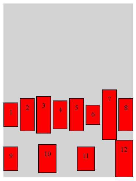
Here's the code:
<div class="container">
    <div class="child" style="height: 30px;">1</div>
    <div class="child" style="height: 50px;">2</div>
    <div class="child" style="height: 60px;">3</div>
    <div class="child" style="height: 40px;">4</div>
    <div class="child" style="height: 50px;">5</div>
    <div class="child" style="height: 20px;">6</div>
    <div class="child" style="height: 90px;">7</div>
    <div class="child" style="height: 50px;">8</div>
    <div class="child" style="height: 30px;">9</div>
    <div class="child" style="height: 40px;">10</div>
    <div class="child" style="height: 30px;">11</div>
    <div class="child" style="height: 60px;">12</div>
</div>

<style>
.container {
    display: flex;
    width: 300px;
    flex-flow: row wrap;
    justify-content: space-between;
    align-items: center;
    align-content: flex-end;
    background: lightgray;
    height: 400px;
}
.child {
    padding: 12px;
    background: red;
    border: solid 1px black;
}
</style>
run_the_race
- 1,344
- 2
- 36
- 62
9
align-content
align-content controls the cross-axis (i.e. vertical direction if the flex-direction is row, and horizontal if the flex-direction is column) positioning of multiple lines relative to each other.
(Think lines of a paragraph being vertically spread out, stacked toward the top, stacked toward the bottom. This is under a flex-direction row paradigm).
align-items
align-items controls the cross-axis of an individual line of flex elements.
(Think how an individual line of a paragraph is aligned, if it contains some normal text and some taller text like math equations. In that case, will it be the bottom, top, or center of each type of text in a line that will be aligned?)
ahnbizcad
- 10,491
- 9
- 59
- 85
6
align-items spreads the child elements vertically with space between them.
align-content bunches them together as if they were one element.
(if the flex-direction is column)
Embedded_Mugs
- 2,132
- 3
- 21
- 33
4
What I have learned from every answer and visiting the blog is
what is the cross axis and main axis
- main axis is horizontal row and cross axis is vertical column - for
flex-direction: row - main axis is vertical column and cross axis is horizontal row - for
flex-direction: column
Now align-content and align-items
align-content is for the row, it works if the container has (more than one row) Properties of align-content
.container {
  align-content: flex-start | flex-end | center | space-between | space-around | space-evenly | stretch | start | end | baseline | first baseline | last baseline + ... safe | unsafe;
}
align-items is for the items in row Properties of align-items
.container {
  align-items: stretch | flex-start | flex-end | center | baseline | first baseline | last baseline | start | end | self-start | self-end + ... safe | unsafe;
}
For more reference visit to flex
bajran
- 1,433
- 14
- 23
4
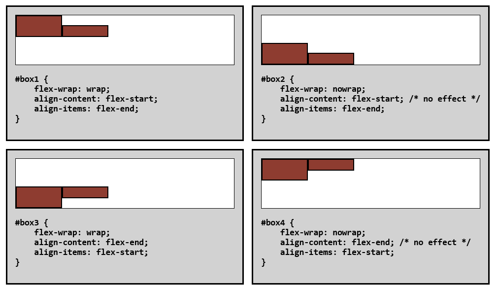
The key property is flex-wrap. When nowrap (or when there is no extra space in the cross axis), align-content has no effect. When wrap or wrap-reverse, it has always an effect (regardless of the line count) if there is extra space in the cross axis.
Compare these four boxes:
JukkaP
- 1,994
- 1
- 14
- 7
2
while align-items would centre as a single line of text both horizontally and vertically inside a container , align-content would behave as if there were multiple lines of text,or a paragraph, and start from top aligning even a single line of text as if it were paragraph which has been given a text-align: center rule.
This is the result we get from
align-content:center;
-
Your example isn’t useful without specifying what flex direction you referring to – West Jul 23 '22 at 13:04
2
First Part
align-items applies to single line of boxes only. Suppose there are 4 boxes in a single line inside the container. then align-items will be applied to align those boxes in a single line. If flex-direction is row (which is default) then align-items will arrange the boxes vertically, if its column then arrange the boxes horizontally.
Second Part
Continuing with the above single line of boxes, if we add one more line of 4 boxes, now there are 8 boxes, 4 in each line. Here align-content comes into picture, if we apply align-content to the container, it will be applied to both lines having total of 8 boxes. If we apply align-content:center, it will center both lines in a container. In that sense align-content is used to arrange multi line flexible boxes.
align-items: center, align-content: flex-start
Wahas Ali Mughal
- 187
- 2
- 11
-2
The main difference is when the height of the elements are not the same! Then you can see how in the row, they are all center\end\start
-2
according to what I understood from here:
when you use align-item or justify-item, you are adjusting "the content inside a grid item along the column axis or row axis respectively.
But: if you use align-content or justify-content, you are setting the position a grid along the column axis or the row axis. it occurs when you have a grid in a bigger container and width or height are inflexible (using px).
Goldenmoon
- 5
- 1
-
1This is inaccurate and confusing. align-items is not fixed to controlling the column, but dependings on the flex-direction. Similarly align-content is not only for column axis, and justify-content is not only for the row axis. justify-itemS has nothing to do with flex box. – run_the_race Jun 22 '20 at 10:19