59

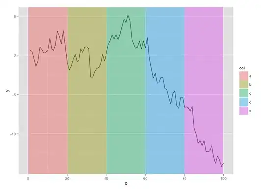
I'm making a straightforward barchart in R using the ggplot2 package. Rather than the grey default I'd like to divide the background into five regions, each a different (but similarly understated) colour. How do I do this?

More specifically, I'd like the five coloured regions to run from 0-25, 25-45, 45-65, 65-85 and 85-100 where the colours represent worse-than-bronze, bronze, silver, gold and platinum respectively. Suggestions for a colour scheme very welcome too.

zx8754
  • 52,746
  • 12
  • 114
  • 209
Matt Ollis
  • 890
  • 1
  • 8
  • 9
  • The only thing I can think of, off the top of my head is to create a cut variable, facet on the cut and edit the facet grobs using the technique in this question: http://stackoverflow.com/questions/6750664/how-to-change-the-format-of-an-individual-ggplot2-facet-plot – Brandon Bertelsen Apr 01 '12 at 23:27
  • I was able to find an example of my suggestion on the ggplot2 mailing list: https://groups.google.com/forum/?fromgroups#!topic/ggplot2/fNBQrBPPbPM – Brandon Bertelsen Apr 01 '12 at 23:35
  • 1
    Try adding `geom_rect()` layer(s) with the fill and alpha values that you want. Note that in this application it is convenient to use +/- Inf as limits for the other direction. – baptiste Apr 01 '12 at 23:46
  • Thank you all for the answers/hints: I'll try and create what I want later today and then accept the appropriate answer (or ask more questions!). – Matt Ollis Apr 02 '12 at 10:54

3 Answers3

71

Here's an example to get you started:

#Fake data
dat <- data.frame(x = 1:100, y = cumsum(rnorm(100)))
#Breaks for background rectangles
rects <- data.frame(xstart = seq(0,80,20), xend = seq(20,100,20), col = letters[1:5])


#As Baptiste points out, the order of the geom's matters, so putting your data as last will 
#make sure that it is plotted "on top" of the background rectangles. Updated code, but
#did not update the JPEG...I think you'll get the point.

ggplot() + 
  geom_rect(data = rects, aes(xmin = xstart, xmax = xend, ymin = -Inf, ymax = Inf, fill = col), alpha = 0.4) +
  geom_line(data = dat, aes(x,y))

enter image description here

Chase
  • 67,710
  • 18
  • 144
  • 161
  • 3
    it's probably better to have the rectangles below the line – baptiste Apr 02 '12 at 02:50
  • 1
    @baptiste - yes, good point. I neglected to think of that in my haste to put an answer together. I incorporated your comments above. Thanks! – Chase Apr 02 '12 at 12:55
  • Thanks! I have it basically working now. (Solving my remaining problems is, I think, just a matter of me getting better at understanding making bar charts via ggplot rather than qplot. The colour/background bit works fine.) – Matt Ollis Apr 02 '12 at 21:11
  • Hi @Chase a very nice code I maybe can reuse. I have changed rects from x to y and now I'm gonna try with my data that has date and hour on x axis. Is it possible to do? Thanks – pacomet Jan 27 '16 at 14:47
  • 1
    Any idea how to apply this and a `facet_wrap()`? – ZS27 Nov 14 '17 at 19:17
  • 2
    With these plots, I like to add `scale_x_continuous(expand = c(0, 0)) + scale_y_continuous(expand = c(0, 0))` to remove extra space between the rectangles and the axis. I find it more aesthetically pleasing. – ZS27 Nov 14 '17 at 19:21
7

Since you are after vertical (or horizontal) area highlighting, geom_rect() might be an overshoot. Consider geom_ribbon() instead:

ggplot(mtcars, aes(x = wt, y = mpg)) + 
  geom_point() +
  geom_ribbon(aes(xmin=3, xmax=4.2), alpha=0.25) +
  theme_minimal()

geom_ribbon

dmi3kno
  • 2,943
  • 17
  • 31
  • 2
    Though `geom_ribbon` implicitly takes `ymin` and `ymax` from the data in the panel. If you are potentially going to use a faceted presentation be aware that the ribbon would take different heights in each panel according to the values present. – dhd Jun 22 '22 at 05:41
7

I wanted to move the line⎯or the bars of the histogram⎯to the foreground, as suggested by baptiste above and fix the background with + theme(panel.background = element_rect(), panel.grid.major = element_line( colour = "white") ), unfortunately I could only do it by sending the geom_bar twice, hopefully someone can improve the code and make the answer complete.

background <- data.frame(lower = seq( 0  , 3  , 1.5 ), 
                         upper = seq( 1.5, 4.5, 1.5 ),
                         col = letters[1:3])
ggplot() + 
    geom_bar( data = mtcars , aes( factor(cyl) ) ) + 
    geom_rect( data = background , 
              mapping = aes( xmin = lower , 
                            xmax = upper ,
                            ymin = 0 ,
                            ymax = 14 ,
                            fill = col ) ,
              alpha = .5 ) + 
    geom_bar(data = mtcars,
             aes(factor(cyl))) +
             theme(panel.background = element_rect(),
                   panel.grid.major = element_line( colour = "white"))

Produces this, geom_bar and geom_rect

Take a look at this site for colour scheme suggestions.

Community
  • 1
  • 1
Eric Fail
  • 8,191
  • 8
  • 72
  • 128