201

I found this example on stackoverflow:

Draw Circle using css alone

Which is great. But I'd like to know how to modify that example so that I can include text in the middle of the circle?

I also found this: Vertically and horizontally centering text in circle in CSS (like iphone notification badge)

but for some reason, its not working for me. When I create the following test code:

<div class="badge">1</div>

instead of a circle, I get a oval shape. I'm trying to play around with the code to see how I can get it to work.

misterManSam
  • 24,303
  • 11
  • 69
  • 89
dot
  • 14,928
  • 41
  • 110
  • 218

19 Answers19

423

Setting a line-height the same value as the height of the div will show one line of text vertically centered. In this example the height and line-height are 500px.

Example

JSFiddle

.circle {
  width: 500px;
  height: 500px;
  line-height: 500px;
  border-radius: 50%;
  font-size: 50px;
  color: #fff;
  text-align: center;
  background: #000
}
<div class="circle">Hello I am A Circle</div>
Augusto
  • 2,125
  • 18
  • 27
Jawad
  • 8,352
  • 10
  • 40
  • 45
  • 9
    @dot: Not really my doing - http://bryanhadaway.com/how-to-create-circles-with-css/ – Jawad May 17 '13 at 18:29
  • 4
    If you can make `border-radius:50%;` that makes your code event more elegant and portable, without having to change this attribute each time based on the width and height ;) – bonCodigo Aug 14 '14 at 10:37
  • 1
    But, at the same time, if your number is **variable** and increases to three digits(eg. 100) , then ``border-radius:50%;`` will look bad. In such cases, its best to use fixed border-radius (eg. 10px) – adi rohan Sep 21 '14 at 08:20
  • 1
    This is still great, but what if I want more than one line in the circle? Since the line height is equal to the height, there can only be one line in the circle. – BrockLee Feb 04 '15 at 03:45
  • 22
    Personally I'd remove the line-height attribute and add vertical-align: middle; display: table-cell; That way your lines of text will still be centered. http://jsfiddle.net/z9bLtw99/ – ministe Mar 16 '15 at 14:17
  • 4
    What about multiple lines. – Henry Zhu Aug 29 '15 at 07:22
  • 1
    Completely agree with ministe2003. Jawad your solution is great if one is sure that the text will fit on one line. To demonstrate, try entering more characters than can fit in one line in your jsfiddle example. @Henry if you follow ministe2003's advice that won't be an issue. Just as a btw, I had to change the 'display' attribute of the parent element to 'table' to make things work (after setting that of 'circle' to 'table-cell'). – nullstellensatz Sep 19 '15 at 23:07
  • 2
    @DamjanPavlica See the last update on this **[answer](http://stackoverflow.com/a/9359039/607874)** that does not explicitly set any width or height. Also works for multiple lines, as you can verify live on the jsfiddle – Jose Rui Santos Jun 08 '16 at 08:17
71

If your content is going to wrap and be of unknown height, this is your best bet:

http://cssdeck.com/labs/aplvrmue

.badge {
  height: 100px;
  width: 100px;
  display: table-cell;
  text-align: center;
  vertical-align: middle;
  border-radius: 50%; /* may require vendor prefixes */
  background: yellow;
}

.badge {
  height: 100px;
  width: 100px;
  display: table-cell;
  text-align: center;
  vertical-align: middle;
  border-radius: 50%;
  background: yellow;
}
<div class="badge">1</div>
mplungjan
  • 169,008
  • 28
  • 173
  • 236
cimmanon
  • 67,211
  • 17
  • 165
  • 171
  • 7
    This generates ovals, not perfect circles. – Sophivorus Apr 08 '14 at 01:41
  • 2
    this is the real solution. although i must mention, that `display: absolute` breaks the alingment - but easy solution is to wrap it inside another div. – Ondřej Želazko Jun 09 '15 at 22:03
  • 1
    produces a a perfect circle (not an oval). Alsoa wrapper div is indeed a good idea when using absolute or fixed positioning. – krivar Jul 23 '15 at 16:42
  • 2
    For absolute positioning, you would use a wrapper. But it gives an oval as the max width it can go to is 180px. So if you specify min-width to the width you want and set height to that value as well. You will get a circle. Otherwise you will get an oval beyond width and height > 180px. – mutp Oct 05 '15 at 08:11
48

You can use css3 flexbox.

HTML:

<div class="circle-with-text">
    Here is some text in circle
</div>

CSS:

.circle-with-text {
  justify-content: center;
  align-items: center;
  border-radius: 100%;
  text-align: center;
  display: flex;
}

This will allow you to have vertically and horizontally middle aligned single line and multi-line text.

body {
  margin: 0;
}
.circles {
  display: flex;
}
.circle-with-text {
  background: linear-gradient(orange, red);
  justify-content: center;
  align-items: center;
  border-radius: 100%;
  text-align: center;
  margin: 5px 20px;
  font-size: 15px;
  padding: 15px;
  display: flex;
  height: 180px;
  width: 180px;
  color: #fff;
}
.multi-line-text {
  font-size: 20px;
}
<div class="circles">
  <div class="circle-with-text">
    Here is some text in circle
  </div>
  <div class="circle-with-text multi-line-text">
    Here is some multi-line text in circle
  </div>
</div>
okliv
  • 3,909
  • 30
  • 47
Mohammad Usman
  • 37,952
  • 20
  • 92
  • 95
15

For a web design I was recently given I had to solve the centered and unknown amount of text in a fixed circle issue and I thought I'd share the solution here for other people looking into circle/text combos.

The main issue I had was text would often break the bounds of the circle. To solve this I ended up using 4 divs. One rectangular container that specified the max (fixed) boundaries of the circle. Inside that would be the div that draws the circle with its width and height set to 100% so changing the size of the parent changes the size of the actual circle. Inside that would be another rectangular div which, using %'s, would create a text boundary area preventing any text leaving the circle (for the most part) Then finally the actual div for the text and vertical centering.

It makes more sense as code:

/* Main Container -  this controls the size of the circle */
.circle_container
{
 width : 128px;
 height : 128px;
 margin : 0;
 padding : 0;
/* border : 1px solid red; */
}

/* Circle Main draws the actual circle */
.circle_main
{
 width : 100%;
 height : 100%;
 border-radius : 50%;
 border : 2px solid black; /* can alter thickness and colour of circle on this line */
 margin : 0;
 padding : 0;
}

/* Circle Text Container - constrains text area to within the circle */
.circle_text_container
{
 /* area constraints */
 width : 70%;
 height : 70%;
 max-width : 70%;
 max-height : 70%;
 margin : 0;
 padding : 0;

 /* some position nudging to center the text area */
 position : relative;
 left : 15%;
 top : 15%;
 
 /* preserve 3d prevents blurring sometimes caused by the text centering in the next class */
 transform-style : preserve-3d;
 
 /*border : 1px solid green;*/
}

/* Circle Text - the appearance of the text within the circle plus vertical centering */
.circle_text
{
 /* change font/size/etc here */
 font: 11px "Tahoma", Arial, Serif; 
 text-align : center;
 
 /* vertical centering technique */
 position : relative;
 top : 50%;
 transform : translateY(-50%);
}
<div class="circle_container">
 <div class="circle_main">
  <div class="circle_text_container">
   <div class = "circle_text">
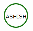
    Here is an example of some text in my circle.
   </div>
  </div>
 </div>
</div>   

You can uncomment the border colours on the container divs to see how it constrains.

Things to be aware of: You can still break the bounds of the circle if you put too much text in or use words/unbroken text that are too long. It's still not a good fit for completely unknown text (such as user input) but works best when you know vaguely what the largest amount of text you'll need to store is and set your circle size and font sizes accordingly. You can set the text container div to hide any overflow of course, but that may just look "broken" and is no replacement for actually accounting for max size properly in your design.

Hope this is useful to someone! HTML/CSS is not my main discipline so I'm sure it can be improved on!

David Burford
  • 791
  • 2
  • 8
  • 17
14

Draw a circle with text in middle with HTML Tag and without CSS

HTML having SVG tag for this. You can follow this standard approach if you don't want to go for CSS.

 <svg width="100" height="100">
   <circle cx="50" cy="50" r="40" stroke="green" stroke-width="4" fill="white" />
     Sorry, your browser does not support inline SVG.
   <text fill="#000000" font-size="18" font-family="Verdana"
     x="15" y="60">ASHISH</text>
 </svg>

enter image description here

Ashish
  • 2,026
  • 17
  • 19
  • 2
    For future reference for casual readers: As be seen in the code and image, the text is centered only because the `font-size`, `font-family`, `x`, and `y` line up. For any one not having Verdana installed it will not be centered. Using `x="50%" y="50%" dominant-baseline="middle" text-anchor="middle"` does not solve the issue either. – LosManos Feb 19 '20 at 08:36
12

I think you want to write text in an oval or circle? why not this one?

<span style="border-radius:50%; border:solid black 1px;padding:5px">Hello</span>
mplungjan
  • 169,008
  • 28
  • 173
  • 236
9

Of course, you have to use to tags to do that. One to create the circle and other for the text.

Here some code may help you

#circle {
    background: #f00;
    width: 200px;
    height: 200px;
    border-radius: 50%;
    color:black;

}
.innerTEXT{
    position:absolute;
    top:80px;
    left:60px;
}

<div id="circle">
    <span class="innerTEXT"> Here a text</span>
</div>

Live example here http://jsbin.com/apumik/1/edit

Update

Here less smaller with a few changes

http://jsbin.com/apumik/3/edit

Ligth
  • 330
  • 1
  • 9
  • thanks! I understand your example better than the one found in the post (http://stackoverflow.com/questions/4801181/vertically-and-horizontally-centering-text-in-circle-in-css-like-iphone-notific) but I'd like to understand why that example is not working for me... – dot May 17 '13 at 18:21
  • it looks like they've done the same thing you're doing, but just combined into one class in the css...? – dot May 17 '13 at 18:22
  • Yes, I just noticed that i did the same. – Ligth May 17 '13 at 18:23
  • Give a secound, ill update my post and my code to make it better :D – Ligth May 17 '13 at 18:24
8

If it's only one line of text you could use the line-height property, with the same value as the element height:

height:100px;
line-height:100px;

If the text has multiple lines, or if the content is variable, you could use the padding-top:

padding-top:30px;
height:70px;

Example: http://jsfiddle.net/2GUFL/

Bruno Gomes
  • 320
  • 1
  • 8
6

For me, only this solution worked for multiline text:

.circle-multiline {
    display: table-cell;
    height: 100px;
    width: 100px;
    text-align: center;
    vertical-align: middle;
    border-radius: 50%;
    background: yellow;
}
<div class="circle-multiline">Hello Wonderful World</div>
Damjan Pavlica
  • 31,277
  • 10
  • 71
  • 76
6

Got this from YouTube page which has a really simple set up. Absolutely maintainable and reusable.

.circle {
    position: absolute;
    top: 4px;
    color: white;
    background-color: red;
    width: 18px;
    height: 18px;
    border-radius: 50%;
    line-height: 18px;
    font-size: 10px;
    text-align: center;
    cursor: pointer;
    z-index: 999;
}
<div class="circle">2</div>
Front-end Developer
  • 400
  • 1
  • 6
  • 17
5

If you are using Foundation 5 and Compass framework, you can try this.

.sass input

$circle-width: rem-calc(25) !default;
$circle-height: $circle-width !default;
$circle-bg: #fff !default;
$circle-radius: 50% !default;
$circle-line-height: $circle-width !default;
$circle-text-align: center !default;

@mixin circle($cw:$circle-width, $ch:$circle-height, $cb:$circle-bg, $clh:$circle-line-height, $cta:$circle-text-align, $cr:$circle-radius) {
    width: $cw;
    height: $ch;
    background: $cb;
    line-height: $clh;
    text-align: $cta;
    @include inline-block;
    @include border-radius($cr);
}

.circle-default {
    @include circle;
}

.css output

.circle-default {
  width: 1.78571rem;
  height: 1.78571rem;
  background: white;
  line-height: 1.78571rem;
  text-align: center;
  display: -moz-inline-stack;
  display: inline-block;
  vertical-align: middle;
  *vertical-align: auto;
  zoom: 1;
  *display: inline;
  -webkit-border-radius: 50%;
  -moz-border-radius: 50%;
  -ms-border-radius: 50%;
  -o-border-radius: 50%;
  border-radius: 50%;
}
Pang
  • 9,564
  • 146
  • 81
  • 122
MagicJoseph
  • 59
  • 1
  • 4
5

HTML:

<div class="circle">
        <p class="inner">HELLO</p>
    </div>

CSS:

.circle { 
background-color: darkgoldenrod;
height: 500px; width: 500px; 
border-radius: 50%;}

.inner {
    position: relative;
    top: 50%;
    text-align: center;
    line-height: 0px;
 
}

The first div class indicates the circle being drawn, you can change the height and width to fit your use.

The inner class represents the location of the text, using position relative allows the text to stay in the circle.

The top 50% centers it vertically, and the text-align centers it horizontally. The line height at 0 just makes it a little crisper or more accurate.

pgfracing
  • 51
  • 1
  • 3
  • Please explain your solution. Answers which do not have an explanation and are only code get flagged as low effort. – cursorrux Sep 09 '21 at 12:57
4

.circle {
  width: 500px;
  height: 500px;
  border-radius: 50%;
  font-size: 50px;
  color: #fff;
  line-height: 500px;
  text-align: center;
  background: #000
}
<div class="circle">Hello I am A CircleHello I am A CircleHello I am A CircleHello I am A CircleHello I am A CircleHello I am A CircleHello I am A CircleHello I am A CircleHello I am A Circle</div>
Hao
  • 49
  • 1
4

Some of solutions here didn't work well for me on small circles. So I made this solution using ol absolute position.

Using SASS will look like this:

.circle-text {
    position: relative;
    display: block;
    text-align: center;
    border-radius: 50%;
    > .inner-text {
        display: block;
        @extend .center-align;
    }
}

.center-align {
    position: absolute;
    top: 50%;
    left: 50%;
    margin: auto;
    -webkit-transform: translateX(-50%) translateY(-50%);
    -ms-transform: translateX(-50%) translateY(-50%);
    transform: translateX(-50%) translateY(-50%);
}

@mixin circle-text($size) {
    width: $size;
    height: $size;
    @extend .circle-text;
}

And can be used like

#red-circle {
    background-color: red;
    border: 1px solid black;
    @include circle-text(50px);
}

#green-circle {
    background-color: green;
    border: 1px solid black;
    @include circle-text(150px);
}

See demo on https://codepen.io/matheusrufca/project/editor/DnYPMK

See the snippet to view output CSS

.circle-text {
  position: relative;
  display: block;
  border-radius: 50%;
  text-align: center;
  min-width: 50px;
  min-height: 50px;
}

.center-align {
  position: absolute;
  top: 50%;
  left: 50%;
  margin: auto;
  -webkit-transform: translateX(-50%) translateY(-50%);
  -ms-transform: translateX(-50%) translateY(-50%);
  transform: translateX(-50%) translateY(-50%);
}
<div id="red-circle" class="circle-text">
  <span class="inner-text center-align">Hey</span>
</div>

<div id="green-circle" class="circle-text">
  <span class="inner-text center-align">Big size circle</span>
  <div>
    <style>
      #red-circle {
        background-color: red;
        border: 1px solid black;
        width: 60px;
        height: 60px;
      }
      
      #green-circle {
        background-color: green;
        border: 1px solid black;
        width: 150px;
        height: 150px;
      }
    </style>
m.rufca
  • 2,558
  • 2
  • 19
  • 26
4

Adding a circle around a number can be easily done with CSS. This can be done using the border-radius property.

Here, we also used the display property set to "inline-block" to represent the element as an inline-level block container.

  span.circle {
  background: #010101;
  border-radius: 50%;
  -moz-border-radius: 50%;
  -webkit-border-radius: 50%;
  color: #f1f1f1;
  display: inline-block;
  font-weight: bold;
  line-height: 40px;
  margin-right: 5px;
  text-align: center;
  width: 40px;
}
 <span class="circle">1</span>
4

do this method you can make the text inside a circle

.cir {
  width: 400px;
  height: 400px;
  background: linear-gradient(to right, blue, orange);/*important*/
  border-radius: 50%;
  display: flex;
  justify-content: center;
  align-items: center;
  font-size: 50px;/*no need*/
  color: white;/*no need*/
  font-family: Arial;/*no need*/
  border: 15px solid red;/*no need*/
  user-select: none;/*no need*/
}
<div class="cir">hello world</div>
tony
  • 61
  • 3
3

Using this code it will be responsive also.

<div class="circle">ICON</div>

.circle {
  position: relative;
  display: inline-block;
  width: 100%;
  height: 0;
  padding: 50% 0;
  border-radius: 50%;
  /* Just making it pretty */
  -webkit-box-shadow: 0 4px 0 0 rgba(0, 0, 0, 0.1);
  box-shadow: 0 4px 0 0 rgba(0, 0, 0, 0.1);
  text-shadow: 0 4px 0 rgba(0, 0, 0, 0.1);
  background: #38a9e4;
  color: white;
  font-family: Helvetica, Arial Black, sans;
  font-size: 48px;
  text-align: center;
}
Ankit Sinha
  • 1,630
  • 1
  • 20
  • 19
2

One way to do it is to use flexbox in order to align the text on the middle. The way I found to do it, is the following:

HTML:

<div class="circle-without-text">
  <div class="text-inside-circle">
    The text
  </div>
</div>

CSS:

.circle-without-text {
    border-radius: 50%;
    width: 70vh;
    height: 70vh;
    background-color: red;
    position: relative;
 }

.text-inside-circle {
    position: absolute;
    top: 0;
    bottom: 0;
    width: 100%;
    display: flex;
    align-items: center;
    justify-content: center;
 }

Here the plnkr: https://plnkr.co/edit/EvWYLNfTb1B7igoc3TZx?p=preview

2

I was combining some answers from other people and with float and relative it gave me the result I needed.

In HTML I use a div. I use it inside a li for a navigation bar.

.large-list-style {
    float: left;
    position: relative;
    top: -8px;

    border-radius: 50%;

    margin-right: 8px;

    background-color: rgb(34, 198, 200);

    font-size: 18px;
    color: white;
}
    .large-list-style:before,
    .large-list-style:after {
        content: '\200B';
        display:inline-block;
        line-height:0;

        padding-top: 50%;
        padding-bottom: 50%;
    }
    .large-list-style:before {
        padding-left: 16px;
    }
    .large-list-style:after {
        padding-right: 16px;
    }
Halfacht
  • 924
  • 1
  • 12
  • 22