157

Problem is described and demonstrated on the following links:

Explanation: Text Clarity in WPF. This link has font comparison.

I would like to collect all possible solutions for this problem. Microsoft Expression Blend uses WPF but fonts look readable.

  • Dark background as in Microsoft Expression Blend
  • Increasing the font size and changing the font (Calibri ... ) [link]
  • Embed windows forms [link]
  • Use GDI+ and/or Windows Forms TextRenderer class to render text to a bitmap, and then render that bitmap as a WPF control. [link]

Are there any more solutions?

This is going to be fixed in VS2010 (and WPF4) beta 2

IT LOOKS LIKE IT HAS BEEN FINALLY SOLVED !

Scott Hanselman's ComputerZen.com: WPF and Text Blurriness, now with complete Clarity

Robert Vuković
  • 4,677
  • 6
  • 31
  • 47

12 Answers12

137

.NET 4 finally has a solution to WPF's poor text rendering quality, but it is well-hidden. Set the following for every window:

TextOptions.TextFormattingMode="Display"

Default value is "Ideal" which is not at all what the name implies.

There are two other options in TextOptions, namely TextHintingMode and TextRenderingMode, but they both have sensible defaults.

Helge Klein
  • 8,829
  • 8
  • 51
  • 71
  • All. Thanks. That helps me to resolve the problem, but you only need to define that once in the container like – Peter Du Mar 20 '11 at 10:37
  • Yes, and if you set it on a window it is valid for everything contained within that window. – Helge Klein Mar 20 '11 at 19:19
  • Spent a lot of time looking for this, at tons of sites and blogs, that go on and on about how much better the text formatting is in VS2010 RTM / .Net 4 (I agree, it is!). But none of them cared to mention how you could make WPF-applications you build with it, look that good too. Why is that property so well-hidden? Thank you very much. – M-Peror Jan 10 '12 at 14:12
  • Oh my... this makes a world of difference! – Roman Starkov Jan 31 '12 at 16:11
  • Cheers for that, that's made my controls look a lot better. – GrandMasterFlush Feb 07 '12 at 10:47
  • Perfect! The solution I was searching for. Looks so much more crisp. – BlueM Sep 17 '12 at 14:51
  • 5
    All I want is this! I really don't care how sophisticated the WPF rendering is, the fonts are just unacceptable to anyone. – OKEEngine May 06 '13 at 06:51
  • For me, `TextFormattingMode="Ideal"` (as per default) and `TextHintingMode="Fixed"` worked best. It's still not perfect though. – Danny Beckett Sep 06 '13 at 00:37
  • Brilliant! Works like a charm. You've relieved so much insane headache for me. – B.K. Feb 03 '14 at 21:51
  • 1
    "Ideal" works for me, instead of "Display". The project is on .NET 4.6.2. Maybe they fixed the confused name. – joe Dec 13 '17 at 06:23
109

Technical background

There is a in-depth article about WPF Text rendering from one of the WPF Text Program Managers on windowsclient.net: Text Clarity in WPF.

The problem boils down to WPF needing a linearly scaling font-renderer for smooth animations. Pure ClearType on the other hand takes quite a bit of freedom with the font to push vertical stems into the next pixel.

The difference is obvious if one compares the classic "cascade" pattern. WinForms on the lower left side, WPF on the top right side:


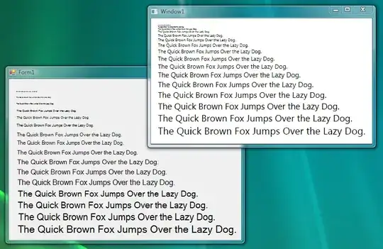
(source: black.co.at)

While I'm no fan of WPF's font rendering idiosyncrasies either, I can imagine the clamor if the animations would jump like they do in the Winforms cascade.

Playing with the registry

Of special interest to me was the link to the MSDN article "ClearType Registry Settings", which explains the possible user-side adjustments in the registry:

  • ClearType level: amount of subpixel hinting
  • Gamma level
  • Pixel structure: how the color stripes in a display-pixel are arranged
  • Text contrast level: adjusts the width of glyph stems to make the font heavier

Playing around with these settings didn't really improve the underlying problem, but can help by reducing the color bleeding effect for sensitive users.

Another approach

The best advice the Text Clarity article gave was increasing the font size and changing the font. Calibri works for me better than the standard Segoe UI. Due to its popularity as web font, I tried Verdana too, but it has a nasty jump in weight between 14pt and 15pt which is very visible when animating the font size.

WPF 4.0

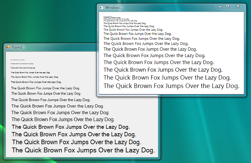
WPF 4 will have improved support for influencing the rendering of fonts. There is an article on the WPF Text Blog explaining the changes. Most prominently, there are now (at least) three different kinds of text rendering:

text rendering comparison
(source: windows.net)

<grumble>That should be enough rope for every designer.</grumble>

Glorfindel
  • 21,988
  • 13
  • 81
  • 109
David Schmitt
  • 58,259
  • 26
  • 121
  • 165
  • 11
    excellent explanation, +1. Probably explains why Flash has such horrid font rendering as well. – Jeff Atwood Oct 10 '08 at 09:12
  • 1
    Yes. That's a good explanation, but I still wish there was a way to turn on font hinting for a nice look when you know you aren't going to animate. I suppose that this would imply a given scale for which you're optimizing the hinting. This kind of stuff makes WPF seem still beta-version to me. – PeterAllenWebb Dec 05 '08 at 16:10
  • It's not like the "scalable" variant doesn't use font hinting, it's just that WPF doesn't optimize for hitting the pixel grid, like ClearType does. Arguably SnapToDevicePixels should work for text, but this would always have to be inherited because a control cannot know whether it may snap or not. – David Schmitt Dec 08 '08 at 12:33
  • 2
    Especially relevant is the TextOptions.TextFormattingMode attached property (http://msdn.microsoft.com/en-us/library/ee169597.aspx). WPF4 and Silverlight also have the UseLayoutRounding ( http://msdn.microsoft.com/en-us/library/dd783605.aspx) and SnapsToDevicePixels (http://msdn.microsoft.com/en-us/library/system.windows.uielement.snapstodevicepixels.aspx) properties. – Pat Mar 23 '11 at 20:37
  • @All: I cannot find a way to disable the anti-aliasing of text in WPF3.5 and as a result label or button text looks really bad. Ideally I'd like to disable anti aliasing globally for fonts. How can I accomplish this? – SharpUrBrain Apr 19 '11 at 12:12
  • @DavidSchmitt Does it exist any solution for this issue in uwp, Actually I have the same issue here in my application and I am using uwp with VS2015 – je30ca Oct 24 '16 at 10:16
  • Here is the original image (now 404): https://web.archive.org/web/20161229180247if_/https://club.black.co.at/david/pics/Fontcascade.png – Patrick Feb 01 '22 at 10:52
44

I encountered a problem the other day when I used a border which had a DropShadowEffect applied. The result was that all text inside that border was extremely blurry. It doesn't matter if text was inside other panels or directly under the border - any text block that is child of parent that has an Effect applied seems to be affected.

The solution to this particular case was to not put stuff inside the border that has effects, but instead use a grid (or anything else that supports putting content on top of each other) and place a rectangle in the same cell as the text (i.e. as a sibling in the visual tree) and put the effects on that.

Like so:

<!-- don't do this --->
<Border>
     <Border.Effect>
          <DropShadowEffect BlurRadius="25" ShadowDepth="0" Opacity="1"/>
     </Border.Effect>
     <TextBlock Text="This Text Will Be Blurry" />
</Border>

<!-- Do this instead -->
<Grid>
  <Rectangle>
     <Rectangle.Effect>
          <DropShadowEffect BlurRadius="25" ShadowDepth="0" Opacity="1"/>
     </Rectangle.Effect>
  </Rectangle>
  <TextBlock Text="This Text Will Be Crisp and Clear" />
</Grid>
Isak Savo
  • 34,957
  • 11
  • 60
  • 92
  • This done the trick nicely. Bit of a hack, but better than messing around with settings etc. Nice one. thanks. One thing I had to do however, was set the fill of the rectangle to something. Maybe this was just my setup though. – HAdes Jan 25 '10 at 15:46
  • Yeah you're right.. the rectangle is by default transparent which makes the drop shadow look weird. – Isak Savo Mar 10 '11 at 19:49
  • this is not happening in My sample application, I am using WPF 3.5 – SharpUrBrain Apr 19 '11 at 12:07
  • @SharpUrBrain: what isn't happening? Is it still blurry even after using my second example? – Isak Savo Apr 21 '11 at 11:30
  • Yes, It is still blurry after using your second example also – SharpUrBrain Apr 25 '11 at 06:49
  • In my WPF app, I faced lots of annoying blurry texts here and there, which drove me crazy (banging head). Then I found this post and simply Searched and deleted ALL occurrence of . Aaah, all those blurry issues are gone. Well, I did not realize any benefit of this Element. Rather, getting rid of the blurriness was my ultimate benefit over whatever fanciness could be done by that DropShadowEffect. – Emran Hussain Apr 27 '18 at 07:32
  • This ended up being the only thing I could get to work. All of the extra properties and tricks others mentioned did nothing for me. In fact, some even made it seem worse. – DonBoitnott Jun 03 '19 at 19:50
  • While I can't believe this is still an issue in WPF, this worked perfect for me! – Ethan Aug 12 '19 at 20:20
10

This is going to be fixed in VS2010 (and WPF4) beta 2.

enter image description here

Glorfindel
  • 21,988
  • 13
  • 81
  • 109
Pavel Minaev
  • 99,783
  • 25
  • 219
  • 289
7

I don't see it as a bug, but the default configuration is indeed very annoying. Here's a comparision of all the combinations of

TextOptions.TextRenderingMode
TextOptions.TextFormattingMode
RenderOptions.ClearTypeHint

SnapToDevicePixels doesn't make any differente in text rendering.

https://i.stack.imgur.com/cS3S2.png

I prefer:

TextOptions.TextRenderingMode="Auto"
TextOptions.TextFormattingMode="Ideal"
RenderOptions.ClearTypeHint="Auto"

where vertical lines are never blurry.

The font used is Open Sans Light, that can be really beautifull if it's well used, like in latest TeamViewer.

For those using Mahapps.Metro, the problem is the TransitioningContentControl https://github.com/MahApps/MahApps.Metro/issues/889

Rahil Wazir
  • 10,007
  • 11
  • 42
  • 64
Gabriel
  • 2,170
  • 1
  • 17
  • 20
6

SnapToDevicePixels only applies to WPF shapes (lines etc), not to text renderer.

There is no known workaround to this issue. According to Microsoft, the behavior is "by design".

Also see this thread on Microsoft forums discussing the problems - it has gotten a few replies from MS guys which clarify their position on the issue.

  • Fixed in WPF 4 using the TextOptions.TextFormattingMode attached property (http://msdn.microsoft.com/en-us/library/ee169597.aspx). – Pat Mar 23 '11 at 20:39
  • 1
    The property name is "SnapsToDevicePixels" and not "SnapToDevicePixels" as written. – Nir Kornfeld Oct 16 '18 at 05:38
6

From a developer's point, the only known "workaround" to date is to use GDI+ and/or Windows Forms TextRenderer class to render text to a bitmap, and then render that bitmap as a WPF control. Aside from obvious performance implications, this doesn't alleviate the problem for existing applications.

I have now created a Microsoft Connect ticket for this issue (to my surprise, despite all the negativity, there was no actual bug report in the designated tracker).

Since that is one of the official channels of communicating requests and questions to Microsoft, I would advise also going through it for a quicker answer. At least, if you wish for the issue to be addressed one way or another, voting for that ticket there and/or validating the issue will help to draw the attention of Microsoft PMs and engineers to this problem, and possibly raise its perceived priority.

David Schmitt
  • 58,259
  • 26
  • 121
  • 165
4

Just tried out VS2010 beta, which is all done in WPF, and it suffers BADLY from the blurry-font issue. Particularly on tooltips.

That seems to give some evidence that WPF4 will in fact not solve the problem (if anything it looks worse)

Orion Edwards
  • 121,657
  • 64
  • 239
  • 328
  • 3
    I am filing bugs against VS2010B1 for each place in the UI the text is blurry. The tooltips are almost comically bad, I agree. Given how explicitly it's been said this was to be fixed in WPF4, I can only hope that it just didn't make the cut for this beta. – Will Dean May 21 '09 at 21:23
4

Wow, I can't believe I finally got my WPF fonts readable. And I also can't believe there is no option dialog to make these changes easy while the default values are horrible on my display.

These registry settings (in decimal) worked for me and come closest to my regular cleartype font:

  • ClearTypeLevel: 10 (mostly greyscale aliasing)
  • GammaLevel: 1300 (higher gamma made the font too thin and I was seeing the colors in the aliasing)
VVS
  • 19,405
  • 5
  • 46
  • 65
3

They say "SnapToDevicePixels = true" works, but I've never seen any good results.

I combat the blurred text by switching to a different font.

Obviously this is not a solution to the problem, however this is how I've worked around it.

Inisheer
  • 20,376
  • 9
  • 50
  • 82
  • I just compared a TextBlock with SnapToDevicePixels="true" with one without and there was _no_ difference with the Segoe UI Font at 12duis. May I ask what fonts you use? – David Schmitt Oct 10 '08 at 07:15
  • We also made the situation better by switching our font. The font we chose was Avenir (I don't think it is installed by default, at least not on Windows XP). – cplotts Oct 10 '08 at 17:22
1

If you prefer to use a C# base class to customizing windows for your app (or now have a reason to), here's how you set can set the text formatting to use the appealing Display mode:

public class SnappyWindow : Window
{
    public SnappyWindow()
    {
        SetValue(TextOptions.TextFormattingModeProperty, TextFormattingMode.Display);
    }
}
Edward Brey
  • 40,302
  • 20
  • 199
  • 253
1

What worked for me (As done in tweetz and after looking again here, as Pat stated in his comment) is setting UseLayoutRounding="True" in my window.
UseLayoutRounding documentation rounds the different layout sizes in order to draw on the device pixels. As the documentation states:

Drawing objects on pixel boundaries eliminates the semi-transparent edges that are produced by anti-aliasing when an edge falls in the middle of a device pixel.

A good answer that explains the difference between UseLayoutRounding and SnapToDevicePixels property is this.

erez
  • 35
  • 7