1273

There will be a 4 pixel wide space between these span elements:

span {
  display: inline-block;
  width: 100px;
  background-color: palevioletred;
}
<p>
  <span> Foo </span>
  <span> Bar </span>
</p>

Fiddle Demo

I understand that I could get rid of that space by removing the white-space between the span elements in the HTML:

<p>
  <span> Foo </span><span> Bar </span>
</p>

I'm Looking for a CSS solution that doesn't involve:

  • Altering the HTML.
  • JavaScript.
Zach Jensz
  • 3,650
  • 5
  • 15
  • 30
Šime Vidas
  • 182,163
  • 62
  • 281
  • 385

41 Answers41

1186

Alternatively, you should now use flexbox to achieve many of the layouts that you may previously have used inline-block for: https://css-tricks.com/snippets/css/a-guide-to-flexbox/


Since this answer has become rather popular, I'm rewriting it significantly.

Let's not forget the actual question that was asked:

How to remove the space between inline-block elements? I was hoping for a CSS solution that doesn't require the HTML source code to be tampered with. Can this issue be solved with CSS alone?

It is possible to solve this problem with CSS alone, but there are no completely robust CSS fixes.

The solution I had in my initial answer was to add font-size: 0 to the parent element, and then declare a sensible font-size on the children.

http://jsfiddle.net/thirtydot/dGHFV/1361/

This works in recent versions of all modern browsers. It works in IE8. It does not work in Safari 5, but it does work in Safari 6. Safari 5 is nearly a dead browser (0.33%, August 2015).

Most of the possible issues with relative font sizes are not complicated to fix.

However, while this is a reasonable solution if you specifically need a CSS only fix, it's not what I recommend if you're free to change your HTML (as most of us are).


This is what I, as a reasonably experienced web developer, actually do to solve this problem:

<p>
    <span>Foo</span><span>Bar</span>
</p>

Yes, that's right. I remove the whitespace in the HTML between the inline-block elements.

It's easy. It's simple. It works everywhere. It's the pragmatic solution.

You do sometimes have to carefully consider where whitespace will come from. Will appending another element with JavaScript add whitespace? No, not if you do it properly.

Let's go on a magical journey of different ways to remove the whitespace, with some new HTML:

<ul>
    <li>Item 1</li>
    <li>Item 2</li>
    <li>Item 3</li>
</ul>
  • You can do this, as I usually do:

     <ul>
         <li>Item 1</li><li>Item 2</li><li>Item 3</li>
     </ul>
    

http://jsfiddle.net/thirtydot/dGHFV/1362/

  • Or, this:

     <ul>
         <li>Item 1</li
         ><li>Item 2</li
         ><li>Item 3</li>
     </ul>
    
  • Or, use comments:

     <ul>
         <li>Item 1</li><!--
         --><li>Item 2</li><!--
         --><li>Item 3</li>
     </ul>
    
  • Or, if you are using using PHP or similar:

     <ul>
         <li>Item 1</li><?
         ?><li>Item 2</li><?
         ?><li>Item 3</li>
     </ul>
    
  • Or, you can even skip certain closing tags entirely (all browsers are fine with this):

     <ul>
         <li>Item 1
         <li>Item 2
         <li>Item 3
     </ul>
    

Now that I've gone and bored you to death with "one thousand different ways to remove whitespace, by thirtydot", hopefully you've forgotten all about font-size: 0.

thirtydot
  • 224,678
  • 48
  • 389
  • 349
  • 11
    this solution only works if you dont work with EMs for your container sizes – meo Jun 26 '12 at 14:40
  • 7
    This breaks child elements with relative font-sizes. – Daniel Jan 15 '13 at 11:30
  • 4
    Everyone criticizing this answer for not being perfect needs to remember that using inline-blocks for (horizontal) block layout is their first mistake to begin with. Of course these solutions are going to be hacky, of course they're not going to work in every situation - when you're using inline-block for something it was never intended for, it's either your fault for using it or CSS's fault for not offering any good alternatives at the time, but not this answerer's fault that their workarounds aren't ideal. – BoltClock Feb 10 '18 at 05:50
  • 2
    @Christopher Alun Lewis: That's because the *premise* of the question (not this answer) *is* fundamentally wrong to begin with. The whole point of inline layout is for whitespace to do what it does best: separate words, or in this case atomic inlines. Treating whitespace as a problem that needs to be removed from a layout that uses inline-blocks, rather than as a *feature*, is like treating text wrapping around a float as a problem when it's the whole *point* of floating. Even so, inadequate as they both are, floats at least have the advantage over inline-blocks of actually being block layout. – BoltClock Feb 10 '18 at 05:56
  • 2
    Care to edit your answer one more time? Flexbox is the definitive solution in 2021 (as other answers reflect); you could simply move that detail from the bottom to the top. – Matt Montag Nov 23 '21 at 20:18
173

For CSS3 conforming browsers there is white-space-collapsing:discard

see: http://www.w3.org/TR/2010/WD-css3-text-20101005/#white-space-collapsing

Josh Crozier
  • 233,099
  • 56
  • 391
  • 304
HBP
  • 15,685
  • 6
  • 28
  • 34
  • 62
    This was removed from Text Level 3, but Text Level 4 has [`text-space-collapse`](https://drafts.csswg.org/css-text-4/#white-space-collapsing)`:`[`discard`](https://drafts.csswg.org/css-text-4/#valdef-text-space-collapse-discard). It's 2016 already and still no support. – Oriol Jan 04 '16 at 15:53
  • 4
    Seems obsolete. CSS is not available in Chrome (built May 2022). – Avatar May 08 '22 at 07:02
  • Even the later version mentioned by Oriol [isn't suppported](https://caniuse.com/sr_text-space-collapse). Please consider deleting or reformulating. – isherwood Jul 25 '23 at 18:09
113

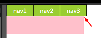
Today, we should just use Flexbox.


OLD ANSWER:

OK, although I've upvoted both the font-size: 0; and the not implemented CSS3 feature answers, after trying I found out that none of them is a real solution.

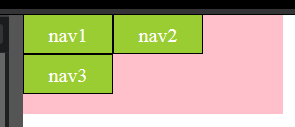
Actually, there is not even one workaround without strong side effects.

Then I decided to remove the spaces (this answers is about this argument) between the inline-block divs from my HTML source (JSP), turning this:

<div class="inlineBlock">
    I'm an inline-block div
</div>
<div class="inlineBlock">
    I'm an inline-block div
</div>

to this

<div class="inlineBlock">
    I'm an inline-block div
</div><div class="inlineBlock">
    I'm an inline-block div
</div>

that is ugly, but working.

But, wait a minute... what if I'm generating my divs inside Taglibs loops (Struts2, JSTL, etc...) ?

For example:

<s:iterator begin="0" end="6" status="ctrDay">
    <br/>
    <s:iterator begin="0" end="23" status="ctrHour">
        <s:push value="%{days[#ctrDay.index].hours[#ctrHour.index]}">
            <div class="inlineBlock">
                I'm an inline-block div in a matrix 
                (Do something here with the pushed object...)
           </div>
       </s:push>
    </s:iterator>
</s:iterator>

It is absolutely not thinkable to inline all that stuff, it would mean

<s:iterator begin="0" end="6" status="ctrDay">
    <br/>
    <s:iterator begin="0" end="23" status="ctrHour"><s:push value="%{days[#ctrDay.index].hours[#ctrHour.index]}"><div class="inlineBlock">
                I'm an inline-block div in a matrix             
                (Do something here with the pushed object...)
           </div></s:push></s:iterator>
</s:iterator>

That is not readable, hard to maintain and understand, etc.

The solution I found:

use HTML comments to connect the end of one div to the begin of the next one!

<s:iterator begin="0" end="6" status="ctrDay">
   <br/>
   <s:iterator begin="0" end="23" status="ctrHour"><!--
    --><s:push value="%{days[#ctrDay.index].hours[#ctrHour.index]}"><!--
        --><div class="inlineBlock">
                I'm an inline-block div in a matrix             
                (Do something here with the pushed object...)
           </div><!--
    --></s:push><!--
--></s:iterator>
</s:iterator>

This way you will have a readable and correctly indented code.

And, as a positive side effect, the HTML source, although infested by empty comments, will result correctly indented;

let's take the first example. In my humble opinion, this:

    <div class="inlineBlock">
        I'm an inline-block div
    </div><!--
 --><div class="inlineBlock">
        I'm an inline-block div
    </div>

is better than this:

    <div class="inlineBlock">
         I'm an inline-block div
    </div><div class="inlineBlock">
         I'm an inline-block div
    </div>
Andrea Ligios
  • 49,480
  • 26
  • 114
  • 243
84

Add display: flex; to the parent element. Here is the solution with a prefix:

Simplified version

p {
  display: flex;
}

span {
  width: 100px;
  background: tomato;
  font-size: 30px;
  color: white;
  text-align: center;
}
<p>
  <span> Foo </span>
  <span> Bar </span>
</p>

Fix with prefix

p {
  display: -webkit-box;
  display: -webkit-flex;
  display: -ms-flexbox;
  display: flex;
}
span {
  float: left;
  display: inline-block;
  width: 100px;
  background: blue;
  font-size: 30px;
  color: white;
  text-align: center;
}
<p>
  <span> Foo </span>
  <span> Bar </span>
</p>
Mo.
  • 26,306
  • 36
  • 159
  • 225
  • 1
    I am getting unexpected behaviour when the contents of the span are longer than one word - for example. the following displays the span contents in long columns, not 'normal' flowing lines of text: `
    Lorem ipsum dolor sit amet, consectetur adipiscing elitDonec mollis nulla vel dignissim varius, aliquam tempor elit eget ante viverra ultrices
    ` note: i have replaced `

    ` with a container div - [jsFiddle link is here](https://jsfiddle.net/rwone/nx5042zy)

    – user1063287 Aug 05 '20 at 07:53
  • 1
    Added display:flex to the main div for a wordpress menu and that made the spacing go away – carnini Feb 23 '22 at 21:34
55

All the space elimination techniques for display:inline-block are nasty hacks...

Use Flexbox

It's awesome, solves all this inline-block layout bs, and as of 2017 has 98% browser support (more if you don't care about old IEs).

Yarin
  • 173,523
  • 149
  • 402
  • 512
  • 1
    nasty hack may be, but font-size:0 works on 100% of the browsers, and applying display: inline-flex still doesn't get rid of the extra whitespace, even on a browser that does support it! – patrick Jun 19 '16 at 21:50
  • @patrick Flexbox definitely solves the problem, you're just doing it wrong. inline-flex is not meant to display flex items inline- it applies only to containers. See http://stackoverflow.com/a/27459133/165673 – Yarin Apr 27 '17 at 01:57
  • 9
    "font-size:0" **does not** work on 100% browsers. (minimum font size browser settings). And this answer is really good. – ViliusL Apr 04 '18 at 13:23
50

Add comments between elements to NOT have a white space. For me it is easier than resetting font size to zero and then setting it back.

<div>
    Element 1
</div><!--
--><div>
    Element 2
</div>
Radek
  • 3,913
  • 3
  • 42
  • 37
  • the answer was written in 2013. And while flexbox is not an answer on the question this one is neither but working too: https://stackoverflow.com/a/37512227/1019850 – David Mar 28 '20 at 18:18
33

2021 Solution

Unfortunately white-space-collapse is still not implemented.

In the meantime, give the parent element font-size: 0; and set the font-size on the children. This should do the trick

dipole_moment
  • 5,266
  • 4
  • 39
  • 55
32

This is the same answer I gave over on the related: Display: Inline block - What is that space?

There’s actually a really simple way to remove whitespace from inline-block that’s both easy and semantic. It’s called a custom font with zero-width spaces, which allows you to collapse the whitespace (added by the browser for inline elements when they're on separate lines) at the font level using a very tiny font. Once you declare the font, you just change the font-family on the container and back again on the children, and voila. Like this:

@font-face{ 
    font-family: 'NoSpace';
    src: url('../Fonts/zerowidthspaces.eot');
    src: url('../Fonts/zerowidthspaces.eot?#iefix') format('embedded-opentype'),
         url('../Fonts/zerowidthspaces.woff') format('woff'),
         url('../Fonts/zerowidthspaces.ttf') format('truetype'),
         url('../Fonts/zerowidthspaces.svg#NoSpace') format('svg');
}

body {
    font-face: 'OpenSans', sans-serif;
}

.inline-container {
    font-face: 'NoSpace';
}

.inline-container > * {
    display: inline-block;
    font-face: 'OpenSans', sans-serif;
}

Suit to taste. Here’s a download to the font I just cooked up in font-forge and converted with FontSquirrel webfont generator. Took me all of 5 minutes. The css @font-face declaration is included: zipped zero-width space font. It's in Google Drive so you'll need to click File > Download to save it to your computer. You'll probably need to change the font paths as well if you copy the declaration to your main css file.

Community
  • 1
  • 1
JPC
  • 783
  • 7
  • 6
  • 1
    I saw you post this in **CSS Tricks** I think, and for me this is a *great* answer. It's lightweight, easy to implement and cross-browser (so far as my tests have shown). I was totally going with flexbox until I realised that Firefox won't support `flex-wrap` until at least v28 (*srsly?*), but this is a perfect fallback until then. – indextwo Jan 23 '14 at 21:03
  • 18
    This is the worst case of overkill I saw in a long while. Download an entire font just to remove a space? Geez. – Mr Lister Nov 04 '15 at 13:27
  • 3
    @MrLister you do realise that such font file is tiny one? It doesn't havy any glyphs inside. I would argue to rather include it base64 encoded anyway so we get rid of the request as well. – Robert Koritnik Feb 14 '18 at 15:46
  • This has the same fatal flaw as icon fonts, i.e. it will not work when Web fonts are either blocked (e.g. for bandwidth or security reasons) or overwritten by custom fonts (e.g. due to health causes, such as dyslexia, etc.). – tomasz86 Oct 01 '19 at 05:56
25

Two more options based on CSS Text Module Level 3 (instead of white-space-collapsing:discard which had been dropped from the spec draft):

  • word-spacing: -100%;

In theory, it should do exactly what is needed — shorten whitespaces between 'words' by the 100% of the space character width, i.e. to zero. But seems not to work anywhere, unfortunately, and this feature is marked 'at risk' (it can be dropped from the specification, too).

  • word-spacing: -1ch;

It shortens the inter-word spaces by the width of the digit '0'. In a monospace font it should be exactly equal to the width of the space character (and any other character as well). This works in Firefox 10+, Chrome 27+, and almost works in Internet Explorer 9+.

Fiddle

Peter Mortensen
  • 30,738
  • 21
  • 105
  • 131
Ilya Streltsyn
  • 13,076
  • 2
  • 37
  • 57
  • +1 for word-spacing, although -0.5ch is the right value, with -1ch text without spaces won't be readable, -0.5ch behaves just like font-size: 0; with explicit set size at text elements. :) – Dennis98 Oct 27 '15 at 08:55
  • 7
    @Dennis98, -1ch works only for monospace fonts (like Courier New), because all their characters have the same width, including `' '` and `'0'`. In non-monospace fonts there is no all-suitable magic proportion between widths of `' '` and `'0'` characters, so `ch` isn't much helpful at all. – Ilya Streltsyn Nov 13 '15 at 12:12
  • instead of `word-spacing`, we could use `letter-spacing` with an arbitrary large negative value as shown in [my answer](http://stackoverflow.com/a/41719076/2803565) – S.Serpooshan Jan 18 '17 at 12:14
18

Use flexbox and do a fallback (from suggestions above) for older browsers:

ul {
    display: -webkit-box;
    display: -moz-box;
    display: -ms-flexbox;
    display: -webkit-flex;
    display: flex;
}
Peter Mortensen
  • 30,738
  • 21
  • 105
  • 131
Plippie
  • 2,836
  • 33
  • 28
18

Simple:

item {
  display: inline-block;
  margin-right: -0.25em;
}

There is no need to touch the parent element.

Only condition here: the item's font-size must not be defined (must be equal to parent's font-size).

0.25em is the default word-spacing

W3Schools - word-spacing property

Peter Mortensen
  • 30,738
  • 21
  • 105
  • 131
Martin Schneider
  • 14,263
  • 7
  • 55
  • 58
  • 3
    0.25em is not the "default word-spacing", it's the width of the whitespace character in Times New Roman font that just happens to be the default font in some popular OSes. Other popular fonts like Helvetica often have wider whitespace character, so removing only 0.25em from them would be insufficient to get rid of the gaps. – Ilya Streltsyn Dec 23 '19 at 06:29
  • Yes working with negative margins is simple and the only thing that actually worked in my case. – Andreas Aug 27 '20 at 08:47
  • Solved mine too! – aldemarcalazans Jul 18 '23 at 19:21
18

Though, technically not an answer to the question: "How do I remove the space between inline-block elements?"

You can try the flexbox solution and apply the code below and the space will be remove.

p {
   display: flex;
   flex-direction: row;
}

You can learn more about it on this link: https://css-tricks.com/snippets/css/a-guide-to-flexbox/

Cyan Baltazar
  • 3,462
  • 1
  • 17
  • 11
  • While _technically_ not an answer to "can I do this with inline-block" this seems to me to be an elegant solution... – Lucas Feb 24 '17 at 21:21
15

font-size:0; can be a bit trickier to manage...

I think the following couple lines is a lot better and more re-usable, and time saver than any other methods. I personally use this:

.inline-block-wrapper>.inline-block-wrapper,
.inline-block-wrapper{letter-spacing: -4px;}
.inline-block-wrapper>*{letter-spacing: 0;display: inline-block;}

/* OR better shorter name...*/
.items>.items,
.items{letter-spacing: -4px;}
.items>*{letter-spacing: 0;display: inline-block;}

Then you can use it as following...

<ul class="items">
   <li>Item 1</li>
   <li>Item 2</li>
   <li>Item 3</li>
</ul>

As far I as I know (I may be wrong) but all browsers support this method.

EXPLANATION:

This works (maybe -3px may be better) exactly as you would anticipate it to work.

  • you copy and paste the code (once)
  • then on your html just use class="items" on the parent of each inline-block.

You will NOT have the need to go back to the css, and add another css rule, for your new inline blocks.

Solving two issues at once.

Also note the > (greater than sign) this means that */all children should be inline-block.

http://jsfiddle.net/fD5u3/

NOTE: I have modified to accommodate to inherit letter-spacing when a wrapper has a child wrapper.

Eric
  • 6,563
  • 5
  • 42
  • 66
Val
  • 17,336
  • 23
  • 95
  • 144
  • instead of `-4px` for `letter-spacing` which may be not enough for large font-sizes [eg: see this fiddle](http://jsfiddle.net/fD5u3/10/), we could use a larger value as in [my post](http://stackoverflow.com/a/41719076/2803565) – S.Serpooshan Jan 23 '17 at 10:52
13

Generally we use elements like this in different lines, but in case of display:inline-block using tags in same line will remove the space, but in a different line will not.

An example with tags in a different line:

p span {
  display: inline-block;
  background: red;
}
<p>
  <span> Foo </span>
  <span> Bar </span>
</p>

Example with tags in same line

p span {
  display: inline-block;
  background: red;
}
<p>
  <span> Foo </span><span> Bar </span>
</p>

Another efficient method is a CSS job that is using font-size:0 to the parent element and give font-size to a child element as much as you want.

p {
  font-size: 0;
}
p span {
  display: inline-block;
  background: red;
  font-size: 14px;
}
<p>
  <span> Foo </span>
  <span> Bar </span>
</p>

The above methods may not work somewhere depending on the whole application, but the last method is a foolproof solution for this situation and can be used anywhere.

Peter Mortensen
  • 30,738
  • 21
  • 105
  • 131
Gaurav Aggarwal
  • 9,809
  • 6
  • 36
  • 74
  • a disadvantage for this method is that we need to know and repeat the default font-size (eg 14px) to set it back to normal in child elements! – S.Serpooshan Jan 23 '17 at 04:29
13

I'm not pretty sure if you want to make two blue spans without a gap or want to handle other white-space, but if you want to remove the gap:

span {
    display: inline-block;
    width: 100px;
    background: blue;
    font-size: 30px;
    color: white;
    text-align: center;

    float: left;
}

And done.

Peter Mortensen
  • 30,738
  • 21
  • 105
  • 131
FlyC
  • 1,844
  • 1
  • 15
  • 18
11

I had this problem right now and from font-size:0; I've found that in Internet Explorer 7 the problem remains because Internet Explorer thinks "Font Size 0?!?! WTF are you crazy man?" - So, in my case I've Eric Meyer's CSS reset and with font-size:0.01em; I have a difference of 1 pixel from Internet Explorer 7 to Firefox 9, so, I think this can be a solution.

Peter Mortensen
  • 30,738
  • 21
  • 105
  • 131
9

p {
  display: flex;
}
span {
  float: left;
  display: inline-block;
  width: 100px;
  background: red;
  font-size: 30px;
  color: white;
}
<p>
  <span> hello </span>
  <span> world </span>
</p>
wsc
  • 916
  • 7
  • 10
  • 1
    While this code snippet may solve the question, [including an explanation](https://meta.stackexchange.com/questions/114762/explaining-entirely-code-based-answers) really helps to improve the quality of your post. Remember that you are answering the question for readers in the future, and those people might not know the reasons for your code suggestion. Please also try not to crowd your code with explanatory comments, this reduces the readability of both the code and the explanations! – Box Box Box Box Jun 09 '16 at 12:40
  • I guess that `float` and `display:inline-block` for `span`s were meant to be fallbacks for the case if `flex` is not supported, but `float` would effectively discard the effect of `inline-block`, so the latter seems redundant. – Ilya Streltsyn Dec 23 '19 at 06:26
8

The simplest answer to this question is to add.

css

float: left;

codepen link: http://jsfiddle.net/dGHFV/3560/

Gokul
  • 117
  • 1
  • 4
7

I’ve been tackling this recently and instead of setting the parent font-size:0 then setting the child back to a reasonable value, I’ve been getting consistent results by setting the parent container letter-spacing:-.25em then the child back to letter-spacing:normal.

In an alternate thread I saw a commenter mention that font-size:0 isn’t always ideal because people can control minimum font sizes in their browsers, completely negating the possibility of setting the font-size to zero.

Using ems appears to work regardless of whether the font-size specified is 100%, 15pt or 36px.

http://cdpn.io/dKIjo

StephenESC
  • 390
  • 4
  • 10
7

I think there is a very simple/old method for this which is supported by all browsers even IE 6/7. We could simply set letter-spacing to a large negative value in parent and then set it back to normal at child elements:

body { font-size: 24px }
span { border: 1px solid #b0b0c0; } /* show borders to see spacing */

.no-spacing { letter-spacing: -1em; } /* could be a large negative value */
.no-spacing > * { letter-spacing: normal; } /* => back to normal spacing */
<p style="color:red">Wrong (default spacing):</p>

<div class="">
  <span>Item-1</span>
  <span>Item-2</span>
  <span>Item-3</span>
</div>

<hr/>

<p style="color:green">Correct (no-spacing):</p>

<div class="no-spacing">
  <span>Item-1</span>
  <span>Item-2</span>
  <span>Item-3</span>
</div>
S.Serpooshan
  • 7,608
  • 4
  • 33
  • 61
  • same thing happening here u need to set `letter-spacing:normal` in all the child elements. – Gaurav Aggarwal Jan 23 '17 at 05:49
  • @GauravAggarwal but `letter-spacing` is 99.99% of the times as `normal`. the font-size has not such a fixed value and highly depends on design. it could be a small value or large value based on the font-family and other things... I never remember in my life to see/use a special value (other than 0/normal) for `letter-spacing`, so i think it is safer and better choise – S.Serpooshan Jan 23 '17 at 05:58
  • i disagree with this...using letter spacing to normal with all the elements and using font-size too (If needed) is not at all usefull as u r writing double code where u need to change font size. Using font size will not make double code and can be used o standard size and any other custom size. I suggest you to do google and check using font size is most acceptable thing these days. Solution changes with time :) – Gaurav Aggarwal Jan 23 '17 at 06:21
  • i can't understand what you mean by _"...and using font-size too (If needed) is not at all usefull as u r writing double code where u need to change font size."_ in my post, there is no font-size setting! all i did is letter-spacing which usually nobody set it in his css (it is always normal). ans as we don't change font-size, we don't need to know original font-size to set it back – S.Serpooshan Jan 23 '17 at 09:26
  • I suppose this method didn't become popular before because it didn't work in Opera/Presto. And currently we have other options that don't need such workarouns, e.g. using Flexbox instead of inline-blocks. – Ilya Streltsyn Aug 08 '17 at 15:50
4

With PHP brackets:

ul li {
  display: inline-block;
}
    <ul>
        <li>
            <div>first</div>
        </li><?
        ?><li>
            <div>first</div>
        </li><?
        ?><li>
            <div>first</div>
        </li>
    </ul>
Peter Mortensen
  • 30,738
  • 21
  • 105
  • 131
Alexufo
  • 1,723
  • 1
  • 15
  • 30
2

I'm going to expand on user5609829's answer a little bit as I believe the other solutions here are too complicated/too much work. Applying a margin-right: -4px to the inline block elements will remove the spacing and is supported by all browsers. See the updated fiddle here. For those concerned with using negative margins, try giving this a read.

Box Box Box Box
  • 5,094
  • 10
  • 49
  • 67
Jrd
  • 668
  • 6
  • 9
2

Add white-space: nowrap to the container element:

CSS:

* {
    box-sizing: border-box;
}
.row {
    vertical-align: top;
    white-space: nowrap;
}
.column{
    float: left;
    display: inline-block;
    width: 50% // Or whatever in your case
}

HTML:

<div class="row">
    <div class="column"> Some stuff</div>
    <div class="column">Some other stuff</div>
</div>

Here is the Plunker.

Peter Mortensen
  • 30,738
  • 21
  • 105
  • 131
Milad
  • 27,506
  • 11
  • 76
  • 85
  • doesn't work without the float - which is missing in your plunker. So "white-space: nowrap" never seems being a working answer. – David Mar 28 '20 at 18:01
1

I found a pure CSS solution that worked for me very well in all browsers:

span {
    display: table-cell;
}
Peter Mortensen
  • 30,738
  • 21
  • 105
  • 131
Franz Deschler
  • 2,456
  • 5
  • 25
  • 39
1

The CSS Text Module Level 4 specification defines a text-space-collapse property, which allow to control the how white space inside and around an element is processed.

So, regarding your example, you would just have to write this:

p {
  text-space-collapse: discard;
}

Unfortunately, no browser is implementing this property yet (as of September 2016) as mentioned in the comments to the answer of HBP.

Community
  • 1
  • 1
Sebastian Zartner
  • 18,808
  • 10
  • 90
  • 132
1

There are lots of solutions like font-size:0,word-spacing,margin-left,letter-spacing and so on.

Normally I prefer using letter-spacing because

  1. it seems ok when we assign a value which is bigger than the width of extra space(e.g. -1em).
  2. However, it won't be okay with word-spacing and margin-left when we set bigger value like -1em.
  3. Using font-size is not convenient when we try to using em as font-size unit.

So, letter-spacing seems to be the best choice.

However, I have to warn you

when you using letter-spacing you had better using -0.3em or -0.31em not others.

* {
  margin: 0;
  padding: 0;
}
a {
  text-decoration: none;
  color: inherit;
  cursor: auto;
}
.nav {
  width: 260px;
  height: 100px;
  background-color: pink;
  color: white;
  font-size: 20px;
  letter-spacing: -1em;
}
.nav__text {
  width: 90px;
  height: 40px;
  box-sizing: border-box;
  border: 1px solid black;
  line-height: 40px;
  background-color: yellowgreen;
  text-align: center;
  display: inline-block;
  letter-spacing: normal;
}
<nav class="nav">
    <span class="nav__text">nav1</span>
    <span class="nav__text">nav2</span>
    <span class="nav__text">nav3</span>
</nav>

If you are using Chrome(test version 66.0.3359.139) or Opera(test version 53.0.2907.99), what you see might be:

enter image description here

If you are using Firefox(60.0.2),IE10 or Edge, what you see might be:

enter image description here

That's interesting. So, I checked the mdn-letter-spacing and found this:

length

Specifies extra inter-character space in addition to the default space between characters. Values may be negative, but there may be implementation-specific limits. User agents may not further increase or decrease the inter-character space in order to justify text.

It seems that this is the reason.

Community
  • 1
  • 1
xianshenglu
  • 4,943
  • 3
  • 17
  • 34
1

Add letter-spacing:-4px; on parent p css and add letter-spacing:0px; to your span css.

span {
  display:inline-block;
  width:100px;
  background-color:palevioletred;
  vertical-align:bottom;
  letter-spacing:0px;
}

p {
  letter-spacing:-4px;
}
<p>
    <span> Foo </span>
    <span> Bar </span>
</p>
Mark Salvania
  • 486
  • 3
  • 17
1

I thought I'd add something new to this question as although many of the answers currently provided are more than adequate & relevant, there are some new CSS properties which can achieve a very clean output, with full support across all browsers, and little to no 'hacks'. This does move away from inline-block but it gives you the same results as the question asked for.

These CSS properties are grid

CSS Grid is highly supported (CanIUse) apart from IE which only needs an -ms- prefix to allow for it to work.

CSS Grid is also highly flexible, and takes all the good parts from table, flex, and inline-block elements and brings them into one place.

When creating a grid you can specify the gaps between the rows and columns. The default gap is already set to 0px but you can change this value to whatever you like.

To cut it a bit short, heres a relevant working example:

body {
  background: lightblue;
  font-family: sans-serif;
}

.container {
  display: grid;
  grid-template-columns: 100px 100px;
  grid-column-gap: 0; /* Not needed but useful for example */
  grid-row-gap: 0; /* Not needed but useful for example */
}

.box {
  background: red;
}
.box:nth-child(even) {
  background: green;
}
<div class="container">
  <div class="box">
    Hello
  </div>
  <div class="box">
    Test
  </div>  
</div>
Stewartside
  • 20,378
  • 12
  • 60
  • 81
  • Just commenting to point out the contents of a `display:grid` element are blockified, so it's not so much that display: grid helps you work with inline-block layouts, but rather it lets you replace working with `inline-block` with something where you can control the 'gutters' as this question wants to. Also, I'm really surprised no one has responded yet with a CSS Grid Layout solution before now. – TylerH Oct 14 '19 at 15:32
  • Will make it clearer this is a change from `inline-block`. And yeah, I was surprised as well, guess nobody with `grid` experience had really come to this before. Have been playing around with it a little bit and came across this question so thought why not :P – Stewartside Oct 14 '19 at 15:47
1

Negative margin

You can scoot the elements back into place with negative 4px of margin (may need to be adjusted based on font size of parent). Apparently this is problematic in older IE (6 & 7), but if you don’t care about those browsers at least you can keep the code formatting clean.

span {
  display: inline-block;
  margin-right: -4px;
}
AminFarajzadeh
  • 346
  • 5
  • 17
0

Remove the spaces from inline block elements, there are so many methods:

  1. Font size to zero

    nav {
        font-size: 0;
    }
    nav a {
        font-size: 16px;
    }
    
  2. Negative margin

    div a {
        display: inline-block;
        margin-right: -4px;
    }
    
  3. Skip the closing tag

    <ul>
        <li> one
        <li> two
        <li> three
    </ul>
    
  4. Use comments:

    <ul> <li>Item 1</li><!-- --><li>Item 2</li><!-- --><li>Item 3</li> </ul>

Sanjib Debnath
  • 3,556
  • 2
  • 22
  • 16
  • 1. negative margin in `px` is not good because it depends on the parent's `font-size`. so `4px` would only work with parent `font-size: 16px`. 2. `font-size: 0` is differntly interpreted by every browser/engine, so not always working. 3. not compatible with XHTML. – Martin Schneider Dec 01 '16 at 12:19
0

One another way I found is applying margin-left as negative values except the first element of the row.

span { 
 display:inline-block;
 width:100px;
 background:blue;
 font-size:30px;
 color:white; 
 text-align:center;
 margin-left:-5px;
}
span:first-child{
 margin:0px;
}
0

I tried out the font-size: 0 solution to a similar problem in React and Sass for a Free Code Camp project I am currently working through.

And it works!

First, the script:

var ActionBox = React.createClass({
    render: function() {
        return(
            <div id="actionBox">
                </div>
        );
    },
});

var ApplicationGrid = React.createClass({
    render: function() {
        var row = [];
        for(var j=0; j<30; j++){
            for(var i=0; i<30; i++){
                row.push(<ActionBox />);
            }
        }
        return(
            <div id="applicationGrid">
                {row}
            </div>
        );
     },
});

var ButtonsAndGrid = React.createClass({
    render: function() {
        return(
            <div>
                <div id="buttonsDiv">
                </div>
                <ApplicationGrid />
            </div>
        );
    },
});

var MyApp = React.createClass({
    render: function() {
        return(
            <div id="mainDiv">
                <h1> Game of Life! </h1>
                <ButtonsAndGrid />
            </div>
        );
    },
});

ReactDOM.render(
    <MyApp />,
    document.getElementById('GoL')
);

Then, the Sass:

html, body
    height: 100%

body
    height: 100%
    margin: 0
    padding: 0

#mainDiv
    width: 80%
    height: 60%
    margin: auto
    padding-top: 5px
    padding-bottom: 5px
    background-color: DeepSkyBlue
    text-align: center
    border: 2px solid #381F0B
    border-radius: 4px
    margin-top: 20px

#buttonsDiv
    width: 80%
    height: 60%
    margin: auto
    margin-bottom: 0px
    padding-top: 5px
    padding-bottom: 0px
    background-color: grey
    text-align: center
    border: 2px solid #381F0B
    border-radius: 4px
    margin-top: 20px

#applicationGrid
    width: 65%
    height: 50%
    padding-top: 0px
    margin: auto
    font-size: 0
    margin-top: 0px
    padding-bottom: 5px
    background-color: white
    text-align: center
    border: 2px solid #381F0B
    border-radius: 4px
    margin-top: 20px

#actionBox
    width: 20px
    height: 20PX
    padding-top: 0px
    display: inline-block
    margin-top: 0px
    padding-bottom: 0px
    background-color: lightgrey
    text-align: center
    border: 2px solid grey
    margin-bottom: 0px
Peter Mortensen
  • 30,738
  • 21
  • 105
  • 131
0

Every question, that try to remove the space between inline-blocks seems like a <table> to me...

Try something like this:

p {
  display: table;
}
span {
  width: 100px;
  border: 1px solid silver; /* added for visualization only*/
  display: table-cell;
}
<p>
  <span> Foo </span>
  <span> Bar </span>
</p>
Usagi Miyamoto
  • 6,196
  • 1
  • 19
  • 33
0

Just for fun: an easy JavaScript solution.

document.querySelectorAll('.container').forEach(clear);

function clear(element) {
  element.childNodes.forEach(check, element);
}

function check(item) {
  if (item.nodeType === 3) this.removeChild(item);
}
span {
  display: inline-block;
  width: 100px;
  background-color: palevioletred;
}
<p class="container">
  <span> Foo </span>
  <span> Bar </span>
</p>
Ruslan
  • 1,293
  • 17
  • 28
  • To keep content compact in order to satisfy CSS `:empty` state, ``` function cleanElement(parent, recursive=false){ for(let child = parent.firstChild, next; child!==null; child=next){ next = child.nextSibling; if(child.nodeType === Node.ELEMENT_NODE && recursive){ cleanElement(child); }else if(child.nodeType === Node.TEXT_NODE && child.textContent.trim().length === 0){ parent.removeChild(child); }else if(child.nodeType === Node.COMMENT_NODE){ parent.removeChild(child); } } } ``` – fuweichin Mar 22 '22 at 17:57
0

Use one of these tricks

  1. Remove the spaces
  2. Negative margin
  3. Skip the closing tag (HTML5 doesn't care anyway)
  4. Set the font size to zero (A space that has zero font-size is... zero width)
  5. Use flexbox

See the code below:

body {
  font-family: sans-serif;
  font-size: 16px;
}

ul {
  list-style: none
}

li {
  background: #000;
  display: inline-block;
  padding: 4px;
  color: #fff;
}

ul.white-space-fix li {
  margin-right: -4px;
}

ul.zero-size {
  font-size: 0px;
}

ul.zero-size li {
  font-size: 16px;
}

ul.flexbox {
  display: -webkit-box;
  display: -moz-box;
  display: -ms-flexbox;
  display: -webkit-flex;
  display: flex;
}
original...
<ul>
  <li>one</li>
  <li>two</li>
  <li>three</li>
</ul>

Funky code formatting...
<ul>
  <li>
   one</li><li>
   two</li><li>
   three</li>
</ul>

Adding html comments...
<ul>
  <li>one</li><!--
  --><li>two</li><!--
  --><li>three</li>
</ul>

CSS margin-right: -4px;
<ul class="white-space-fix">
  <li>one</li>
  <li>two</li>
  <li>three</li>
</ul>

Omitting the &lt;/li&gt;
<ul>
  <li>one
    <li>two
      <li>three
</ul>

fixed with font-size: 0
<br><br>
<ul class="zero-size">
  <li>one</li>
  <li>two</li>
  <li>three</li>
</ul>

<br> flexbox
<br>
<ul class="flexbox">
  <li>one</li>
  <li>two</li>
  <li>three</li>
</ul>
Rahul K
  • 888
  • 5
  • 16
0

If you're using Twig template engine, you can use spaceless:

<p>
    {% spaceless %}
    <span>Foo</span>
    <span>Bar</span>
    {% endspaceless %}
</p>

Note whilst this doesn't address the exact question asked, this could be useful if someone has Twig at their disposal, to avoid using some lesser solution.

Nicholas Betsworth
  • 1,707
  • 19
  • 24
0

Why not something like this... a bit hacky, and depends on your code for the css units, but:

.my-span {
    position: relative;
    left: -1em;
    width: 1em;
}
<span>...</span><span class="my-span"></span>
Jonathan
  • 3,893
  • 5
  • 46
  • 77
-2

There is a easy solution in CSS. For example:

HTML

<p class="parent">
    <span class="children"> Foo </span>
    <span class="children"> Bar </span>
</p>

CSS

.parent {
    letter-spacing: -.31em;
    *letter-spacing: normal;
    *word-spacing: -.43em;
}
.children {
    display: inline-block;
    *display: inline;
    zoom: 1;
    letter-spacing: normal;
    word-spacing: normal;
}

In my opinion writing font-size: 0 is not safe when you use it in a project like em, so I prefer purecss' solution.

You can check this framework in this link purecss. Enjoy :)

.row {
    letter-spacing: -.31em;
    *letter-spacing: normal;
    *word-spacing: -.43em;

    /* For better view */
    background: #f9f9f9;
    padding: 1em .5em;
}

.col {
    display: inline-block;
    *display: inline;
    zoom: 1;
    letter-spacing: normal;
    word-spacing: normal;

    /* For better view */
    padding: 16px;
    background: #dbdbdb;
    border: 3px #bdbdbd solid;
    box-sizing: border-box;
    width: 25%;
}
<div class="row">

    <div class="col">1</div>
    <div class="col">2</div>
    <div class="col">3</div>
    <div class="col">4</div>

</div>
Peter Mortensen
  • 30,738
  • 21
  • 105
  • 131
jseezo
  • 462
  • 3
  • 4
-2

Try this snippet:

span {
    display: inline-block;
    width: 100px;
    background: blue;
    font-size: 30px;
    color: white;
    text-align: center;
    margin-right: -3px;
}

Working demo: http://jsfiddle.net/dGHFV/2784/

Peter Mortensen
  • 30,738
  • 21
  • 105
  • 131
-2

span { 
    display:inline-block;
    width:50px;
    background:blue;
    font-size:30px;
    color:white; 
    text-align:center;
}
<p><span>Foo</span><span>Bar</span></p>
TylerH
  • 20,799
  • 66
  • 75
  • 101
Tarun..
  • 1,029
  • 2
  • 9
  • 20
-5

So a lot of complicated answers. The easiest way I can think of is to just give one of the elements a negative margin (either margin-left or margin-right depending on the position of the element).